The Look
Wizard's D&D books have a distinctive look. The customer can usually pick out a WotC D&D product with little trouble. At the same time it is a busy look. Lots of business going on both inside and outside a tome. So for 4th edition what say we simplify?
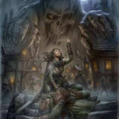
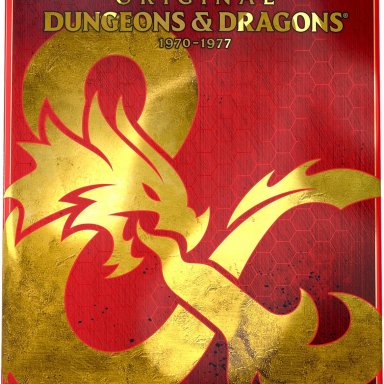
Covers: A plain background on which the title and authors' names appear. Plus a simple color illustration representing what the book is about. Dungeon Master's Guide or related; a medium dark blue. Player's Handbook or related; a medium dark brown. Monster Manual or related; a medium dark green. The lettering would be gold for corebooks, silver for settings, and copper for supplements.
Cover Design: Book title on two lines. First line; "Dungeons & Dragons" in 18 point type. Second line: The name of the book in 36 point type. Then the illustration of a single object below which, in 18 point type, would be the authors' names (two man writing team on each book). As an example of what I mean regarding cover illustrations: DMG: A brass astrolabe; PHB; plain, ordinary, everyday, workingman's broadsword; MM: Red dragon head in profile. No decoration, geegaws, gimcrackery, fussbudgetry, or other embellishments. Keep it simple or work for somebody else.
Inside Design: Black ink on white paper. All chapters start on odd numbered pages. If this means the last page of a chapter would be left blank, use it for a full page illustrattion. 12 point type in a serif font, two columns. 1" inside margins, 1/2" outside margins. Book title on even number pages, chapter title on odd numbered pages. Both up top. Page numbers on outside upper corner. No lines between paragraphs. same for sub-sections. Single line between sections. Chapter heads 24 points, section heads 18 points, sub-section heads 14 points. All sidebars in the outer column; light shading. All game mechanics in sidebars and clearly designated as OGC. Illustrations as appropriate, and only appropriate illustrations.
Page Count: A multiple of 16. If layout produces something that is a not quite or a bit over a multiple of 16, extra pages will be added until page count is a multiple of 16. (Illustrations, rules examples, fiction, whatever it takes.") )
)
Advertising: Absolutely forbidden. Magazines are for selling stuff, books aren't.
That ends this installment of the series. Next, what goes where.
Wizard's D&D books have a distinctive look. The customer can usually pick out a WotC D&D product with little trouble. At the same time it is a busy look. Lots of business going on both inside and outside a tome. So for 4th edition what say we simplify?
Covers: A plain background on which the title and authors' names appear. Plus a simple color illustration representing what the book is about. Dungeon Master's Guide or related; a medium dark blue. Player's Handbook or related; a medium dark brown. Monster Manual or related; a medium dark green. The lettering would be gold for corebooks, silver for settings, and copper for supplements.
Cover Design: Book title on two lines. First line; "Dungeons & Dragons" in 18 point type. Second line: The name of the book in 36 point type. Then the illustration of a single object below which, in 18 point type, would be the authors' names (two man writing team on each book). As an example of what I mean regarding cover illustrations: DMG: A brass astrolabe; PHB; plain, ordinary, everyday, workingman's broadsword; MM: Red dragon head in profile. No decoration, geegaws, gimcrackery, fussbudgetry, or other embellishments. Keep it simple or work for somebody else.
Inside Design: Black ink on white paper. All chapters start on odd numbered pages. If this means the last page of a chapter would be left blank, use it for a full page illustrattion. 12 point type in a serif font, two columns. 1" inside margins, 1/2" outside margins. Book title on even number pages, chapter title on odd numbered pages. Both up top. Page numbers on outside upper corner. No lines between paragraphs. same for sub-sections. Single line between sections. Chapter heads 24 points, section heads 18 points, sub-section heads 14 points. All sidebars in the outer column; light shading. All game mechanics in sidebars and clearly designated as OGC. Illustrations as appropriate, and only appropriate illustrations.
Page Count: A multiple of 16. If layout produces something that is a not quite or a bit over a multiple of 16, extra pages will be added until page count is a multiple of 16. (Illustrations, rules examples, fiction, whatever it takes.
)Advertising: Absolutely forbidden. Magazines are for selling stuff, books aren't.
That ends this installment of the series. Next, what goes where.