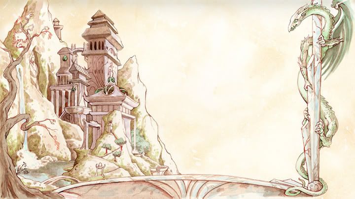
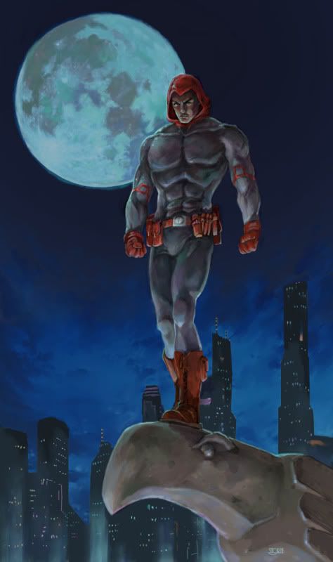
I just looked through all 30 pages. I'm not much for superhero or "pulp" games, so much of it I skimmed through despite its quality, but your fantasy portraits were great and your maps and the few oriental-themed "backgrounds" blew me away.
This is my new desktop background, first time I've changed it this year.
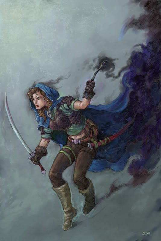
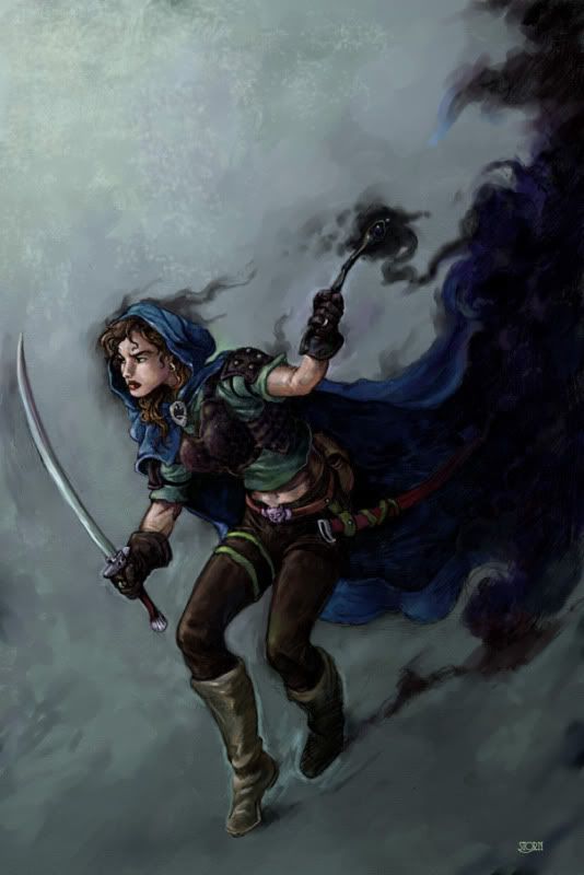
Thanks, that piece was a fun experiment, I did a watercolor wash on illustration board, with sepia tones...but the color was done in Painter... I really like how that turned out.
I actually prefer doing fantasy portraits over the superheroes (although, don't get me wrong, i love doing supers too). But I get called upon to do more superhero artwork than fantasy.
Spread the word! I LOVE doing the fantasy stuff.
...
Hi folks, sorry for the long absence. I've had a few things on my plate, but I've been cranking away. One choke point is that I'm switching computers... but my scanner and a lot (hundreds!) of files are still on the old computer. New computer won't run my scanner, Windows 7 issues with my SCSI card.... yup, my massive scanner is THAT old.
While I've had some of Death Tribble's commissions to put up, I've been lazy about getting them off the old computer, up on to my photobucket and posted in the various threads I've got around.
Anyway, here are some of those commissions...
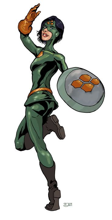
First up is the Terrible Terrapin, a concept from over on the Mutants and Masterminds boards...
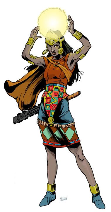
Next we have one of Death Tribble's contest entries, Acylla. I am always excited to tackle a "national" hero that seems to be a bit out of the norm. She is Peruvian and it was fun doing the research to put this one together.
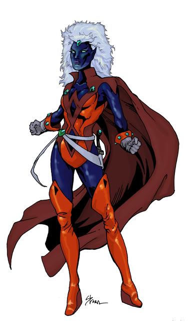
Lastly in our trio of ladies is another of Death Tribble's, his concept of a Super Drow. Somehow, the theme to Shaft is rattling around in my head. 'nuff said.
These works are licensed under a Creative Commons Attribution-NonCommercial-ShareAlike 2.5 License.
Creative Commons Attribution-Noncommercial-Share Alike 2.5 Generic