RDU Neil's Secret Worlds as been a game that he has a tough time finding images for. There are plenty of modern anime or modern super hero stuff or even modern horror... but he has a very fine line to walk with that particular game.
And I tried to do an image that was sorta in the "secret worlds" motif. I played around with doing washes, then scanning and color digital on top of watercolor washes. I'm not quite happy with it.... but it was interesting to try.
It is very hard to give an easy answer to that question. Since I do commissions in and around publishers, their work comes first, as they have deadlines. Sometimes, I have a flurry of commissions and sometimes I don't.
So, roughly? 3-4 weeks.
Here are a couple more, suitable for M&M (or the champions campaign they actually came from...)
Storn, how are you doing the lettering for the comic? The font seems a bit odd -- oddly emphasized letters, random bolding (especially on the letter "I"). I'm not sure if its the font you're using, in which case I'll hope it changes, or that you're doing the lettering by hand.
Storn, how are you doing the lettering for the comic? The font seems a bit odd -- oddly emphasized letters, random bolding (especially on the letter "I"). I'm not sure if its the font you're using, in which case I'll hope it changes, or that you're doing the lettering by hand.
I'm researching some more web friendly fonts. I hope to redux the lettering this weekend. Yeah, I agree, there is something odd happening between Illustrator, photoshop and then the final image in the lettering dept.
I'm continuing to experiment with finding the right look for RDU Neil's Secret Worlds campaign. Here is another attempt:
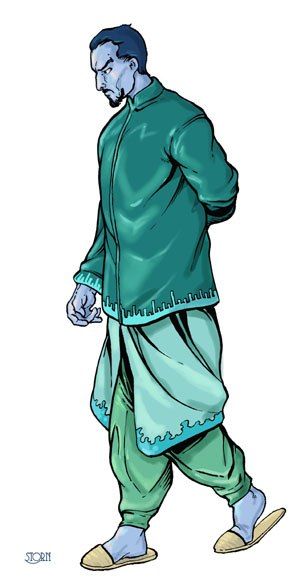
And here is another commisson from parton extraordinaire, Death Tribble, and his "blue man".
I'm still screwing around for a "Secret Worlds" style. I still need edgy... this is going back to color, although I kinda like the style of tinted color over the blue scale stuff.
so, it is closer to what I am looking for. I think. Experiments to continue.
") (Wish I had looked at it sooner.)
(Wish I had looked at it sooner.)