Pbartender
First Post
el-remmen said:Here is my latest map. So far, I am sticking with the light blue text for the sea names, as I still have not found something I like better and don't want them to stand out too much. I made the town/cities names bigger than on the other maps to make them clearer.
It's looking nice. What font did you use for "Verdun" and "The Kingdom of Herman Land"? I like it and it looks familiar, but I can't quite place it.
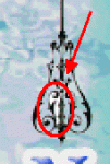
Oh, and take a close look at your compass roses. I just noticed that you missed a little bit of white...