Shadowend map - updated 2/5 with revised local map

Nellisir

Hero
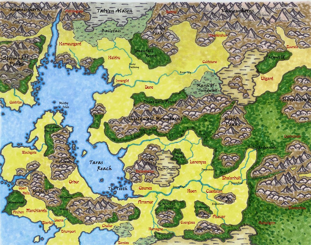
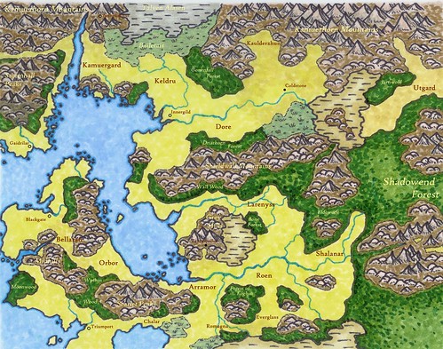
My new Shadowend campaign setting map. I'm pretty happy with it. :D
Hand-drawn, hand-colored, marker on vellum. This was my first real effort using a number of new techniques I'd learned in a landscape design class, and it was -hard-. Should be easier now that I've identified alot of the colors and lines that work for me.
Text added in Photoshop Elements. Not completely happy with it.

2177346006_017246b3d5.jpg
 
Last edited:

log in or register to remove this ad

Pyrandon

First Post
Well done map! I really like the water details and coastlines--very interesting and rich. I am not sure the yellow is my favorite, for it seems so bare and arid instead of rich or lush--was that the effect you were looking for?

I also agree the font isn't well suited to the map--it is rather bland in comparison with the detailed, stylized impact of the rest of the map. Perhaps something a bit more ornate? (On that, though, I also wouldn't go too far and choose some frilly calligraphic hand, though.)

Great job overall. Nice post.
 

Nellisir

Hero
Pyrandon said:
Well done map! I really like the water details and coastlines--very interesting and rich. I am not sure the yellow is my favorite, for it seems so bare and arid instead of rich or lush--was that the effect you were looking for?
Yellow vs green was a big quandary. Ultimately I went yellow to set up more contrast between open lands, swamp lands, and forest.
 

jaerdaph

#UkraineStrong
Nice work, Nell! Do you have a larger image? I'd love to see some of the detail, like the forests, and islands and rocks in the water. :)


Nellisir

Hero
Pyrandon said:
I also agree the font isn't well suited to the map--it is rather bland in comparison with the detailed, stylized impact of the rest of the map. Perhaps something a bit more ornate? (On that, though, I also wouldn't go too far and choose some frilly calligraphic hand, though.)

I redid the fonts in Madeira (for countries and city-states) and Viner Hand (for natural features. I think it works better. I'll post it later tonight to see what other people think.

sunaj2k3 said:
He does and how Jaerdaph. He's hosting the map on his flickr site and you can view it at its original size at http://www.flickr.com/photo_zoom.gn...77346006&size=o . It's at 6202x4880 resolution! Good Heavens, at that size I can make out the smudging of the ink and markers on the paper.
LOL! Smudges, bleeding, and everything!
 
Last edited:

Sirith

First Post
Wow, I really like it :). The use of colour makes for recognizable areas and for some reason the coastline is my favourite part of the map.
However, that's also something that draws attention away from the rest of the map, because of the huge contract between the water - coastline - land. Perhaps use a lighter colour next time (unless of course you want to draw attention to that, in that case it's great :))
 

Nellisir

Hero
Sirith said:
Wow, I really like it :). The use of colour makes for recognizable areas and for some reason the coastline is my favourite part of the map.
However, that's also something that draws attention away from the rest of the map, because of the huge contract between the water - coastline - land. Perhaps use a lighter colour next time (unless of course you want to draw attention to that, in that case it's great :))

It does "pop" a bit. I think it's one of those things that once you notice it, you see it constantly. Getting more texture into the open land might have helped, but I had to call it quits somewhere before I screwed up and had to start over (again).
 

Nellisir

Hero
New fonts

OK, here's a new version - same map, different fonts. Madeira for political entities, viner hand for geographical features. This is slightly more of a "working" copy with all the names on it (there'll be alot of names when everything's labelled!)

For the curious, I've started a thread to collect some of my notes on the setting.

2186477294_0fd1cf3619_b.jpg
 
Last edited:

Sirith

First Post
Nellisir said:
It does "pop" a bit. I think it's one of those things that once you notice it, you see it constantly. Getting more texture into the open land might have helped, but I had to call it quits somewhere before I screwed up and had to start over (again).

Yeah, going on and on with such a thing isn't working either :)

I think those new fonts look nice, btw.
 

Remove ads

AD6_gamerati_skyscraper

Remove ads

Recent & Upcoming Releases

Top