Making your own power cards

Snarls-at-Fleas

First Post
Oryzarius said:
Fun to find this thread! (New member, first-time poster).

I've been working on the same concept, albeit in a different format than MtG-sized cards. Mine are landscape-format, third-of-a-sheet pieces, created in Adobe InDesign -- I hate reading small text, and there's a lot of detail in some powers, particularly the advanced Wizard spells we've seen in the DDXP page previews. The design is not as lavish as some of examples here, since I tend to eschew backgrounds for readability (and ink savings!).

I've used color-coded borders for classes (to make it easier for different players to find their own cards and fish them out of the discard pile after the encounter, for example) with a different border style to distinguish encounter from daily powers (since I figure at-will should go on the character sheet).

I think I've figured out how thumbnails/attachments work, so I've attached some examples.

THIS I like much more. Big and clear - that's what I need. That's how I'm gonna do them. Great job!
 

log in or register to remove this ad

Belorin

Explorer
Using the magic items listed in the Pre-Release Rules Compilation, here are some of the cards I've created:
 

Attachments

  • 1 Staff of the Warmage.jpg
    1 Staff of the Warmage.jpg
    39.7 KB · Views: 647
  • 1 Frost Warhammer.jpg
    1 Frost Warhammer.jpg
    41.5 KB · Views: 507
  • 1 Delvers Leather Armor.jpg
    1 Delvers Leather Armor.jpg
    38.7 KB · Views: 503
  • Belt of Vigor.jpg
    Belt of Vigor.jpg
    35.7 KB · Views: 446

mikekannard

First Post
ianleblanc said:
mikekannard, what program did you use to make your card? (I'm looking for something that might work on OS X)

Do you still have the template?

Thanks
Well I used Microsoft Expressions Designer, mainly because I have an MSDN subscription, and learning how to use that program helps me design future WPF applications. A similar application that is cross-platform is Adobe Illustrator. I still have the files for the stuff I did, but it wouldn't really help unless you can open it in Expressions Designer.
 

Lindorie

First Post
Enclosed are a few of the cards I've made. I started making cards with photos, using the images that LordThanatos used , but I didn't like how much of the card was used for the image (and I'd have a problem getting images for all the powers). Still, I enclosed one just to show what it was looking like.

The others are samples from the pre-gen wizard class and a couple of monsters from Raiders of Oakhurst - Reloaded . I'm still experimenting with the colors and font sizes in the monster's stat blocks, as seen in the Dragon card, and have yet to give a lot of thought to the fonts I'm using.

Any suggestions or corrections are welcome.

Notes:
I made these to print on photo paper. They are a bit more difficult to read when printed on plain paper.
I have the DPI set to print them 6.5cm x 9cm, about the size of a poker card. They are, however, much larger. I also used jpg compression to reduce the file size for posting here.

Known issues:
The quotes on the bottom are a bit difficult to read. Will make Bold or change font.
I just noted that I have the OA icon in the top right of InfernalWrath. Since it is a personal spell, it does not provide an OA on the caster.
 

Attachments

  • P-Light.jpg
    P-Light.jpg
    64.5 KB · Views: 486
  • P-InfernalWrath.jpg
    P-InfernalWrath.jpg
    59.9 KB · Views: 585
  • P-AcidArrow.jpg
    P-AcidArrow.jpg
    70 KB · Views: 540
  • P2-BlastOfCold.jpg
    P2-BlastOfCold.jpg
    45.2 KB · Views: 604
  • M-BlackDragon-Young.jpg
    M-BlackDragon-Young.jpg
    96.5 KB · Views: 609
  • M-KoboldMinion.gif
    M-KoboldMinion.gif
    107.9 KB · Views: 443
Last edited:

ianleblanc

First Post
Mike, I'm going to try to get some work time on a pc with xpressions Designer so if you could send me those templates it would be appreciated.
 
Last edited:

ianleblanc

First Post
Lindorie I like your monster cards, but they somehow feel a little 'busy', I know it's probably not easy to fit all those monster stats on a single card. I would suggest removing the side bar, that info seems distracting. The alignment and xp value could probably fit in the subtitle, or beside it. Or use colors to convey meaning instead of words, put the level bubble in black to convey 'evil alignment', etc. If at all possible I would also remove the abbreviations, maybe use symbols or reduce the font.

Aside from space constraints, I think they are very cool!
 

tecnowraith

First Post
Do we really need Power Cards? I mean we really know how many powers you will total above first level? I have seen or heard anything about how many total power you gain beyond 1st level.
 

Mostlyjoe

Explorer
We need status cards stat! Bloodied, stunned, etc. It's weird, but D&D is turning into a hybrid mini's card roleplaying game and I'm really, really starting to like it. :D
 

Lindorie

First Post
ianleblanc said:
Aside from space constraints, I think they are very cool!
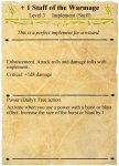
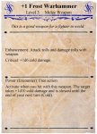
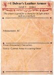
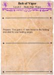
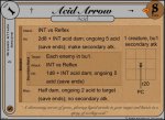
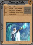
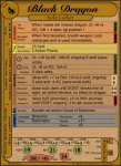
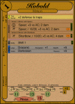
Thanks! It is tight, which is why I used the abbreviations and symbols for things like implement or melee.

ianleblanc said:
I would suggest removing the side bar, that info seems distracting. The alignment and xp value could probably fit in the subtitle, or beside it. Or use colors to convey meaning instead of words, put the level bubble in black to convey 'evil alignment', etc.
Good suggestion on the color-for-alignment, although I wonder if there would be too many alignments to easily represent in colors.

Regarding the side bar: I know that takes up space, so I kept debating taking it out completely. The reason I left it in is to allow me to put the cards in a 3x5 index box. Then the side bar would be at the top, allowing me to sort by level, then monster name or XP. If I needed to create an encounter, I could pull out my box and quickly thumb through to find an appropriate monster. This is all theoretical, of course, since I only have about 6 monsters created for the Raiders of Oakhurst.

My group has already had one combat using the pregen character sheets and monster stat blocks in Second Son. When we do Oakhurst next weekend, the wizard will playtest the power cards I created while I playtest the monster cards. We'll see how useful they are then.

ianleblanc said:
If at all possible I would also remove the abbreviations, maybe use symbols or reduce the font.
Do you really mean "reduce" the font and not "make it bigger"? I had no abbreviations, but the font was smaller than my aging eyesight liked. I pulled up some online DDM card photos and used abbreviations found on those, also adding EONT for "end of [the monsters] next turn". I find that using no abbreviations helps the first couple of times the card is read. After that, abbreviations are fine. So I envision the books to be the monster introductions, and these to be gaming aids.

Note: My comments on the font are when I print it 3.5cm x 9cm, which was my original intent. If I do print it 3x5", I may be able to reduce the font while keeping the text legible.
 
Last edited:

Lindorie

First Post
tecnowraith said:
Do we really need Power Cards? I mean we really know how many powers you will total above first level?
The reason I created the power cards was because during combat, several of the players kept forgetting to use a power or feat they had. There were also a couple of times they tried to reuse an encounter or daily power they already burned, or spent time going through their sheet looking for a single stat for the power (e.g. damage). We will hopefully playtest these cards this weekend.

The reason I created my monster cards is because of playtest reports I read in these forums. Several times, the DM's wrote that they forgot a monster's powers, or forgot to roll for a recharge. Although I haven't used them yet, I hope having the cards laid out in a consistent format with coloring hints, icons, etc will help.
 

Remove ads

AD6_gamerati_skyscraper

Remove ads

Upcoming Releases

Top