New Power Cards...

dzokvic

First Post
First off, I'm not sure if this is the right forum for this, as this is my first time posting here, so if it's not please tell me.

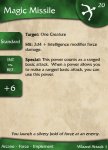
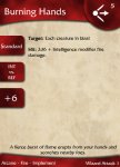
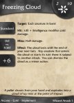
After searching around on the internet and looking for some power cards that I liked, and not really finding any, I decided to load up Photoshop and make some of my own. I have incorporated what I feel are the best elements of several different designs into one card.

I know new power card designs are a dime a dozen, so now I'm looking for criticism. Any ideas or suggestions would be welcome. Hell, if if you'd just like to tell me you like them, my ego would not be opposed to that either.

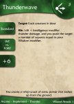
Some explanation is in order for the bottom box on the left. It is for the attack bonus with that power. Now I realize that I would have to print out new cards at least every other level, but I wanted that information on the card, and every attempt to just make a write in box for it did not look right.

I only have one card mocked up currently, but it is a simple matter of changing colors/text/icons for the others. If others like them I would be willing to upload the PSD as well, so you can make changes and make your own cards if you like.

And now for the credit. Design inspiration came mainly from two sources: Sunspots, (which are here: http://sites.google.com/a/educatedgamer.net/4e-fans/Home/power-cards-1), and Cameron (here, http://www.dragonavenue.com/forums/viewthread/701/). Fonts and icons are by Daniel Rivera, (here, http://sites.google.com/a/educatedgamer.net/4e-fans/Home/power-cards-1).

Thanks in advance for any comments you may have.
 

Attachments

  • Thunderwave.jpg
    Thunderwave.jpg
    204.1 KB · Views: 388

log in or register to remove this ad


dzokvic

First Post
That is the only one I currently have done, but now that the design is done it is a much simpler matter to create the other ones. Just wanted to get the one proof-of-concept up and get some feedback to see if there was interest in the others. I should have some more up tomorrow, I just need to find a place to host them.

I also was thinking of possibly using icons to represent the action type (standard, move, minor, etc.), what are peoples thoughts on this? Do you think it would be to unintuitive?
 
Last edited:

guybrush

First Post
A lot of the MSE sets use icons for action types and, as long as the icons are clear, they're great. (The common ones are a fist for Standard actions, a boot for Move actions, and a small star for Minor actions.)

MSE, by the way, is Magic Set Editor, if you're not familiar with the acronym. It's a Windows app for creating your own Magic cards, but you can make templates to use it for anything you like, including D&D4 power cards. You should check out the thread on it; yours is a great, clean design, and would work really well as an MSE template.
 

dzokvic

First Post
Yes, I am familiar with MSE. Unfortunately, I don't see myself having the time to learn the scripting language in order to create the templates, although I do admit that it would be a really good idea, especially with the attack bonus field that I have created. Unless it is incredibly simple of course, then I could manage it. As I said before though, I would be more than willing to upload the PSD if someone else wants to create the MSE template, obviously provided that I recieve credit for the actual design.

Here are a couple more mock-ups, one At-Will, one encounter, and one daily so you can see them all side by side. Later tonight or tomorrow I will post some versions with icons in place of the action type text, once I find some icons that I like, and we'll see what ya all think.
 

Attachments

  • Magic Missile.jpg
    Magic Missile.jpg
    208.2 KB · Views: 192
  • Burning Hands.jpg
    Burning Hands.jpg
    198.6 KB · Views: 169
  • Freezing Cloud.jpg
    Freezing Cloud.jpg
    208.1 KB · Views: 200

dzokvic

First Post
After some tinkering, I decided not to go with icons for the action type. It looked odd having one tab on the left with an icon in it, and the other two with text. Trying to come up with icons for every conceivable attack and defense so I could use icons along the whole side defeated the purpose. The whole point was to make things easily recognizable, and having too many icons does not play nicely with that.

I am also working on a new template for magic items. I could not find an easy way with the current design to differentiate clearly what abilities and powers were coming from an item, and which were just player powers. There is much more information that needs to be displayed quickly and cleanly on a magic item (especially those that grant abilities or powers). I am going to stay true to the look and feel of the first card, so the two can be played together, maybe just going with a more angular, man-made look for the magic items. Thoughts?
 

eloquentaction

First Post
Yes, I am familiar with MSE. Unfortunately, I don't see myself having the time to learn the scripting language in order to create the templates, although I do admit that it would be a really good idea, especially with the attack bonus field that I have created. Unless it is incredibly simple of course, then I could manage it. As I said before though, I would be more than willing to upload the PSD if someone else wants to create the MSE template, obviously provided that I recieve credit for the actual design.

Here are a couple more mock-ups, one At-Will, one encounter, and one daily so you can see them all side by side. Later tonight or tomorrow I will post some versions with icons in place of the action type text, once I find some icons that I like, and we'll see what ya all think.

Hey Dzokvic -

I like your designs. They're very close to the ones I've already put out.

If you like, I could take your backgrounds and design ideas and make them a new option to my already existing set.

Totally up to you.

-- Hirahito
 

Mercutio01

First Post
After some tinkering, I decided not to go with icons for the action type. It looked odd having one tab on the left with an icon in it, and the other two with text. Trying to come up with icons for every conceivable attack and defense so I could use icons along the whole side defeated the purpose. The whole point was to make things easily recognizable, and having too many icons does not play nicely with that.
There are only 4 defenses and I already created icons for those. For the attacks, I have "text" but that's only because I will be putting the actual number into that block for my cards. Feel free to use my icons if you would like.

For me, I completely disagree with the idea that "too many" icons makes things less recognizable. In my playtest, my icons (after a little getting used to) were actually easier to recognize quickly. But that may not be for everyone. For me, looking at a shield means AC and I can picture that quicker than seeing the letters AC.
 

Remove ads

AD6_gamerati_skyscraper

Remove ads

Recent & Upcoming Releases

Top