A Tale of Two Covers

Which image do you prefer (and why)?

  • First Image (blue backdrop)

    Votes: 7 15.9%
  • Second Image (faded)

    Votes: 34 77.3%
  • Other: See my comment below

    Votes: 3 6.8%

  • Poll closed .

BASHMAN

Basic Action Games
I had a bit of a re-model done on the front cover for Honor + Intrigue (swashbuckling RPG based on the BoL system) and am seeking feedback as to which looks best. First we have the blue backdrop:
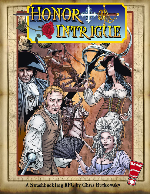
6377885483_9a73124c77_z.jpg


And then we have the updated "faded" image:

377869_10150525744497838_89564587837_8907783_1203777047_n.jpg


Which do you like better, and also why?
 
Last edited:

log in or register to remove this ad

CAFRedblade

Explorer
I'm liking the second one better than the blue backdrop, but the position of Intrigue could use a minor adjustment. Perhaps a little tighter upwards. You're just fractionally overlapping the sword hilt, but you have the blue cross and the word just barely touching. Perhaps either a little more separation, or overlap them more.

The reason I don't like the blue backdrop version is that it simply feels slapped on at the moment, with very little attempt to fit it in with the title, and the cover itself.
It could be made to work, but not as is.
 

FreeXenon

American Male (he/him); INTP ADHD Introverted Geek
What he said.... and the blue box does not seem to mesh well with the rest of the cover...
 

steeldragons

Steeliest of the dragons
Epic
Three votes for cover numero 2.

The blue background doesn't really do anything to the design of the first cover...it is a (an unpleasant) distraction...I understand that is the name of the game and all...but still, better cover and as easily noticeable name in the second.

Cheers and good luck with it.
--Steel Dragons
 

howandwhy99

Adventurer
The 1st one pops, but the second is softer and more appealing to me.

The catch is, you probably want something to pop on the cover in order to catch someone's eye. I would make that the title, but the blue is jarring to the rest of the composition.

Plus, while #2 is really nice, maybe you could think about doing something with the edges outside of the picture other than tan? I mean, it has no texture. I think a nice beaten in leather congruent across the whole cover (under the rest) and even extending to the back would work nicely.

Then make the title on the spine pop to, maybe over the same backplate & background texture combo.
 

Dannyalcatraz

Schmoderator
Staff member
Supporter
Another vote for #2, and I think you should take the blue version of the title and use a variant of it on the spine (if it's big enough).
 

chriton227

Explorer
I like the second better, but I don't care for the kerning between the R and I in Intrigue, something about it makes me feel like the second half of the word is shifted up slightly compared to the first half.


Stormonu

Legend
Another vote for the 2nd.

However, it might look better on the 1st if the picture started a bit lower (half-way down the blue box) or underneath the blue logo. And also if the top of the blue logo was below the outline of the map.
 

Remove ads

AD6_gamerati_skyscraper

Remove ads

Recent & Upcoming Releases

Top