A Tale of Two Covers: Part DEUX

Which cover do you like better (and why)?

  • Cover #1 (winner of last thread)

    Votes: 4 22.2%
  • Cover #2 (brighter letters)

    Votes: 13 72.2%
  • Other: See my comment below

    Votes: 1 5.6%

  • Poll closed .

BASHMAN

Basic Action Games
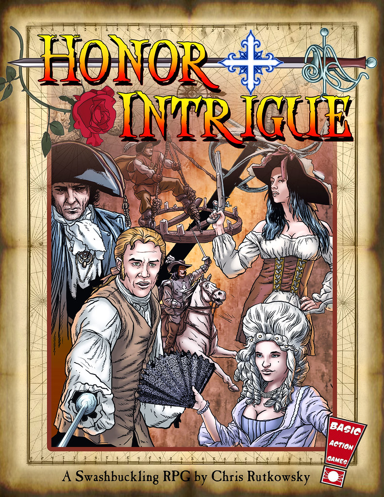
So I think it was pretty clear that the second cover was the winner last time, when I asked about a new cover for Honor + Intrigue (swashbuckling RPG based on the Barbarians of Lemuria system). I did refine it a bit since then. What do people think this time?

Here is Cover #1
377869_10150525744497838_89564587837_8907783_1203777047_n.jpg


And here is Cover #2 with more of a sunburst on the letters and a steel colored hilt on the sword:
6686395013_2866b5b104_b.jpg
 

log in or register to remove this ad


SkredlitheOgre

Explorer
I voted #2. The red gives the title some contrast within itself without being as obnoxious as the blue box was.

And I would vote for more cleavage on the girl at the bottom, but that's just me.


Griego

First Post
#2, also I would add some color (or something) to the "+" to make it more apparent that it's part of the title; at a glance it looks like the title is "Honor Intrigue."
 

Greg K

Legend
Chris,
I like the second and I agree with Greigo about adding something to make the "+" read as part of the title.

By the way, is it me or does the sword hand of the man in the lower left appear to be missing? Maybe, it needs additional color to contrast from the sleeve.


Remove ads

AD6_gamerati_skyscraper

Remove ads

Recent & Upcoming Releases

Top