Have a character sheet.

Rune

Once A Fool
The giant circle in the center of the page is a waste of space and it's awkward to read your stats at that bizarre angle. It's also unclear whether you write the stat before the word or after the word. Space for ability bonuses is nowhere to be found. Spellbook page is either too spaced out to neatly contain a list of all your spells (so many pages just to hold a level 1 clerics spells, etc) or too small to write down what every spell does in detail (which no one will do).

Mostly just that giant circle. It's visually clever, sure. But when you're playing the game you don't want to be staring at your sheet marveling at how pretty it is. You want to quickly find the number you need. There isn't much to recommend this sheet over a sheet of notebook paper. Sorry.

I'm thinking that this sheet does not lend itself to your playstyle. Nor was it ever intended to. That "waste of space" in the center is prominant because it is what I consider to be the most important part of a character sheet. Sure, you disagree, but this sheet does what it is designed to do.

In your case, however, may I recommend a sheet of notebook paper?
 

log in or register to remove this ad


Morrus

Well, that was fun
Staff member
It's not my preference or a sheet I would use, but I like its audacity.

Yeah. Character sheets made of rectangles and boxes are ten-a-penny. Audacity is something to be encouraged in character sheet design!

I love the NUMENERA character sheet, for example. I asked Monte about it at Gen Con and he said the difference was hat they asked an artist to make the character sheet rather than a layout design person. They approached it differently.

Numenera_CharacterSheet_Internal.jpg
 

Jeff Carlsen

Adventurer
Yeah. Character sheets made of rectangles and boxes are ten-a-penny. Audacity is something to be encouraged in character sheet design!

I love the NUMENERA character sheet, for example. I asked Monte about it at Gen Con and he said the difference was hat they asked an artist to make the character sheet rather than a layout design person. They approached it differently.

View attachment 59653

That's a beautiful sheet, but it's also very noisy and difficult to parse, particularly near the center.

Designing a character sheet is an exercise in balance and compromise. You want a sheet to be evocative, but it is foremost a tool, so it has to be navigable. You want it to be simple, but also complete. It must support varying character types without unduly limiting any of them.

There are other considerations as well. Does it need to support photo-copiers? If so, stick to black borders and don't use backgrounds.

Will it be printed? Does it require color? How much ink does it take to print? Will dark spots show through to the back of the sheet?

Personally, I love the process of making a sheet. I tend toward highly structured, multi-page sheets with just enough decor to be evocative without disrupting utility.
 

Morrus

Well, that was fun
Staff member
Photocopiers? I don't think I've photocopied a sheet in 20 years!

Sure, a sheet or a game can look complex at first. Especially in RPG I think that's OK. If you like the sheet, you'll be familiar with it in no time. Or you can use another one if you're not so keen. Options!
 

Jeff Carlsen

Adventurer
Photocopiers? I don't think I've photocopied a sheet in 20 years!

Sure, a sheet or a game can look complex at first. Especially in RPG I think that's OK. If you like the sheet, you'll be familiar with it in no time. Or you can use another one if you're not so keen. Options!

Enforced Uniformity!
 

Rune

Once A Fool
At n00bdragon's suggestion, I have reworked the second page to fit in 24 spells (rather than the original 14).


Here's the latest update (includes version 2 of the first page):
 

Attachments

  • Charsheetcirclepage2V2.jpg
    Charsheetcirclepage2V2.jpg
    49.1 KB · Views: 1,483
  • CharsheetcircleV3.pdf
    45 KB · Views: 258

HRSegovia

Explorer
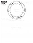
I actually encountered this sheet on my own and loved how visually stunning it was. The idea of doing the faded wording (as well as a circle stat board with info filling the corners) was something I did a LONG time ago in other games but you know what they say... "great minds." In fact, that's really what kind of attracted me to it, that someone else thought of it, too. It does, however, lend itself to some spacial problems. If those simple spacial problems were fixed, the sheet would actually be functional.

The sheet functions exactly as you intend it (which most people are not getting). It is a light minimalist sheet. You don't write down all the formulae and details. Get to the point, write down the end result, and to hell with what confusion may follow later when leveling up - let's get moving, right? I like it. To hell with the documentation, full speed ahead! YES!

Sure, make the character profile the focal point, and even large, but not THIS large. By shrinking it even 15%, you open up enough space for a character levels 1-10. This is only possible because you adopted the freeform box concept (a concept I love as you can see on my sheets). As it stands, there is not enough room on the right side of the sheet, particularly since you threw in the two longest lists together: Equipment and prepared spells (don't forget, level 1 clerics get cantrips and channel divinity as well).

http://community.wizards.com/sites/m...%20Segovax.pdf
http://community.wizards.com/sites/m...0Stingfire.pdf
http://community.wizards.com/sites/m...Magavarico.pdf
http://community.wizards.com/sites/m...20Sheet_18.pdf

Others have made this point and it's true, there is a small amount of confusion as to which side the stat is to be written. Even if you have your own method, you may forget later or it psychologically delays picking the right one. I can think of 20 ways to fix this and will name none because I'm sure someone as artistic and clever as you can figure it out (and because someone as creative as myself will spend the next 12 hours trying to pick which 10 to present and how to thoroughly present their pros and cons).

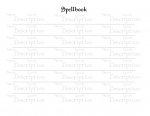
The spellbook is almost unnecessary in your case. Sure, I did almost the same thing with mine but you might be better off doing what I did and going with a fully freeform box as opposed to individual spaces.

Shouldn't Throw Attack also be Ranged?

In fact, this sheet may benefit from even LESS information. Almost every problem can be fixed by actually REMOVING stuff.
- Shrink the circle 15%
- Fix the Ability issue (pertaining to which side the stat goes)
- Turn the sheet from landscape to profile and move the circle to the top center as opposed to dead center (or not, you can experiment with which way leaves you more room)
- and then freeform box the whole sheet.

Let me try this... be right back.


Rune

Once A Fool
I like it, HRSegovia. Although your interior circles are cutting into the triangles a little bit. Those aren't just fancy borders; they're actually designed to be utilized as checkboxes for hit points, ammo, or whatever (and are grouped in fives and tens to facilitate this).

Still, I'm inspired. I'll see if I can make a few tweaks for folk who want to actually put more information on it, in the long run. And clarifying where the stat goes would be an improvement, also.
 

Remove ads

AD6_gamerati_skyscraper

Remove ads

Upcoming Releases

Top