You are using an out of date browser. It may not display this or other websites correctly.
You should upgrade or use an alternative browser.
You should upgrade or use an alternative browser.
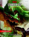
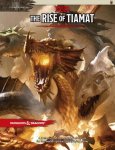
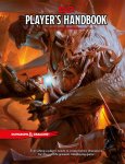
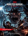
D&D 5E Vote for your favourite 5E cover art!
mach1.9pants
Hero
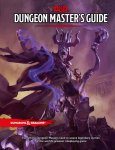
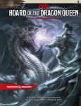
Two hard to choose. Everyone is sensibly dressed. No bewbs on reptiles (or at all really). Not odd poses. And best of all lots of nudges towards previous classic covers. I also like to see PCs getting toasted! So
dunno buuuuuuuuuuuut if I had to choose
DMG. Player's will look at that and despair!
dunno buuuuuuuuuuuut if I had to choose
DMG. Player's will look at that and despair!

Tovec
Explorer
For art for its own sake: They're not bad.
For art for a cover: Not my cup of tea. Though to answer the question, I like the Tiamat one best for some reason.
I'm not a huge fan of random poses. I like context and story. I also like a bit of realistic looking (don't care how practical) art. I enjoy a well designed alley in a big city with nice bits of bobs to look at and random people in the street doing things. I care less about a spread of every character just facing the "camera" or the more recent "landscapes" I saw coming out of WotC - with the one singular base in the middle of the craggy landscape. I'm sure it looks cool, but no one would actually build something like that outside of a fictional world because it is too impractical to get to the front door. And that second part ruins a lot of atmosphere for me. So, yeah, Tiamat's base is shiny.. but why does it look that way? What about that screams, "Tiamat the destroyer, fear me!" because to me, nothing does. The same kind of goes for these covers, they're detailed but they lack context. They're flare but without substance. Like comparing the iconic Fonze to some random dude wearing a leather jacket with a popped collar. One thing is actually cool and one that just thinks it looks it. But a hard thing to define, except to say one thing isn't the Fonze (Ehhhh!).
Last edited:
MortalPlague
Adventurer
I really love all the pieces of art.
But that Monster Manual just oozes 'sinister' in a way that other MMs have not. That takes top spot for me.
But that Monster Manual just oozes 'sinister' in a way that other MMs have not. That takes top spot for me.
Those illustrations are nice, but IMO everything else is just "off" Typography is amateurish; that font is just too 90's for me, and it's not as easy to read as I'd like. D&D logo is okay with the ampersand, but I don't like the bright red color. I'm just glad they didn't put the silvery version on the books (it honestly looks like someone at WotC is enamored with the 'bevel/emboss' feature in Photoshop). And what's with the messy red "splotch" and "slash" underneath the logo and the title? IMO they are badly done, and don't serve any purpose? In any case black (or varying colors, like they did in 4E books) would work much better.
If this is the result of all those surveys and years of polishing, they sure don't have a very good team of Art Directors (IMHO, of course).
If this is the result of all those surveys and years of polishing, they sure don't have a very good team of Art Directors (IMHO, of course).
babomb
First Post
The illustrations themselves aren't bad: maybe a little busy for a cover, and not necessarily the most inspiring choices, but they're okay. (I think the Tiamat one is my least favorite, partly because it isn't well-framed. I voted the Monster Manual as the best, but it's starting to bother me that the woman is attacking something that is just barely sticking into frame. It's a weird choice.)
The problem with the covers is the graphic design. The full cover illustration with no border or negative space looks cheesy. It puts me in mind of bad 90s fantasy novel covers that made one a little embarrassed to be seen reading them.
The red line underneath is just about the worst option they could have picked for setting of the title, and it's not even spaced well.
The title font is a poor choice.
As for the little blurb on the bottom, if you're really "the greatest", you don't need to keep telling people that you are.
Blackwarder
Adventurer
All the covers are great but I love the starter set, remind me of the black box I had in 91'
Warder
Warder
Similar Threads
D&D General
D&D Survivor: Spelljammer Dragons
- Replies
- 143
- Views
- 5K
D&D General
D&D Survivor: Wrack Dragons
- Replies
- 101
- Views
- 3K
- Replies
- 13
- Views
- 682
- Poll
- Replies
- 28
- Views
- 1K
- Poll
- Replies
- 35
- Views
- 2K

