GX.Sigma
Adventurer
With a paid product, you're also telling people you want to be treated like a professional.
There are different categories of professional products but they all have two things in common: proper English and clean layouts.
I agree with the above.It's my personal opinion that readability is first priority, so a more "bland" option that is more readable will always win my favor over a "fancy" or "cool" option that is less readable. So yes, I'd recommend ditching the textures
If you don't believe in your graphic design ability, why did you get creative with the graphic design on this product?Honestly, exploring on my own is pointless. My brain just doesn't work in a way that allows me to judge these things properly - it seems to dedicate itself entirely to whatever I am focused on (it also makes multitasking impossible too but that is besides the point). When I look at the text, the background textures are basically invisible to me. When I look at the textures, the other images and words and pretty much everything is gone.
Whenever I judge aspects of the page, I can only judge each aspect in isolation, so the combined effects is not something I will ever be able to assess accurately.
***
So, my unfiltered first impression of this product, and why I don't want to buy it:
I am not interested in player options, because these require very intricate design and careful balance, and I don't trust some random guy on the internet (no offense) to do these things.
I'm especially not interested in player options that allow a great deal of flexibility. These are even more difficult to balance and design.
I'm definitely not interested in monsters as PCs.
On the DM side, I already thought the Vampires in the Monster Manual were all I needed. Nothing on the store page tells me why I'd want this. This is mostly a marketing problem.
So, I'm already not interested, but let's say I'm interested enough to click on the preview:
The graphic design is unprofessional, as mentioned above. The first thing I see is the title, half-unreadable on the same-colored background. I do not want to pay $2 for this.
The second thing I see is a paragraph explaining something I already know. My patience is razor-thin.
The next section is headed "How to Build a Vampire," and does not explain how to build a vampire. Instead, more information I already know. I give up on reading, and begin to skim.
The next page seems to be the end of a section on vampire subraces. The first one I see is called "Zekaqux," which is not promising.
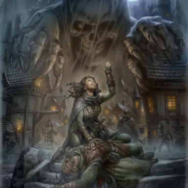
Seemingly unrelated stock image of the floating organs monster?
I continue to skim. More unpronouncable subraces. I don't know what any of these are, and reading the descriptions doesn't help. It would be nice if it was a choice between strong archetypes I already know (Dracula, Nosferatu, Twilight, etc.). I have nothing to hook onto.
At this point, I shift to an even shallower skim. The backgrounds get more and more annoying.
The blurb says it offers a lot of flexibility, but the class just looks like a Fighter/Monk variant?
***
Overall, the front-end doesn't hook me in and make me want to read more. If I was really interested in the subject matter and it was PWYW, maybe I'd download it for 10 cents. Even if I was interested in the subject matter, I wouldn't pay $2. That's just me, though.

