Check Out The First 3 Pages Of TALES FROM THE YAWNING PORTAL

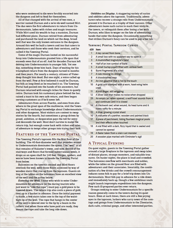
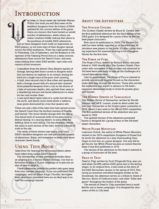
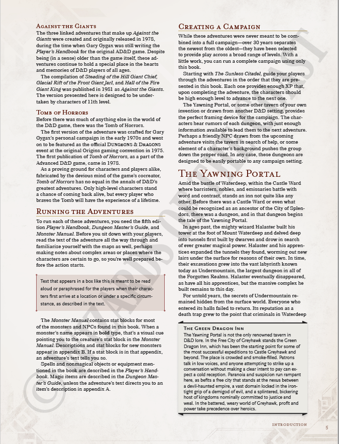
Tales From the Yawning Portal is about a month away, which means the previews are starting to appear across the internet. First up is the first three pages of the book - the introduction, which summarises the included adventures (The Sunless Citadel, The Forge of Fury, The Hidden Shrine of Tamoachan, White Plume Mountain, Dead in That, Against the Giants, and Tomb of Horrors) with basic details about The Yawning Portal itself. Enjoy!

Tales From the Yawning Portal is about a month away, which means the previews are starting to appear across the internet. First up is the first three pages of the book - the introduction, which summarises the included adventures (The Sunless Citadel, The Forge of Fury, The Hidden Shrine of Tamoachan, White Plume Mountain, Dead in That, Against the Giants, and Tomb of Horrors) with basic details about The Yawning Portal itself. Enjoy!


Screen Shot 2017-03-06 at 14.16.28.png


Screen Shot 2017-03-06 at 14.16.38.png


Screen Shot 2017-03-06 at 14.16.48.png


You can download those three pages as a PDF from WotC here.
 

log in or register to remove this ad

machineelf

Explorer
Sorry it's taken a few days to provide the examples; I'm rarely at my computer anymore, and referencing things on my phone is a pain. So here we go:

3-Page Preview

First sentence under "Introduction:" capitalization is all over the place.

Bottom of Page 4, last line of left column: extend the campaign beyond what? At least one word is clearly missing here.

Bottom of Page 5, last line of left column: "Appendix" should be capitalized.

Tomb of Horrors Preview:

First page, in the sidebar under Eberron: "among Shargon's Teeth." That's the entirety of the "sentence."


In addition, both previews are rife with run-on sentences and repetitive wording. I don't expect that those issues will ever be resolved, no matter how many printings the book sees, but it still makes me sad. These are issues most of us have weeded out of our writing by the time we graduate from high school.

Don't get me wrong; my own writing is far from perfect, and I don't imagine anybody's is. But it doesn't speak too well of the editing staff of a major company to have so much stuff like this slip through the cracks - my writing isn't perfect, but that's why I have other people look it over before publication. Which means that when my writing does hit the streets, it actually reads better than most of the stuff in these previews. I mean seriously, four issues in five pages? That's a baaaaaad proportion.
With regard to the first sentence under "Introduction," Tales From the Yawning Portal is the title of the book, so it should be capitalized. It is weird that each letter is capitalized, and some letters seem to be a larger font than others, but maybe that's just a design choice for the first sentence of the chapter after the drop-cap. It's hard to tell, but this might be more of a design choice than a mistake.

You're definitely right about the other things you've pointed out. But I wouldn't say there are mistakes "galore."

Have you read through much of the AD&D 2nd edition modules? There were plenty of mistakes in them as well. But they were never bad enough to distract me from the material or prevent me from purchasing them. This kind of thing may be a bigger annoyance to you, which is fine of course. Opinions vary. But they don't bother me so much. As long as the information they are presenting is understandable and has value, then a few butchered sentences here or there is not going to worry me. I'll still buy it.
 

log in or register to remove this ad


DonEsteban

First Post
Huh, I thought it was still there, but apparently it was only in my cache. Anyway, I'm sure you can still find it somewhere. I would send you a link, but I'm not sure if that would be legal.


trystero

Explorer
With regard to the first sentence under "Introduction," Tales From the Yawning Portal is the title of the book, so it should be capitalized. It is weird that each letter is capitalized, and some letters seem to be a larger font than others, but maybe that's just a design choice for the first sentence of the chapter after the drop-cap. It's hard to tell, but this might be more of a design choice than a mistake.

Yeah, that sentence is set in small caps, which is standard for the first line in a chapter in WotC's D&D 5 layout, and the words "Tales" and "Yawning" and "Portal", being capitalised, have larger initial capitals. I don't see a problem here.

I haven't noticed any run-on sentences so far. But I do agree that there are missing words and a fragment, and that another clean-up pass wouldn't go amiss.
 

robus

Lowcountry Low Roller
Supporter
Yeah, that sentence is set in small caps, which is standard for the first line in a chapter in WotC's D&D 5 layout, and the words "Tales" and "Yawning" and "Portal", being capitalised, have larger initial capitals. I don't see a problem here.

I dunno, those glyphs undulate more than a yuan-ti at a tribal dance! :)


Related Articles

Remove ads

Remove ads

Top