It’s August and that means that the annual #RPGaDAY ‘question a day’ is here to celebrate “everything cool, memorable and amazing about our hobby.” This year we’ve decided to join in the fun and will be canvassing answers from the ENWorld crew, columnists and friends in the industry to bring you some of our answers. We hope you’ll join in, in the comments section, and share your thoughts with us too… So, without further ado, here’s Day 12 of #RPGaDAY 2017!
#RPGaDAY Question 12: Which RPG has the most inspiring interior art?
Angus Abranson: There’s a lot of fantastic art in RPGs these days so it’s very hard to choose one (it’d be hard to select my favourite dozen let alone one!!!). I’m going to opt for the fantastic Shadows of Esteren though. I picked up a copy when it first came out in France at a show in Paris and was instantly stuck by the interior artwork and have been so pleased to see the game do so well in its English edition – picking up a fair share of ENnies on its way! One game I’m looking forward to seeing, that hasn’t been released yet, which I think will have fantastic artwork in is the Trudvang Chronicles RPG from RiotMInds, so keep an eye out for that one.
Christopher Helton: I'm going to go old school and say the Realm of Chaos books for Warhammer. The Lost and Damned and Slaves to Darkness have some of the best art for getting you into the Warhammer setting of any book ever published for it. I wish they would reprint those books. The Warhammer 40K books put out by Fantasy Flight Games really pull you into the setting, too
Morrus: My choice is an odd one, and I suspect I'll be alone in this, because it's not full-colour gorgeous art. It's the Ship Recognition Manuals from FASA's Star Trek. There was something about thumbing through those pages, and the technical black and white diagrams of the ships which just kinda worked in the context of the book as a sort of "technical manual" that dynamic full-colour art wouldn't have suited. To this day, I still thumb through those books.
Michael J Tresca: Just about anything Planescape for AD&D!
Darryl Mott: The art in the original Vampire: The Masquerade books had this unity of style even across various techniques that managed to evoke the feel of the dark urban fantasy world the games worked to build. Many game books in the 80s and 90s would grab whatever art happened to fit the description, but the attention to detail in those early World of Darkness books in making sure that all the different artists' art styles still fed into that same stylistic vision was a huge part of the game's appeal for many.
Steven S. Long (Hero Games, Last Unicorn Games): Shadowrun. I've always loved the art for this game, especially the first two editions. At its best it's compelling and inspirational, and even at its worst it still conveys the setting's flavor well.
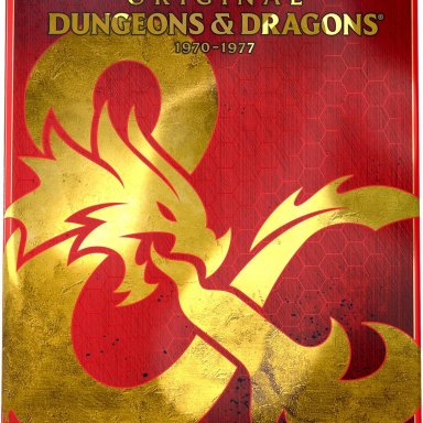
Dennis Detwiller (Creator of Delta Green, Arc Dream Publishing): The original D&D Basic Red Box. The consistency of the art (by Larry Elmore) and the stories the pieces tell are magnificent. The style, execution and clarity have not been matched yet, in my opinion.
Bruce Heard (Dungeons & Dragons; Calidar): D&D Gazetteers' Stephen Fabian internal art & Clyde Caldwell cover art.
Ian Sturrock (RPG writer and game design lecturer?): For me, it’s Symbaroum from Jarnringen. The game is very much a dark fantasy and all of the artwork portrays this well. The style is sketchy with deep colors which gives off a sense of foreboding.
Stephanie McAlea (Stygian Fox Publishing, The Things We Leave Behind): The One Ring or Call of Cthulhu 7e.
Ken Spencer (Rocket Age; Why Not Games): I have been most moved to play a game by the art in Star Trek Adventures. Reading the pdf on a tablet feels like, looks like, and if only the panels were hyperlinks, would be like a Next Generation datapad. The rest of the art is top notch and catches the feel of the shows, especially the exploration and discovery aspects.
Andrew Peregrine (Doctor Who, Victoriana, Cabal): Games are just gorgeous these days, and that’s set the bar outrageously high for production values. Skyrealms of Jorune has always been a favourite of mine for interior art. But I’d really have to pick The One Ring (and not just because I work for Cubicle 7!). Jon Hodgson was simply born to draw for this world quite frankly, and the team he assembled are phenomenal. I love the work in this not just because its good but it is also an object lesson in art direction. You could easily believe it is all one artist, as the mixture of styles and organisation of each piece is seamless. I’ve never really been a Tolkein fan, but on seeing the world through the eyes of this book, I finally got what all the fuss was about.
Charlie Etheridge-Nunn (RPG Reviewer; Who Dares Rolls): Dead of Night Second Edition has some fantastic art, which was even given away as postcards at conventions. First edition’s art was cute but pretty rough. Still, I enjoyed the hell out of the games I played and ran. DoN Second Edition was not playing around. From the evocative cover (especially as the game I played once and ran a bunch of times was a werewolf-based one). The game was fairly simple, so as well as the system, there were essays on horror and tons of plot hooks. The main interior art panels were fictional horror film posters, each one nicely evocative and with plot seeds within the book. As I said, there were postcards handed out at conventions. It must have been Dragonmeet where I picked up my copy from the author, Andrew Kenrick, who’d GM’d for me a few times there. I thought the postcards were just tangentally-related fluff, but ended up using them in some of the games I ran.
Mike Lafferty (BAMF Podcast; Fainting Goat Games): I don’t play Pathfinder – but the art in those books is simply amazing.
Simon Brake (Stygian Fox): My first encounter with the Cthulhu Mythos was with the 3rd edition of the Call of Cthulhu RPG. Amongst the artwork inside were some full page full colour plates (most of the pictures were black and white) – in particular the picture of a ghoul, by Les Edwards, was something to rival what Lovecraft’s character Pickman must’ve been painting. Those pictures were the first indication that this was a game of truly terrifying horror. Cthulhu art nowadays is pretty much common place but, at the time, it really grabbed my attention. If I were to pick a modern day game I’d have to say I love the photo manipulated art from the latest edition of Unknown Armies. It helps set the game is a version of our real world, and stands out amongst the illustrative nature of the art in many contemporary horror games.
Marc Langworthy (Modiphius; Red Scar): Again, this is a difficult choice. I’ll stick with Symbaroum though.
Darren Pearce (EN Publishing; Savage Mojo): This is a grand question, one that’s got a lot of answers. I’d have to say The One Ring, because that art nails Middle Earth and it’s also inspiring. 7th Sea 2 comes in next, because that book has inspiring and diverse art.
Federico Sohns (Nibiru RPG): The Swedes are usually pumping out great stuff with regards to art; look at games like Symbaroum and Tales from the Loop—these are people that really got how important art is to evoke a game's setting! With that said, I do have certain favourites, particularly the work of Michael Koch in the New World of Darkness line. I've got to say, then, that sourcebooks like Night Horrors: The Wicked Dead & Night Horrors: Immortal Sinners have the best art I've seen (in my opinion).
Uli Lindner (Space: 1889; Clockwork Publishing): I really love the interior artwork from Fantasy Flight Games Star Wars line. Truly wonderful artwork (and layout)!
****
Originally created by Dave Chapman (Doctor Who: Adventures in Time & Space; Conspiracy X) #RPGaDAY os now being caretakered by the crew over at RPGBrigade. We hope you’ll join in, in the comments section, and share your thoughts with us too!

