D&D (2024) 1D&D trade dress: What do you want the books to look like?

Whizbang Dustyboots

Gnometown Hero
Honestly, I don't love the 5E books. They're not as wildly dated as the 3E and 4E books are (the 4E books looked dated the moment they were published, IMO), but they are very much of their time, as opposed to the 1E and 2E books which look, to me, largely timeless.

The red stuff on the spine (blood? fire?) never worked for me, and the inconsistent use of other icons on the spines is kind of sloppy. OK, the MTG books have its log on their spine, that makes sense. But why does Wild Beyond the Witchlight have an icon on its spine? And I seem to recall an icon on the spine of Curse of Strahd, but if it's a Ravenloft icon, why isn't it on the spine of Van Richten's Guide?

In 2024, WotC should start fresh and maybe go out of house and hire some real superstars to design the 2024 trade dress. This will be an edition that will show up in a lot of newspaper articles and elsewhere, so this should be a great looking edition.

And if it was me at WotC, I would make the copies that go on sale in 2024 even better with gold foil on their covers for 2024 only. Make it a cool souvenir/really goose those sales numbers, all at the same time.

Or am I completely off-base? Does everyone else love the 5E trade dress, or is it time for a change?
 

log in or register to remove this ad

Parmandur

Book-Friend
Honestly, I don't love the 5E books. They're not as wildly dated as the 3E and 4E books are (the 4E books looked dated the moment they were published, IMO), but they are very much of their time, as opposed to the 1E and 2E books which look, to me, largely timeless.

The red stuff on the spine (blood? fire?) never worked for me, and the inconsistent use of other icons on the spines is kind of sloppy. OK, the MTG books have its log on their spine, that makes sense. But why does Wild Beyond the Witchlight have an icon on its spine? And I seem to recall an icon on the spine of Curse of Strahd, but if it's a Ravenloft icon, why isn't it on the spine of Van Richten's Guide?

In 2024, WotC should start fresh and maybe go out of house and hire some real superstars to design the 2024 trade dress. This will be an edition that will show up in a lot of newspaper articles and elsewhere, so this should be a great looking edition.

And if it was me at WotC, I would make the copies that go on sale in 2024 even better with gold foil on their covers for 2024 only. Make it a cool souvenir/really goose those sales numbers, all at the same time.

Or am I completely off-base? Does everyone else love the 5E trade dress, or is it time for a change?
The icons are keyed to Adventurer's League material: modules for OP that tie into the big books, or video game DLC that ties in, use the same logos.

A refresh in trade dress and art style seems plausible, dunno if I have strong feelings on how it looks.
 

Whizbang Dustyboots

Gnometown Hero
The icons are keyed to Adventurer's League material: modules for OP that tie into the big books, or video game DLC that ties in, use the same logos.
Unless Adventurer's League is several orders of magnitude more popular than it appears to be, that makes for a very sloppy design for very little benefit.
 

Parmandur

Book-Friend
Unless Adventurer's League is several orders of magnitude more popular than it appears to be, that makes for a very sloppy design for very little benefit.
About 100,000 last I recall seeing any numbers. The design was initiated in 2014, when they weren't expecting the TTRPG to be as popular, and seemed to feel the Seasons tying into stuff like Neverwinter would be more important than it ended up being.
 

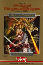
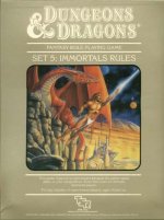
For the Golden Anniversary, something inspired by the Immortals box set and the the SSI CRPGs.

Immortal.jpg Pool.jpg


CrashFiend82

Explorer
I just hope they are better looking than the 3.5 core books. Even at the time they made me yawn with boredom. They felt like highschool textbook covers in a depressed fantasy world. Make these covers bold with eye grabbing art. If it was on an aisle cap at Target, they should make me stop and wonder, what is this D&D thing, anything less is a disappointing.
 

Alby87

Adventurer
Make a "componibile" cover, with the PHB showing heroes charging against a fire breath of an unseen dragon, the DMG showing this dragon breathing with a powerful enemy under him pointing the heroes (Acererak? Szass Tam? A beholder?), and the MM completing the composition with an horde of "minions" like goblin, orcs and/or undead (maybe mounted) rallying against the heroes. Red sky of thunderstorm mandatory.

They would work as a cover showing what the book is for, putting together side by side would create a terrific image, and putting on display on a bookshop the three books toghter would be a great advertising. Poster would be fantastic also!
 

Whizbang Dustyboots

Gnometown Hero
Make a "componibile" cover, with the PHB showing heroes charging against a fire breath of an unseen dragon, the DMG showing this dragon breathing with a powerful enemy under him pointing the heroes (Acererak? Szass Tam? A beholder?), and the MM completing the composition with an horde of "minions" like goblin, orcs and/or undead (maybe mounted) rallying against the heroes. Red sky of thunderstorm mandatory.

They would work as a cover showing what the book is for, putting together side by side would create a terrific image, and putting on display on a bookshop the three books toghter would be a great advertising. Poster would be fantastic also!
A nice callback to the Erol Otus covers of the Basic and Expert boxes, too.
 

Remove ads

Top