• The VOIDRUNNER'S CODEX is LIVE! Explore new worlds, fight oppressive empires, fend off fearsome aliens, and wield deadly psionics with this comprehensive boxed set expansion for 5E and A5E!

Smuggled photos

The_Fan

First Post
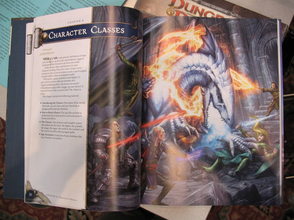
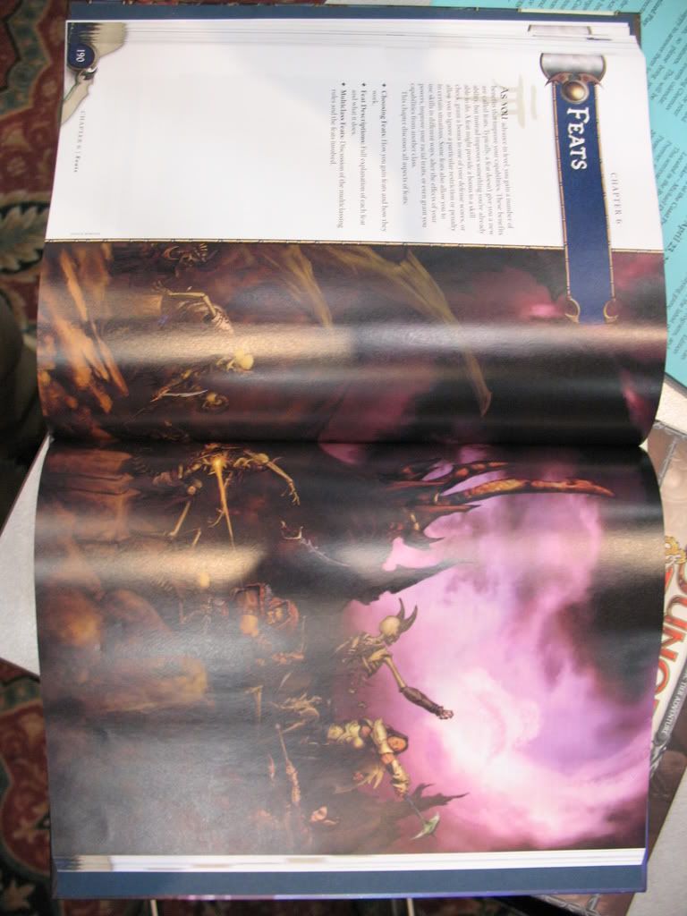
Don't know if this is old news or not, but it's news to me: someone managed to sneak three photos of the PHB at the GAMA trade show.

[SBLOCK]
IMG_1243.jpg


IMG_1244.jpg


IMG_1245.jpg

[/SBLOCK]
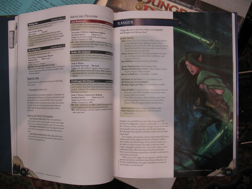
I find the middle one the most interesting. It shows just how short a Paragon Path is. No wonder they were able to fit 30+ into the PHB! Also, almost full stats for the ranger.

Also, shiny! Colors! Ooooh...(ferret shock)
 
Last edited:

log in or register to remove this ad

Jack99

Adventurer
These pics are in the GAMA thread, but thanks for posting them :)

I have go to say, I love the art of 4e so far. But maybe it is just the shiny and new factor.


neceros

Adventurer
Elsenrail said:
Personally I don't find the art partcicularly good. The battle with the dragon looks very unreal.
Depending on your meaning of unreal, I would have to disagree. The art is fantastic. It is vibrant, suits to this game very well, and is exciting.

I hated 3.5 artwork where everyone wore brown and grey and looked like normal folk. I don't play D&D to be reminded of the world's uninspiring bland. I want to be reminded that freaking Dragons exist here and can be slain with spells of fire and glowing swords. :):):):) yes. PArdon my language; I got excited.
 

WhatGravitas

Explorer
Elsenrail said:
Personally I don't find the art partcicularly good. The battle with the dragon looks very unreal.
The two red laser beams/blaster bolts are a bit irritating. And too much glowing weapons. But I've seen worse art.

Cheers, LT.
 

Brudewollen

First Post
There seems to be a whole lot of white space on the text areas of the page. I hope they didn't do too much of that - adds unnecessary bulk to the books, only driving up the cost. Something about the style reminds me a bit of the original 2nd Edition books, though it's not nearly as bad. I've just always liked it when the books looked more arcane and not overly concerned with looking clean. 3rd Ed. found the right balance between this and being easy to scan for information, IMO.

1st Ed. certainly looked chock-full of information, but it was also sometimes hard to scan. 2nd lost any sense of visceral enjoyment of looking at the page, but it was easier to find stuff. The books were ugly as sin, though. The later 'red' 2nd Ed. stuff struck a better balance on this account (actually maybe even better than 3rd). I still think those books looked great.

The artwork isn't to my tastes at all. I far preferred the red 2nd and 3rd Ed. style the best. This is kind of anime, which is fine for anime or an anime-based game, but just doesn't appeal to me for D&D. I like my D&D games dark and grim - but I guess you can't appeal to everyone all of the time.
 

Midnight Dawns

First Post
Brudewollen said:
. This is kind of anime, which is fine for anime or an anime-based game, but just doesn't appeal to me for D&D. I like my D&D games dark and grim - but I guess you can't appeal to everyone all of the time.
I can kind of see the second pic being considered anime, and maybe the first to a much lesser extent but how does the third pic not fit what you described? It seems to be both classical fantasy inspired and has a dark tone.
 

Voidrunner's Codex

Remove ads

Top