• The VOIDRUNNER'S CODEX is coming! Explore new worlds, fight oppressive empires, fend off fearsome aliens, and wield deadly psionics with this comprehensive boxed set expansion for 5E and A5E!

A Magical Society: Ecology and Culture available now

jgbrowning said:
I'm not quite sure how to respond. I know there are typos (we've tried our best to prevent them) and I know that some people won't like our writing style. I also know that such errors put off some people to greater or lesser degree, but the majority of individuals I've interacted with have been pleased overall with our work.

My only negative comments are on the covers, not between them. So one way to look at it is that out of the 40-odd pages I've seen, I wasn't thrilled with 2 of them. And I probably won't ever read them again since covers are for protecting the content.

I like the writing style used in the sample chapter. It's a point of view and presentation style I never would have taken, but it works. I'll wait 'til I can lay my hands on a hardcopy via FLGS, but I'm certain I'll buy it, though it may be as a gift instead of for myself.

As far as typos, they happen. Yours aren't even so much typos as creative license with the language. It's not riddled with "Page XX" references like the early WW books. IIRC, VtM 1st had on a "Page XX" every ten pages or so and that's a *glaring* error. With the PDF publishing side you (rather we, the consumers) have an advantage since you can release corrected versions without massive effort or cost.

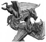
To be more particular about these comments, I think the cover art is some of the best cover art seen in a long time and it is tied into the theme of the book to a greater extent than many other covers. I'm not sure how it is misleading considering the back of the book as well as the first pages of text explain what is illustrated.

True, but to me the cover art is to get me to pick it up; basically, an advertisement. Yours is consistent with the theme of the book, but it wouldn't inspire me to pick it up to discover that. I wouldn't expect it to be a book of rules and mechanics.

You'll never get art that everyone likes, just won't happen. Take my opinion with a grain of salt and be happy that you'll still get my money. And I don't often complain about art; I generally buy rule supplements for the rules, not the pretty colorful bits. (Darned engineer's aesthetics of function over form)

But how often do I have the publisher's ear? Err, eye.
 

log in or register to remove this ad

allenw

Explorer
kigmatzomat said:
True, but to me the cover art is to get me to pick it up; basically, an advertisement. Yours is consistent with the theme of the book, but it wouldn't inspire me to pick it up to discover that. I wouldn't expect it to be a book of rules and mechanics.
I agree: In the absence of other information, the cover art (and the title) of a book gets you to pick it up, and the back cover blurb gets you to look inside. Unfortunately, in this case, the back cover would get me to put it back down very quickly. :(
 
Last edited:

Wrath of the Swarm

Banned
Banned
I must concur. Mistakes will happen, and discarding a book because of a few minor errors is neither reasonable nor proper, but these mistakes go beyond accident and into sloppiness. Expeditious Retreat Press should be ashamed. Unlike matters of art or design, there are objective rules for determining when the use of language is correct - so while the appearance of the book isn't a guide to its quality, its blurbs are.

ERP is going to end up impairing its sales if it keeps this up. If it wasn't for its hard-earned reputation for quality content, it would be hurting now, and it won't be able to coast on that reputation forever.

Friendly warning: shape up, or you'll eventually be shipped out.
 

Wrath of the Swarm said:
I must concur. Mistakes will happen, and discarding a book because of a few minor errors is neither reasonable nor proper, but these mistakes go beyond accident and into sloppiness. Expeditious Retreat Press should be ashamed. Unlike matters of art or design, there are objective rules for determining when the use of language is correct - so while the appearance of the book isn't a guide to its quality, its blurbs are.

Ouch. Harsh, much?

XRP intentionally did things in a non-standard fashion, starting with the god's eye vantage point and ending with the cover art and blurb verbage. Some of it works, some doesn't.

The main thing I've complained about was a design decision, intentional or not. Two typos are not the end of the world and the art isn't *bad* I just don't *like* it.

I'll tell them what I like, what I don't and why so they can make more informed decisions in the future, but I'm not going to dump on them.

And as far as the rules of language go, they get ignored all the time in creative works. The Jabberwocky is a classic example of creativity beating the crap out of the rules of language.


allenw

Explorer
And Clemens' use of backwoods vernacular worked because he was writing in the first person, in (or near to) the idiom people like his narrators (e.g., Huck Finn) actually spoke.

I don't think the art is bad, either. I don't even dislike it. The back-cover blurb, however, is bad writing, and I'm not just talking about the typos. I say this with reluctance, knowing that it's quite possible that the original poster is friends with, or might even be, the author of the blurb; however, from a business standpoint, he needs to be informed of this problem.
 
Last edited:

Frilf

Explorer
Well my hat is off to John and Suzi for producing such a great book! The sheer depth of the material is amazing and very useful to those of us who are into the world-building thing. In fact, we're taking many of the factors mentioned in the book and applying them to our upcoming Evernor gazetteers. Simply wonderful stuff. Every GM out there should own a copy of this thing!

Now, the cover and interior art lack a lot to be desired and there are some miscellaneous errors, but sheesh, people! The content is where it's at! I've read a great deal of the book already and it simply is the best resource on RPG world building out there. Nuff said.

Keep up the fantastic work, XP! I'm a fan! :)

Cheers!
 

Cergorach

The Laughing One
I just bought and downloaded a copy, and i must say i'm impressed! I don't actually have had time to read through it yet, just browse through it.

The on screen version just looks amazing! Much better than the last book, i really hope that this layout and background will be in the printed book. The art is great, it gives a feeling of a notebook, the two dragons fighting where great! That this book would look great took me completely by suprise (no offense, but the other one was a bit dry on the eyes ;-)

The godly notebook approach is very cute, it gives a fantasy feelling to an otherwise pretty straigthforward textbook.

This one, like the previous release, can be found on the net or through some research at the library. 80% of the real world information presented i already know (i did my research at school ;-), but this line of books puts all of the information together and weaves it into a whole in a very pleasant way, just as i found Magical Society a pleasant read, i'll find this a pleasant read.

Btw, who are you using as a distributor for the printed version? Hopefully one of the bigger companies (osseum would be nice)...
 

Cergorach said:
I just bought and downloaded a copy, and i must say i'm impressed! I don't actually have had time to read through it yet, just browse through it.

The on screen version just looks amazing! Much better than the last book, i really hope that this layout and background will be in the printed book. The art is great, it gives a feeling of a notebook, the two dragons fighting where great! That this book would look great took me completely by suprise (no offense, but the other one was a bit dry on the eyes ;-)

Thanks, we've made quite an effort to raise the production quality and visual appeal. Again, I have to thank Ravindra Rana for his efforts. I also think that having a single artist throughout the book makes it thematically singular to go with the writing.

The godly notebook approach is very cute, it gives a fantasy feelling to an otherwise pretty straigthforward textbook.

The book didn't click until we thought of this. It tied everything nicely together.

This one, like the previous release, can be found on the net or through some research at the library. 80% of the real world information presented i already know (i did my research at school ;-), but this line of books puts all of the information together and weaves it into a whole in a very pleasant way, just as i found Magical Society a pleasant read, i'll find this a pleasant read.

Btw, who are you using as a distributor for the printed version? Hopefully one of the bigger companies (osseum would be nice)...

We're consolidated under Impressions Marketing and Advertising. They sell to all the major distributors worldwide, so A Magical Society: Ecology and Culture should have a wider shelf presence than MMS:WE, which was released six months before it was picked up for distribution.

And since you liked the picture so much... :)

joe b.
 

Attachments

  • red_vs_blue web.jpg
    red_vs_blue web.jpg
    100.7 KB · Views: 55
Last edited:

Remove ads

Top