Have a character sheet.

Rune

Once A Fool
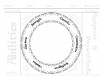
This sheet was designed for the Next playtest, but should be no less useful for any edition. It features:

  • A distinctly visual design.

  • A generously-sized character portrait/description area, framed by the rest of the character information.

  • Two rings of check-boxes (triangles) that can be used to keep track of ammunition, consumables, hit points, or whatever you wish. 440 in total, divided into groups of 5 and 10 for easy counting.

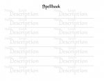
  • One page for most characters, with a second page devoted to a spellbook.

  • Grayscale for easy printing.


Here's an image of the first page:
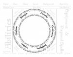
Charsheetcircle.jpg

...And here's the second page:

Charsheetcircle2.jpg


Hope y'all enjoy! Feedback is welcome; I'd be happy to customize this (within my ability, that is).

Update! I've polished up and updated the first page for use with the current playtest packet with minor adjustments. Version two can be found in this post.

Update Again! I've reworked page two to fit in nearly twice as many spells. This version can be found in this post.
 

Attachments

  • Circular Character Sheet.pdf
    44.7 KB · Views: 517
Last edited:

log in or register to remove this ad

Rune

Once A Fool
Just a quick note about functionality, specifically regarding the text used for the majority of the sheet: In order to conserve space (and because I liked the visual effect), I used a light shade of gray that can be written over in pencil (or pen, if preferred), without hindering the visibility of that writing.
 

Libramarian

Adventurer
Just a quick note about functionality, specifically regarding the text used for the majority of the sheet: In order to conserve space (and because I liked the visual effect), I used a light shade of gray that can be written over in pencil (or pen, if preferred), without hindering the visibility of that writing.

I noticed that and thought it was a nice idea.
 

Rune

Once A Fool
I noticed that and thought it was a nice idea.

Thanks!

Because I really wanted such a significant portion of the character sheet to be taken up by an area for the portrait (and/or description, as fits the player's style), I was confronted with a challenge: how best to fit as much relevant information in as condensed a space as possible. While still having a character sheet that was functional and looked good, of course.

It took a couple of nights sleeping on it to come up with this solution.
 

Rune

Once A Fool
Images of the character sheets have been added to the first post, in case folk would like to see them before downloading.
 

Rune

Once A Fool
By the way, I've found that adjusting the contrast in your print properties may be necessary to adjust the darkness of the gray text. Lighter text is better for seeing what you write over it and darker text is easier to read.

For lighter gray text, increase the contrast and for darker gray text, decrease it.
 

Rune

Once A Fool
Here's a slightly cleaned up (and updated for the current playtest packet) version of the first page:

CharsheetcircleV2page1.jpg

Enjoy!
 

Attachments

  • CharsheetcircleV2.pdf
    44.7 KB · Views: 234

darjr

I crit!
This is really neat!

I LOVE the idea that section labels are light grey and are meant to be written upon. That is a wonderful invention. More sheets should adopt this. [MENTION=1]Morrus[/MENTION]; [MENTION=67]Rune[/MENTION]; is this OK for the download section of ENWorld?
 

n00bdragon

First Post
The giant circle in the center of the page is a waste of space and it's awkward to read your stats at that bizarre angle. It's also unclear whether you write the stat before the word or after the word. Space for ability bonuses is nowhere to be found. Spellbook page is either too spaced out to neatly contain a list of all your spells (so many pages just to hold a level 1 clerics spells, etc) or too small to write down what every spell does in detail (which no one will do).

Mostly just that giant circle. It's visually clever, sure. But when you're playing the game you don't want to be staring at your sheet marveling at how pretty it is. You want to quickly find the number you need. There isn't much to recommend this sheet over a sheet of notebook paper. Sorry.
 

Rune

Once A Fool
This is really neat!

I LOVE the idea that section labels are light grey and are meant to be written upon. That is a wonderful invention. More sheets should adopt this. [MENTION=1]Morrus[/MENTION]; [MENTION=67]Rune[/MENTION]; is this OK for the download section of ENWorld?

Thanks! Yeah, I was looking for a way to condense space so the portrait area could be the focus.

As for the downloads section, works for me; I'll look into it afrter work.
 

Remove ads

Top