D&D 5E The 5E Art is Awesome

S

Sunseeker

Guest
Well, if you're not going to read what I said...

I would respond but: a mod has dropped by and reminded us that this thread is about the art.

I actually like the piece in question. The fact that it can stir discussion on morality, regardless of if we agree, is a good quality to have in a piece of art.
 

log in or register to remove this ad

Sacrosanct

Legend
That painting is from 2e. Here is what 2e says about green dragons:

Green dragons are bad tempered, mean, cruel, and rude. They hate goodness and good-aligned creatures. They love intrigue and seek to enslave other woodland creatures, killing those who cannot be controlled or intimidated.

Green dragons initiate fights with little or no provocation, picking on creatures of any size. However, if the target appears weak, the dragon will make its presence known quickly for it enjoys evoking terror in its targets. When the dragon has tired of this game, it will bring down the creature using its physical attacks so the fight lasts longer and the creature's agony is prolonged.

Although green dragons have been known to eat practically anything,... they especially prize elves

Only two things are known. The above, and the fact that the dragon in the painting is big enough to kill people pretty easily. In fact, even an age 2 dragon like in the pic has a breath weapon of 4d6+2, AC 2, 9HD, and damage is 1d8+2/1d8+2/2d10+2. A creature like that would wreck havoc on any typical small town or village.

So for someone to come away with the assumption that the people in that painting are the true evil ones with no other context? Yeah, OK. You go on thinking that if you want. But don't dare accuse me of not having a moral compass for thinking otherwise.
 

If you do decide to run it, you can use Last Breath of Ashenport for 4e, it does not take much to modify it. That is pretty much a Call of Cthulhu adventure set against a Dagon cult. More hack and slash and less investigating, but it does capture the vibe well. I have used it in 5e.

There's also a (late) 3.5e version of it in Dungeon issue 152--which was a free download from WotC. I'm not sure if you can easily find it now.
 

Li Shenron

Legend
I still haven't got the books, so I haven't seen all the artwork. But between the previews and a trip to the FLGS to browse them on the shelves, overall I think 5e artwork is generally as good as 3e artwork, which means very good.

With the caveat however, that at the beginning I thought 5e had utterly awesome art, but then after flipping through the MM, I "demoted" my opinion to just very good. For some reason, I felt they did everything wonderfully in the MM except exactly for my favourite categories of monsters: giants, devils and demons, (all of which have some goodies and some truly awful ones) and even the dragons are not as good as the 3e ones (although still pretty good).

I haven't seen the DMG yet, but the PHB seemed to me very good with the artwork, except of course the commonly displeasing Halflings. Really, I have no idea what they were thinking when choosing their style for 5e... they even had them on preview in the WotC website's artwork blog, stating boldly that they were by no means the final choice, and AFAIK there was already an outrage in the comments to the preview. How did we still end up with that choice escapes me...
 

Melkor

Explorer
Other than the cover and the condition art (which I absolutely love), I felt that the art in the PHB was very disappointing. Particularly the halfling and tiefling art, but most of the rest of the book just left me totally uninspired. On a positive note, I think the art in subsequent books has improved.
 

halfling rogue

Explorer
I do chuckle to myself every time I see one of the worst offending pieces and can't shake the idea that they used This Guy as a reference.

I know exactly what you are talking about! When I turned the page I was all, "Wow what an awesome---Whatthe?!" The worst part about it is later on there is a picture of the back of an elf, with no face showing at all, but for some reason I can only picture that elf as the same one in the Whatthe?! pic
 

jayoungr

Legend
Supporter
Surely the question of whether the adventurers in the dragon-kill picture are heroes or murderhobos depends on the campaign? And different tables can have it different ways, and everybody can be happy with that? Or is that too naive of me? :D
 

halfling rogue

Explorer
I only have the PHB and I was a tad underwhelmed. I do like the over all vibe of the art, but some of them just don't work for me. Lots of pictures look great but then maybe something will be just a bit off, mostly faces. For example, I'm thinking the elf with the bird referenced above (sorry no page numbers working off memory) and the Ranger chick in green (I think in the backgrounds section?)

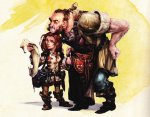
The halflings, when they are bad (and unfortunately the prominent ones), they're hella bad. But others are actually pretty great and I think they'd be wise in the future to pattern halflings similar to this (sorry it's so huge...):

5E-Halfling-C.jpg

My one tentative complaint would be that, while I respect the motive and vision of inclusiveness or diversity as a theme, and while I think they achieved it quite well in many respects with their art, I do feel like they overdid it a bit. Let me be clear before everyone stones me, I think it's cool what they did and love most of the art individually, but it really does feel like nearly every page had some sort of normal fantasy archetype with a twist geared solely for the purpose of being diverse. What I'm trying to say is that you can tell that they were trying too hard. This isn't a complaint about diversity (at all...hooray for diversity!), but a complaint about the impression I got. I flip through the PHB and what I hear from the art is "Look how inclusive we are!" rather than "Look how awesome this is!" Take each 'diverse' pic individually, and yeah, you get "This is awesome" but the over all feel of the PHB to me comes off more like propaganda then it does about a fantasy game. For instance, I think the female samurai picture is awesome, but I can't shake the feeling that it was included, not because it was an awesome picture in its own right, but because it was part of their plan to sell to us that they are being as diverse as possible. The picture comes off as a tool rather than a treat, like an AARP commercial playing a Beatles song.
 

jayoungr

Legend
Supporter
For instance, I think the female samurai picture is awesome, but I can't shake the feeling that it was included, not because it was an awesome picture in its own right, but because it was part of their plan to sell to us that they are being as diverse as possible.
Different strokes; that female samurai is one of my favorite pictures. I found it to be awesome and I immediately started thinking it would be cool to have a character like that! (All just to say that response to art is subjective, I guess...which is hardly news, but bears saying anyway. :) )

Also, re the picture you posted above, ISTR some debate about whether that was a halfling or a gnome...
 

redrick

First Post
The halflings, when they are bad (and unfortunately the prominent ones), they're hella bad. But others are actually pretty great and I think they'd be wise in the future to pattern halflings similar to this (sorry it's so huge...):

I don't remember that one, but, yes, that works quite nicely.

My one tentative complaint would be that, while I respect the motive and vision of inclusiveness or diversity as a theme, and while I think they achieved it quite well in many respects with their art, I do feel like they overdid it a bit. Let me be clear before everyone stones me, I think it's cool what they did and love most of the art individually, but it really does feel like nearly every page had some sort of normal fantasy archetype with a twist geared solely for the purpose of being diverse. What I'm trying to say is that you can tell that they were trying too hard. This isn't a complaint about diversity (at all...hooray for diversity!), but a complaint about the impression I got. I flip through the PHB and what I hear from the art is "Look how inclusive we are!" rather than "Look how awesome this is!" Take each 'diverse' pic individually, and yeah, you get "This is awesome" but the over all feel of the PHB to me comes off more like propaganda then it does about a fantasy game. For instance, I think the female samurai picture is awesome, but I can't shake the feeling that it was included, not because it was an awesome picture in its own right, but because it was part of their plan to sell to us that they are being as diverse as possible. The picture comes off as a tool rather than a treat, like an AARP commercial playing a Beatles song.

I think this is just the nature of the beast. Being diverse is, by nature, a little over the top, when your predecessors were so incredibly racially homogenous. For it to work, there is a bit of a need to "try too hard," because you're compensating for quite some time of really not trying at all. Or, possibly, in some cases, worse. Just remember — it doesn't matter if they selected the samurai picture in part because they were excited about the fact that she was a woman samurai. It's a great picture.
 

Remove ads

Top