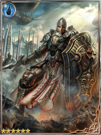
The good ole days. Classic.I love the 5e art. Although I do kind of miss the 1e art like this:
View attachment 63820
or this:
View attachment 63821
You are using an out of date browser. It may not display this or other websites correctly.
You should upgrade or use an alternative browser.
You should upgrade or use an alternative browser.
D&D 5E (2014) Good art and Really bad art in the 5e PHB
- Thread starter sgtscott658
- Start date
I'm not crazy about the art to be honest. Who ever drew those halflings need to be fired and their brushes taken away from them. There are way better artists out there who could have done a better job. Not sure why they went with this group to be honest.
Here's a good paladin.


I am a big fan of the art as a whole. I'm a fan of the fact that a major RPG company has deliberately created inclusive art; I enjoy the slightly more "real" take on the art, a style I've always preferred.
I'd agree that I enjoy a bit of whimsy, too - but there's that in there also. Just look at things like Conditions and the like.
Visually, my favourite D&D version yet.
I'd agree that I enjoy a bit of whimsy, too - but there's that in there also. Just look at things like Conditions and the like.
Visually, my favourite D&D version yet.
ambroseji
Explorer
I'm a big fan of the PHB art too, and I was very excited about how much space was dedicated to it.
The conditions in the back are excellent and whimsical, and I think the half-orc paladin is very cool. It's one of my favorite pieces from the book. Fierce, strong, and defiant. I have no problem with atypical class/race combos are used in the art, especially if the art has the potential to inspire an interesting character, which I feel it does.
Also, I know that the halfling look is was a choice explicitly made by the art team. I thought it was a bit wonky when I first saw it, but it's grown on me.
Oryan77
Adventurer
That's crazy that you said this. I was going to post the exact same thing. Hell, I was thinking about starting this thread yesterday and was going to write just that, but I know how it is talking about art in D&D. Most of you guys claim to prefer the art from OD&D that looks like it was drawn by a child using his left hand when he's right-handed. Then I hear people complain about the Tony D art or WAR's art. Both of which I find to be fantastic and inspiring. So I didn't even want to go there with a thread like this.There is a general softness to most of the colour choices (whether these were filtered for the book or artist choice I don't know) with the sense of children's book...if not in content.
But since I didn't start the thread....

The 5e art really is uninspiring to me. The art is exactly like what you find in a lot of children's book. It's bland and the portraits don't look "heroic". I'm sure the heroic part is ok with others that don't need a character to look "macho". It may indeed look heroic to you. But, I'm sure a lot of guys still picture their ranger looking like Errol Flynn's Robin Hood with tights and all. I'm also sure that some of you secretively want to see mullets and eraser hair on your portraits because those never go out of style.
The art would be perfectly fine if the book was released in the 80's. It's 2014 though. Look at the stuff professionals are pumping out these days. Everyone is an artist, and people are really good at it. I'm blown away by the amount of detail people put into their work. It just seems strange that this is the style of art WotC went with when it will be sitting on the same shelves with books that actually have modern day looking art styles in them. It's one thing for a grognard to be satisfied with that art, but I find it hard to believe that youngsters are going to flip through that book and think, "Wow, what is this book!?! I wanna pretend to be a housewife Tiefling or a Barbarian disguised as a commoner! That sounds like fun!"
Don't get me wrong. There is a lot of nice art in the book. But most of it still has that same washed out and simple look to it. I remember my wife looking at the 3.5 Barbarian picture in the PHB and wanting to play a barbarian just because of that image (ignoring the ridiculously over-sized anime sword). Tons of 3e/4e art inspired me & my friends to want to play certain type of characters. I guarantee none of us will feel the same way with this 5e style art.
Even going back and imitating the style of Larry Elmore with updated hairstyles would have been a step forward. The art seems to be the worst thing to come from 5e in my opinion. No offense intended to people that like it. It's not bad, it just doesn't feel like it should be 5e art. It's just hugely disappointing to me.
sgtscott658
First Post
Oryan77 I do agree with many of your points, The Gnome art in 5E is awesome as is the Druid art on page 67 where as the Druid on page 64 looks like a Twilight wannabe, Anyway, the art for the Druid for the most part really inspires me to want to play a Gnome Druid. Unfortunately being the DM it aint gonna happen : (
The Dwarf Cleric art also looks fantastic on page 56 and is another example (to me) of wanting to try a Dwarf Cleric. Sadly and I understand some think the art here is a 100% awesome, that is their opinion but almost all the art for the races (except the Gnome) looked very uninspiring to me.
Scott
The Dwarf Cleric art also looks fantastic on page 56 and is another example (to me) of wanting to try a Dwarf Cleric. Sadly and I understand some think the art here is a 100% awesome, that is their opinion but almost all the art for the races (except the Gnome) looked very uninspiring to me.
Scott
Olaf the Stout
Legend
It weighs in at about 60 less pages than 3.5E and has a lot more art, so significantly less rules. More correctly it spends significantly less time on the rules that it has, as overall it covers pretty much the same ground as previous editions do. There are numerous sites with many hugely talented artists showing galleries of their work. The value of having a lot of art in the book is exactly zero. I'm paying for rules.
I'm normally a function over form guy but, for me, I definitely find value in the PHB artwork. In particular I liked that there were several full page art pieces. From memory there wasn't much of that at all in the 3.5E PHB (I didn't buy the 4E PHB, so I don't know what that was like). It definitely helped me make reading the PHB more immersive, which was actually a surprise for me.
Olaf the Stout
Legend
The Halfling art is definitely a let down for me. The Halfling Bard on page 26 of the PHB looks like he decreases in scale as you go down his body. The size of his head compared to his hands and then his feet is just silly. I'm definitely no artist, but it just doesn't look anatomically correct.
Similar Threads
- Replies
- 30
- Views
- 2K
D&D 5E (2024)
Hellfire Club Starter Set
- Replies
- 34
- Views
- 3K
D&D 5E (2024)
2024 PHB/DMG/MM art/layout: like or dislike?
- Replies
- 88
- Views
- 14K
- Replies
- 51
- Views
- 10K
- Replies
- 29
- Views
- 2K
