Character Sheet Feedback

Jeff Carlsen

Adventurer
You would consent that I share the results of your work on some French forums? I will make sure you give all copyright credits. I also mention that your character sheet is still under construction or still looking for improvements (although I find superbly successful for the moment).Also, I will publish all future new versions that you kindly share with us in the future.

When I'm finished, I will release the working documents for you to translate and do with as you wish.
 

log in or register to remove this ad


Jeff Carlsen

Adventurer
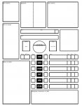
After far too many hours, the 1.0 release of my sheet is complete. Thank you all for your feedback. It was invaluable.

I have only made the main page and the spellcasting pages fillable for now (though that alone increased the file size by an order of magnitude). I'll get to the other two pages eventually, but I needed a break.

D&D 5E Character Sheet 1.0 (Static).pdf (185 KB)

D&D 5E Character Sheet 1.0 (Paritally Fillable).pdf (1,674 KB)

As promised, I'm also providing the InDesign document. Feel free to do with it as you will.

Dungeons and Dragons 5E character sheet.indd
 

Zaruthustran

The tingling means it’s working!
Thanks for working on this. The community needs a good character sheet.

What I appreciate the most is the openness of your design. The lines (instead of boxes) give it an airy, unconstrained feel. While the big horizontal divisions give a comforting sense of order. I also like how spellcasting is a supplemental page. Doing that removes a source of inadequacy for noncasters / avoids wasting space on a noncaster's sheet. And, it's clever how you put "other features" in the class & race section, and let the player figure out what goes where. Same for the generic "limited use features" section.

I know you're on 1.0, so take the following suggestions a wishlist for a 2.0, since they involve a pretty significant re-org.

My first suggestion is to figure out how to get class features and limited use abilities onto the front page, with ability scores, skills, hp, ac, and attacks. The idea being to get everything you'd need to reference in a combat onto the same page. The front page is already pleasantly full, so I'd move the soft details (weight, hair color, ideals, flaws, etc--all the stuff except name, race, class from the top section) onto the second page. Place them along other soft details like weight, coinage, lifestyle, treasure, and equipment.

The second suggestion is more design conceptual: one of the things I like about the "official" contest-winning sheet was that big central element. I like that idea, but think that the thing they put dead center--"level"--is probably one of the least-important bits of information. Instead, I'd love to see Hit Points in the dead center--that's my primary concern as a player. That, and core identity info like name, race, and class, should be dead center. If you're doing a design with a strong enter element, of course.

I've attached a jpg of mockup of such which I built in Excel. Zaruthustran Character Sheet v4 Souvenir - NonCaster.jpg

All in all though: thanks for doing this, and keep up the good work!
 

Jeff Carlsen

Adventurer
Thanks for working on this. The community needs a good character sheet.

What I appreciate the most is the openness of your design. The lines (instead of boxes) give it an airy, unconstrained feel. While the big horizontal divisions give a comforting sense of order. I also like how spellcasting is a supplemental page. Doing that removes a source of inadequacy for noncasters / avoids wasting space on a noncaster's sheet. And, it's clever how you put "other features" in the class & race section, and let the player figure out what goes where. Same for the generic "limited use features" section.

I know you're on 1.0, so take the following suggestions a wishlist for a 2.0, since they involve a pretty significant re-org.

My first suggestion is to figure out how to get class features and limited use abilities onto the front page, with ability scores, skills, hp, ac, and attacks. The idea being to get everything you'd need to reference in a combat onto the same page. The front page is already pleasantly full, so I'd move the soft details (weight, hair color, ideals, flaws, etc--all the stuff except name, race, class from the top section) onto the second page. Place them along other soft details like weight, coinage, lifestyle, treasure, and equipment.

The second suggestion is more design conceptual: one of the things I like about the "official" contest-winning sheet was that big central element. I like that idea, but think that the thing they put dead center--"level"--is probably one of the least-important bits of information. Instead, I'd love to see Hit Points in the dead center--that's my primary concern as a player. That, and core identity info like name, race, and class, should be dead center. If you're doing a design with a strong enter element, of course.

I've attached a jpg of mockup of such which I built in Excel. View attachment 59110

All in all though: thanks for doing this, and keep up the good work!

When designing a sheet, I always have certain goals and priorities. In this case, I wanted the sheet to make the game easier to learn. Simply looking at the sheet should give a sense as to the games parts, how they work, and their importance. It also had to evoke a sense of character, because a character sheet is the one source of truth for any PC, and looking at it should tell you who they are.

Making sure that the most used stuff was on the front is simply a lower priority. Though I did give it some credence, as otherwise I might have put class and race features on the front, and combat information on the back with equipment (since there's a lot of crossover there).

As for the contest winner. That was a sheet with different goals. What I like isn't simply that it has a strong central element, but that it has a radial structure. If I were to do such a sheet, I'd use that to tap into the player's spacial memory. Instead of quadrants, I'd break it into sextants, and would also go with a landscape design.

But, I'm not planning on taking up such an endeavor in the near future.


Baksartha

First Post
Hi,

I like your sheet, especially the auto-calc feature. I noticed that 'Abilities' is spelled wrong in the 'Abilities and Proficiencies' section, however (it says 'Abilitys'). My only other criticism is that in that same section it would be nice to have maybe three broad columns instead of the Additional Modifiers column. I have a druid with lots of individual weapon and armor proficiencies (as opposed to just simple weapons, for example), and they take up much of the space provided. Also, on the spell sheet, when I type in my number of 1st level spells per day, it puts that same exact number under 2nd level spells.
 

Jeff Carlsen

Adventurer
Hi,

I like your sheet, especially the auto-calc feature. I noticed that 'Abilities' is spelled wrong in the 'Abilities and Proficiencies' section, however (it says 'Abilitys'). My only other criticism is that in that same section it would be nice to have maybe three broad columns instead of the Additional Modifiers column. I have a druid with lots of individual weapon and armor proficiencies (as opposed to just simple weapons, for example), and they take up much of the space provided. Also, on the spell sheet, when I type in my number of 1st level spells per day, it puts that same exact number under 2nd level spells.

I can at least address the misspelling and the spells per day problem. Those are simple fixes.

I'll think on your second point, but I don't suspect I'll make the change.


Remove ads

Top