WotC's Irwin, Tanji, and Crawford on Tales from the Yawning Portal's Art Direction

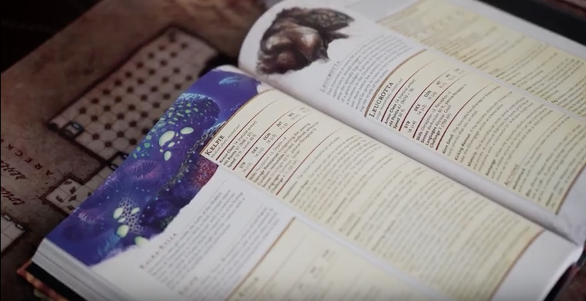
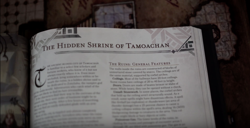
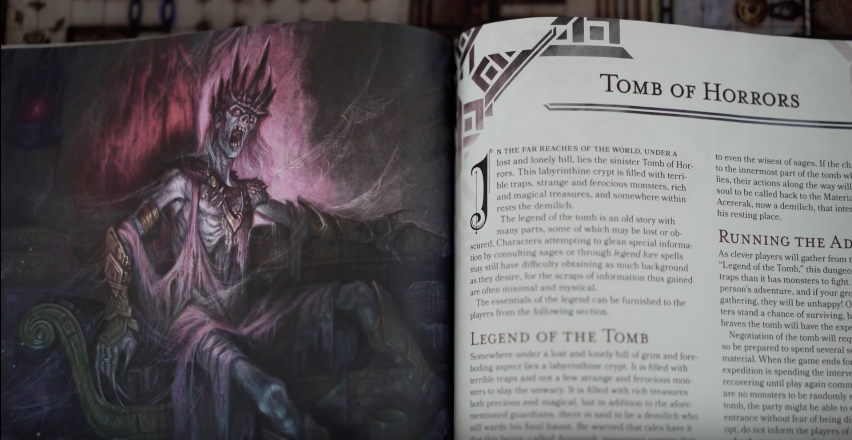
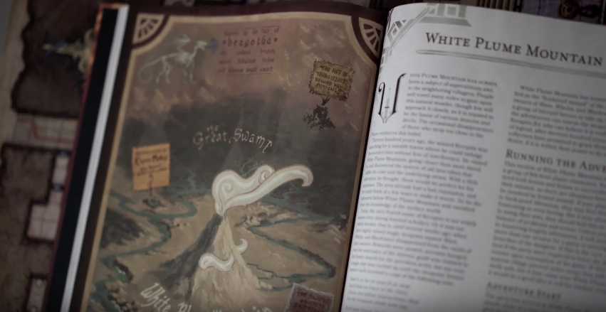
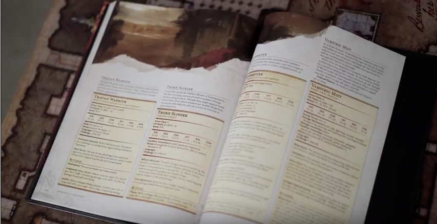
The YouTube channel Dungeon Life has posted a video featuring WotC's Kate Irwin (senior art director), Emi Tanji (senior graphic designer), and Jeremy Crawford (managing editor). It talks about designing Tales from the Yawning Portal. One of the themes discussed it how the adventures in the book were kept the same at the core, updating the stats and wording to make them feel like 5th Edition - "What would you do if you redesigned the adventures to be more like a modern D&D design? And the answer is, we didn't. What we did is we took Tomb of Horrors, and it's still Tomb of Horrors that Gary Gygax wrote..." Tales from the Yawning Portal hits preferred game stores tomorrow (ask your local store!) and everywhere else 11 days later.

The YouTube channel Dungeon Life has posted a video featuring WotC's Kate Irwin (senior art director), Emi Tanji (senior graphic designer), and Jeremy Crawford (managing editor). It talks about designing Tales from the Yawning Portal. One of the themes discussed it how the adventures in the book were kept the same at the core, updating the stats and wording to make them feel like 5th Edition - "What would you do if you redesigned the adventures to be more like a modern D&D design? And the answer is, we didn't. What we did is we took Tomb of Horrors, and it's still Tomb of Horrors that Gary Gygax wrote..." Tales from the Yawning Portal hits preferred game stores tomorrow (ask your local store!) and everywhere else 11 days later.

[video=youtube;6-rif5ag9bY]https://www.youtube.com/watch?v=6-rif5ag9bY[/video]
Screen Shot 2017-03-23 at 17.11.47.png


Screen Shot 2017-03-23 at 17.11.56.png


Screen Shot 2017-03-23 at 17.13.48.png


Screen Shot 2017-03-23 at 17.14.01.png


Screen Shot 2017-03-23 at 17.14.15.png


Screen Shot 2017-03-23 at 17.15.31.png


Screen Shot 2017-03-23 at 17.14.38.png

SaveSave
 

log in or register to remove this ad


log in or register to remove this ad


machineelf

Explorer
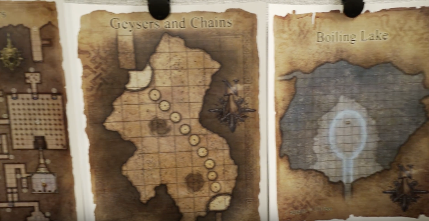
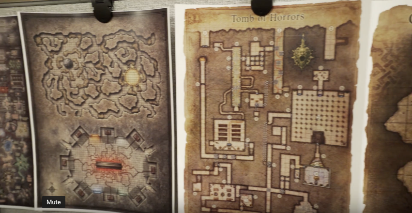
Bummer. I wonder why there's one in the video then.

Probably a special piece of enlarged art they were working with in the office. It looked to me like it was a special material, like a fabric map.

I'm not big on full-sized dungeon maps anyway, since the players aren't supposed to see the whole map at once. They seem almost useless, unless you are using digital tools to display it and hide the parts they haven't discovered, as well as hiding secret doors.


machineelf

Explorer
I for one am thrilled they didn't mess around too much with the original adventures, and just converted them to 5th edition.

It was a real letdown when I saw the 4th edition Undermountain book (Halls of Undermountain), where they cut out big and memorable chunks of the dungeon. I was hoping they wouldn't do that to these dungeons, and it looks like they haven't.


The Old Crow

Explorer
I don't care much for modern game maps. They are too saturated with color. Does WOTC put out plain black and white printer friendly maps too? I am very tempted to get Tales From The Yawning Portal, but I need maps that are easy to play the game with.
 

mykesfree

Adventurer
Likewise. 3 & 3.5 were good but after how ugly 4E was I assumed I'd dislike 5E even more. Was pleasantly shocked when I opened the PHB.

Funny a lot of the 5E books reused 4E art. For example on the second page of the 5E Bard Class, it uses artwork from a 4E book on the Fey Wild.
 

Remove ads

Remove ads

Top