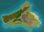
In respect to the game, the map is actually quite dispraportionate. I made it on DJ after looking at the DM's pencil sketch. For this one, just try to think of it as a "fantasy affected" map. The whole thing isn't even 60 miles wide and its terrain is that diverse....
I'll try to infuse more realism into my originals. Thanks for the tip.
")