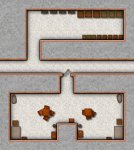
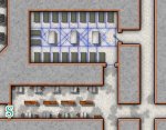
Maybe my expectation was off - Dungeon of the mad mage doesnt use the full maps for undermountain....

Inchoroi

Adventurer
The thing that pushed me away from buying the book last week was paging through it and seeing the maps they did provide.

Wth.

I'm 100% fine with the levels being incomplete; I'm a halfway decent DM and writer, and can homebrew the rest if necessary, stealing from things like Rappan Athuk if need be.

What I'm not okay with is the absolutely terrible maps in the book. If I'm paying $50 US for a book like this, from a multi-million dollar company, I expect at least decent color maps. This is like something from the days of bad 3.5 third-party stuff (of which I have my fair share).
 

log in or register to remove this ad

Parmandur

Book-Friend
Let's not be silly. It's a 300 page book which leaves out half of some of the levels. That doesn't equate to a multi-thousand page book.

The book covers 23 dungeon levels in some detail. My understanding is that previous products covered the upper levels in more extensive detail, with the lower levels left as names but otherwise blank slates.
 

the Jester

Legend
The thing that pushed me away from buying the book last week was paging through it and seeing the maps they did provide.

The full color pretty maps tend to be lacking in terms of readability and actual utility, IMHO. They are nice to look at but difficult to use; the numbering often blends in with the background colors. I'm actually quite happy that the maps in DotMM are so clear.
 

Satyrn

First Post
The book covers 23 dungeon levels in some detail. My understanding is that previous products covered the upper levels in more extensive detail, with the lower levels left as names but otherwise blank slates.

From what I've seen, the original boxed set provided about the same level of detail for first level as this new book does. The box set provided a massively larger map, sure, but all of that extra space was unkeyed rooms left for the DM to fill. The 5e book looks like it details roughly the same number of rooms, then had those hallways leading off for the DM to fill.

And the coolest bit about that, to me, is that the 5e map is just a piece of the original, so I could use the original map if I wanted, branch those hallways off into my own content (with Dyson's maps, or Turgenev's), or just dead end them. I love the way 5e handled that top level.
 

The book covers 23 dungeon levels in some detail. My understanding is that previous products covered the upper levels in more extensive detail, with the lower levels left as names but otherwise blank slates.

From what I've seen, the original boxed set provided about the same level of detail for first level as this new book does. The box set provided a massively larger map, sure, but all of that extra space was unkeyed rooms left for the DM to fill. The 5e book looks like it details roughly the same number of rooms, then had those hallways leading off for the DM to fill.

"Some detail" is right, again about 40 locations or so for the first 3 levels. The Lost Levels etc are smaller levels, but fully detailed the 3 levels defined there. Plus some of the 3E/4E books details a bit more of the first three levels and some of the later levels, include parts of the Pit. But in all a rough estimate is about 20% of the number of locations/rooms either shown in the poster maps or implied in the lower levels that are said to be the same size as the first three.

And the coolest bit about that, to me, is that the 5e map is just a piece of the original, so I could use the original map if I wanted, branch those hallways off into my own content (with Dyson's maps, or Turgenev's), or just dead end them. I love the way 5e handled that top level.

Not quite. I have only looked at detail on the first level, and it has taken locations from the poster map, but has cut out a lot of the rooms and halls in between them. For instance, the Dry Well and Hall of Many Pillars is as previously detailed. But the 'cross' room with the curved hallway north of it has a bunch of rooms such as the Water Shrine between it and the Dry Well that are not drawn in the new maps.

The full color pretty maps tend to be lacking in terms of readability and actual utility, IMHO. They are nice to look at but difficult to use; the numbering often blends in with the background colors. I'm actually quite happy that the maps in DotMM are so clear.

I agree that full-color maps are often done in a style that hinders readability. Not sure what you mean by utility though. But, a well drawn full color map doesn't have to hinder readability or utility, imo. I wonder what your impression of the style of the Ultimate Undermountain maps are. They were designed with clarity in mind, and are full color so very curious.
 

Satyrn

First Post
Not quite. I have only looked at detail on the first level, and it has taken locations from the poster map, but has cut out a lot of the rooms and halls in between them. For instance, the Dry Well and Hall of Many Pillars is as previously detailed. But the 'cross' room with the curved hallway north of it has a bunch of rooms such as the Water Shrine between it and the Dry Well that are not drawn in the new maps.
Aye. Looking at [MENTION=37579]Jester David[/MENTION]'s overlay I can see what you're talking about. That just makes it even more awesomely expansive if I wanted to use the original map, while still having a solid cohesive fleshed out dungeon level with the work done for me if I just use the book.
 

the Jester

Legend
I agree that full-color maps are often done in a style that hinders readability. Not sure what you mean by utility though. But, a well drawn full color map doesn't have to hinder readability or utility, imo. I wonder what your impression of the style of the Ultimate Undermountain maps are. They were designed with clarity in mind, and are full color so very curious.

By utility, I am referring to the ease of use in play. It's sometimes hard to see where doors, secret doors, etc are in some of the published color maps.

I haven't seen the Ultimate Undermountain maps to the best of my knowledge, so can't comment. I do prefer full color maps if they can be done without sacrificing the clarity that I want in my adventures. But, for instance, 4e adventures were full of poster sized maps that were moody and nice to look at, but terrible when it came to clarity and utility.
 

CapnZapp

Legend
Aye. Looking at [MENTION=37579]Jester David[/MENTION]'s overlay I can see what you're talking about.
Thank you for the overlay link.

The majority of customers will not have or even know about those old maps, and by looking at the overlay it seems the complaints are overblown.

To me it appears that most customers will not even consider it an issue. Yes there are a very small number of corridors that lead into the "expanded" map, but I can't imagine anyone being compelled to make these resemble in any way the old ones. It is equally easy to say these exits are all caved in, if you don't feel inclined to come up with extra content yourself.

This new product is simply that - a completely new product that doesn't feel incomplete at all. In fact, whatever my personal misgivings are, one thing that this product seems to do much better than the old is the feeling of being self-contained and complete. It is much easier to ignore any references to an even larger dungeon that what's already there, than in the old modules, which went out their way to feel inadequate.

I guess those exits are a nice and quick nod to the old content without in any way giving off the feeling the designer is overwhelmed with the possibilities.
 

By utility, I am referring to the ease of use in play. It's sometimes hard to see where doors, secret doors, etc are in some of the published color maps.

I haven't seen the Ultimate Undermountain maps to the best of my knowledge, so can't comment. I do prefer full color maps if they can be done without sacrificing the clarity that I want in my adventures. But, for instance, 4e adventures were full of poster sized maps that were moody and nice to look at, but terrible when it came to clarity and utility.

Ah, doors are, imo, the biggest challenge with realistic and/or color maps. The way I have chosen to deal with them is by showing them open. Opens doors are pretty recognizable. Here's an example;
Goblin Sargeant South.JPG

Secret doors, imo, are best handled with separate DM and player maps. Here's a DM map with a secret door. The player map has the "S" removed and just a thick wall there.
Infirmary-DM.jpg
 

Satyrn

First Post
Thank you for the overlay link.

The majority of customers will not have or even know about those old maps, and by looking at the overlay it seems the complaints are overblown.

To me it appears that most customers will not even consider it an issue. Yes there are a very small number of corridors that lead into the "expanded" map, but I can't imagine anyone being compelled to make these resemble in any way the old ones. It is equally easy to say these exits are all caved in, if you don't feel inclined to come up with extra content yourself.

This new product is simply that - a completely new product that doesn't feel incomplete at all. In fact, whatever my personal misgivings are, one thing that this product seems to do much better than the old is the feeling of being self-contained and complete. It is much easier to ignore any references to an even larger dungeon that what's already there, than in the old modules, which went out their way to feel inadequate.

I guess those exits are a nice and quick nod to the old content without in any way giving off the feeling the designer is overwhelmed with the possibilities.

Aye. That's much like I was saying.
 

Remove ads

AD6_gamerati_skyscraper

Remove ads

Recent & Upcoming Releases

Top