D&D General DALL·E 3 does amazing D&D art


log in or register to remove this ad

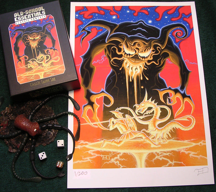
It looks like Erol Otus is still around, but I haven't seen art with his name on it since that early D&D stuff. Is there new work out there?

Looks like his life passed through some of the same places mine did, but a decade earlier.
 

It looks like Erol Otus is still around, but I haven't seen art with his name on it since that early D&D stuff. Is there new work out there?

Looks like his life passed through some of the same places mine did, but a decade earlier.
He’s still a working artist. You can find his art mostly in the OSR. DCC RPG recently did an alt cover from him for their core book. A dust cover for Dungeon Denizens. A DCC module or two. An alt cover for Old-School Essentials. One or more editions of Swords & Wizardry has an Otus cover. That’s all I remember off the top of my head but I know there’s more.

He also has a merch store.


1746355461580.png

May the 4th.

Prompt: A Jedi Knight is captured mid-fall from a flying car, plummeting through the neon-lit canyons of a sprawling sci-fi metropolis. His body twists dynamically in freefall, arms and legs outstretched, cloak billowing, as he locks eyes with the viewer — a mix of determination and urgency in his expression. Around him, towering futuristic skyscrapers stretch into the clouds, their surfaces aglow with holographic ads and pulsing lights. Streams of flying vehicles zip by in the distance, casting motion blur and reflections across the scene. Beside him, his lightsaber tumbles through the air, catching ambient light as it falls.

Missed the lightsabre, though.
 

Everybody is different!

Can you give a few examples of some images you can't understand why people would like them?

I am not the person you asked for, but I browsed through the PBH 2024 trying to seek an image that I find completely bland and uninspiring.

So while I find most of the PHB 2024 as reaching my expectation of looking pretty on the pages but adding little (I am generally not moved by D&D art like I am by major artists), I am perplexed with a few that I find actively detrimental: the illustrations on page 18, 21 or 31. I am finding bard image on page 58 silly looking (though it might be intended to spur a sane and completely rational hatred of bards, but then why illustration page 61, that one is nice?). The image p. 269 of the Entangle spell cast by a Druid is sad.

There are other that I don't like (the sorcerer page 138, for example) but I can see how it might appeal to others. I am not sure others are necessary (like the illustration of a lamp, or a net, page 227: I assume most readers would be able to imagine a fishing net, or a cat in the bestiary, without a visual cue).
 
Last edited:

I am not the person you asked for, but I browsed through the PBH 2024 trying to seek an image that I find completely bland and uninspiring.

So while I find most of the PHB 2024 as reaching my expectation of looking pretty on the pages but adding little (I am generally not moved by D&D art like I am by major artists), I am perplexed with a few that I find actively detrimental: the illustrations on page 18, 21 or 31. I am finding bard image on page 58 silly looking (though it might be intended to spur a sane and completely rational hatred of bards, but then why illustration page 61, that one is nice?). The image p. 269 of the Entangle spell cast by a Druid is sad.

There are other that I don't like (the sorcerer page 138, for example) but I can see how it might appeal to others. I am not sure others are necessary (like the illustration of a lamp, or a net, page 227: I assume most readers would be able to imagine a fishing net, or a cat in the bestiary, without a visual cue).
Do find any of the art you noted that you would describe as "garbage" or "crap" as @ezo did?

Also, can you describe the page the art is on? DnD Beyond doesn't list page numbers and my local Flgs was sold out of PHBs when I picked up the MM & DMG. I still need to go get that! I would like to know what art you feel is detrimental. The PHB is the one book I haven't looked at much!
 

I am not the person you asked for, but I browsed through the PBH 2024 trying to seek an image that I find completely bland and uninspiring.

So while I find most of the PHB 2024 as reaching my expectation of looking pretty on the pages but adding little (I am generally not moved by D&D art like I am by major artists), I am perplexed with a few that I find actively detrimental: the illustrations on page 18, 21 or 31. I am finding bard image on page 58 silly looking (though it might be intended to spur a sane and completely rational hatred of bards, but then why illustration page 61, that one is nice?). The image p. 269 of the Entangle spell cast by a Druid is sad.

There are other that I don't like (the sorcerer page 138, for example) but I can see how it might appeal to others. I am not sure others are necessary (like the illustration of a lamp, or a net, page 227: I assume most readers would be able to imagine a fishing net, or a cat in the bestiary, without a visual cue).
Doing a little research, do I have the images below correct? If so, what about them is detrimental in your opinion. Is it the quality of the art (the question that was being discussed) or what it is trying to do? Regarding the Bard (page 58), while I don't like the style for D&D personally, I also don't think it is "crap" or "garbage" as @ezo put it, or "detrimental" for the game as you did. Can you elaborate on your thoughts?

Page 18
1746399244806.png


Page 21
1746399376388.png


Page 31
1746399443293.png


Page 58
1746399551741.png


Doing a little research, do I have the images below correct? If so, what about them is detrimental in your opinion. Is it the quality of the art (the question that was being discussed) or what it is trying to do?

I think an it's both: first, I find it depicts the players in a little too silly poses, as if making fun of players. I don't like the visual style they used for the real-world part of the image. And the images of the fantasy part evokes more players-cosplaying-as-their-D&D-characters than representation of their characters. Also, the design goal of the image doesn't fit with me, it detracts from the fantasy vibes of the rest of the book. Once, maybe, thrice?


Regarding the Bard (page 58), while I don't like the style for D&D personally, I also don't think it is "crap" or "garbage" as @ezo put it, or "detrimental" for the game as you did. Can you elaborate on your thoughts

I think the art style on the bard one is far worse at immersing into the world than most images. I can see it called garbage, though it's not technically badly done. It's just that doing better was easy, including by... not having any image there. That's what I call "detrimental": if it adds little (like an illustration of a mundane armour) it doesn't bother me, if I'd prefer the image not to be there, it detracts from my enjoyment. I have seen much better bards on this thread.

The other one (a druid casting entangle at a gnoll, resulting in huge vegetables like tomato and pumpkin growing is silly. It might be appropriate for a whimsical theme, but that's not what the rest of the book is going for. I like when there is some consistency in the art direction.


Remove ads

Top