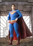
The "S" is way too small.
The "s" on the belt is redundant and lame.
The colors are darker on purpose, and that I guess I'm not sure about yet, will probably depend on how it looks in palette of the finished film.
The "S" is way too small.
The "s" on the belt is redundant and lame.
The colors are darker on purpose, and that I guess I'm not sure about yet, will probably depend on how it looks in palette of the finished film.
In it we can see a "pattern" over the entire suit, not unlike the Spiderman one, and the sci-fi looking boots, which look like something Luke Skywalker would've used in Bespin or something.

")