Steampunk Musha 4 page comic preview

rick_hershey

First Post
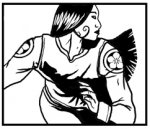
We just posted these 4 preview pages of the Steampunk Musha comic and I wanted to show them off around the forums I frequent to get a better idea of where I need to improve. to be honest, the entire sequential thing is new to me, so I feel i'm still learning to pace myself and develope a panel-to panel storytelling method. I do believe the pages are getting stronger as I progress. . . either way, feedback welcome.

Also, if you are into the whole tabletop rpg's, check out the Steampunk Musha core book. You can pick it up from our site, or order the collectors edition with original art inside.

www.steampunkmusha.com

thanks

mushapage1web.jpg


mushapage2web.jpg


mushapage3web.jpg


mushapage4web.jpg
 

log in or register to remove this ad

Um, yeah, ok.... I'm in awe. Sequential art can be hard to do. The inking is fantastic. I really enjoyed the clean black and white nature of the images. I wish I could get that down myself (more practice I suppose). The only real criticism that I have to offer is the first two pages panel wise are not as visually interesting as the last two pages. The art is fantastic throughout, but the panel placement in the last two pages is much more visually interesting (not being as linear with the interuptions).

So, now I'll be looking forward to more work! You have a new fan!
 

Nice... very nice.

I can't say why, but my favorite parts are the repeated view of the small puddle.

My only raised eyebrow was at the last panel of the first page - the woman's swinging arm looks... strange... at the shoulder. But I can't really say what's wrong with it, it just looks odd to me.
 

I'm not really sold on the comic yet, I'll have to see more to really make a decision. But I love the info you have up on the setting! I'll put the setting and Iron Gauntlets pdf's on my wishlist and pick them up in my next order.
 

Cor Azer said:
My only raised eyebrow was at the last panel of the first page - the woman's swinging arm looks... strange... at the shoulder. But I can't really say what's wrong with it, it just looks odd to me.

The emblem on the shirt sleeve isn't quite in the right spot, and the arm isn't going quite in the right direction for the perpective of the picture. The gut feeling is, "A shoulder shouldn't bend that way."

Hence, her arm looks as though it's been pulled out of its socket and is flopping about while she runs.

Simply flipping the arm vertically makes a big difference. Like so (I hope you don't mind me taking the liberty, Rick)...
 

Attachments

  • musharun.jpg
    musharun.jpg
    33.4 KB · Views: 77

Xyanthon - I entirely agree with you, I didn't really start getting comfortable till the last panel on the second page. Here is where I started to find the style I liked and became at ease with characters that up until this point were only words. I appreciate the compliments on my inks, I work hard on that area.

Cor Azer - I'm glad you liked the puddle, all the writers idea. . . and to be honest everyone seems to hate the way it looks. The swinging arm was a big problem and still is, I want to keep it dynamic and really loved the flow of the arm in that position, our agreement at the studio had to do a lot with the placement of the pattern.

Bobitron - The comic is a work in progress, and i don't think it's where I want it, but I'm very happy you dig the setting. . . I think anybody looking for an interesting setting able to incorporate several genres would really dig the rpg. And we have lots more content being worked on for the setting, so expect plenty of gritty details and support.

Pbartender- I do not mind at all, and in fact really appreciate the alteration. I think it works much better this way, and most likely will now change it. Thanks very much.
 

rick_hershey said:
The swinging arm was a big problem and still is, I want to keep it dynamic and really loved the flow of the arm in that position, our agreement at the studio had to do a lot with the placement of the pattern.

...

I do not mind at all, and in fact really appreciate the alteration. I think it works much better this way, and most likely will now change it. Thanks very much.

No problem. Always glad to help.

Another suggestion... the arm as I edited it, really changes the feel of that panel. It's looks less like escaping by a controlled run, and more like a panicked flee, if you know what I mean. If want to feel more like a purposeful run -- and maybe bring back the dynamic and flow you were looking for -- try a Google image search on "running" or something similar... You'll find lots of photos of people running to gives some good examples of how to position the arm, and where the patch-emblem should be sitting.
 

rick_hershey said:
Bobitron - The comic is a work in progress, and i don't think it's where I want it, but I'm very happy you dig the setting. . .

I think it doesn't tell a story well enough at this point. That's just my opinion- there are plenty of comics out there that I have trouble 'getting' in terms of the flow, especially in a few pages!

It really looks great, though. Interested to see how it turns out!
 

Pbartender- I actually reference the arm that got us into this position. . . I know the arm can bend that way, it just looks unatural.

Bobitron- Both I and Alana Abbott (writer of Steampunk Musha, Into the Reach, and several rpg books) are both pretty new to doing this type of media. I think with her words on the page, it will work very well. . . but just the images themselves do not express the story in such a few pages.


Remove ads

Top