Hiya!
As a 3D artist I can tell you why. The hand made one is unknown to our brains as opposed to something it recognizes ("Oh, it's a bowl", vs "Oh, is that a bowl?").
WARNING: Somewhat boring explanation below!

Photos: If it's a photo that was taken to convey information, it will likely be..."centrally focused". What I mean is the artifact, say a morter and pestel, will be sitting square in the middle of the picture. The focus will be as clear as possible across the whole image. This leads the eye quickly to the center of the shot...the 'central thing'. As everything in the image is in equal focus, there is no real spot for the eye to 'rest' when viewing it. So, our human brains think "Ok, info, it's a rock bowl and rock stick. Got it. Move on..."
A photo that was taken
artistically will likely be using the "rule of thirds", where the focus isn't square in the center of the image. A good example is to compare pro photos and tourist photos of the ruins at Playa del Carmen. Here are a bunch of (mostly) "pro" photos of the area:
https://duckduckgo.com/?q=playa+del+carmen&t=brave&iax=images&ia=images
Just looking at them it becomes obvious. You can 'divide' the shots into three more or less equal parts, in, usually, the left or right 'side' is where something the photographer wants you to see is. We can also get into the "golden ratio" and "lines of convergence", but my point is this: unless the photographer is an actual 'artist' (as in has taken time and effort to learn to use, and not use, these classical ideas), the photo's tend to be...boring to look at.
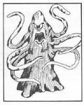
Drawings/Paintings: Likely the artist is using multiple 'tricks' to get your eye to look at what he wants. If it's a simple line art with little (or very crude) shading, it will look "cheap/bad" to us. Pretty much everything in the original 0e 3-booklets version of D&D was of this quality. It's just...very armature, but charming in it's authenticity. We get the feeling the artist was actually trying to make it look as good as he/she could. That puts a smile on our faces. The emotional connection.
With more "pro" art, b/w or colour, an artist will use how much detail he puts into something to draw the eye of the viewer towards what he thought was important in the pic. The rule of thirds or the "golden ratio" (too hard to describe what that is; it's sort of a 'spiral of square areas'; search for it and you'll see) are often used, as well as perspective. Using a pictures "negative space" (stuff where there isn't really anything to look at) can also help point the viewers eye to the 'important stuff'. Combine all of this together, and you have a MUCH more interesting picture than if someone centered an object and snapped a perfectly focused pic of something.
So...in closing...it's much harder to control the viewers focus with a photo unless you really know what you are doing. With a hand drawn picture the artist can use various techniques to "lead" the viewers eyes around the whole picture. It's sort of like having someone open their eyes and them seeing an entire car engine all at once vs slowly letting them see chunks of it in a way you want. The "open your eyes" will get the person the whole picture in one go...making them think "Oh, it's a car engine. Cool". But showing a bit here, a bit there, something over here, then up a bit over there...will make them think "Oh...what the heck is that? Some kind of metal plate? ...oh, wait, that's not a plate, look at all those lines on the side going down...what
is that? ...ahhhh....I think it's some kind of stacked cardboard cylinders, they...wait a sec...are those...hoses? Ropes? No, wires. Maybe wires. Why are they red?" ...etc...etc...etc. The 'slow reveal' is the same as a well drawn picture; the views eyes are lead all over the pic, one interesting thing to another, to a boring thing so he can rest for a moment, then something else interesting, and so on. Hence...why your players took longer to look at the hand-drawn stuff; they were interested in 'discovering' things in it.
Sorry for the long-winded explanation. I hope it wasn't too boring and I hope it explains why looking at "hand made" art is usually more interested than looking at "perfectly framed product-shot photos". It's all about leading the viewers gaze and giving him something to focus on, then rest on, then focus on, the rest on, etc, which encourages exploration of the picture.
PS: The Roper pic is from the 1e AD&D Monster Manual, iirc. Or was that MM2? Yeah, I think MM2 as the Roper was first introduced in the Lost Caverns of Tsojacanth...I think.
^_^
Paul L. Ming


