Olgar Shiverstone
Legend
So my copy of Dragon 355 arrives today. I flip it open, and on th einside cover is a nice illo of a party around a campfire (part of an Origins ad). My response: "Great art! Now this is what they need to have on the cover!" Then I notice the picture is dated ... 1989. Apparently, my taste for fantasy art is just stuck in the past.
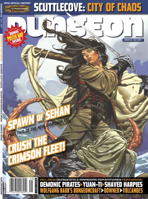
For the record, this month's cover is OK in my opinion ... much better than the latest Dungeon. The face of the woman on the front of the Dungeon issue just looks wrong -- out of proportion, or something. There have been some great covers, but on the average, Dragon cover art doesn't grab me like it used too. The style seems to have shifted from (excuse my poor art descriptions) a realistic painting style to more comic-bookish.
For the record, this month's cover is OK in my opinion ... much better than the latest Dungeon. The face of the woman on the front of the Dungeon issue just looks wrong -- out of proportion, or something. There have been some great covers, but on the average, Dragon cover art doesn't grab me like it used too. The style seems to have shifted from (excuse my poor art descriptions) a realistic painting style to more comic-bookish.
Last edited: