
Emirikol
Adventurer
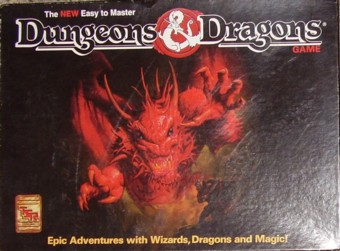
I'm sorry, this topic has probably been attacked to death, but I got my Starter Set for 5e and immediately saw that "blah" art. What the heck? Are they attempting to save money? The artwork is incomplete and... blah... Isn't the year 2014? Didn't we get overwhelmed with every marketing gimmick known to man..and now we have this blah artwork? "..it's got really great rules..." isn't going to cut it when I try to sell this game against others that my kids play.
Well, what do I like about it?
* It is simple
* It conveys a sense of action
* The Dragon is front and center and follows the tradition of D&D's previous covers
* Good enough to make a basic point
..but not enough to compete..not enough to inspire.
When I go to Target and imagine seeing it sitting next to a whole slew of other games with inspiring/appropriate/flashy artwork, here's what I see:
* A pencil drawing of a guy with a shield (no sword visible) that looks like it came off somebody's grade school notebook
* blah blah blah gray and green lack of contrast
* a very diminished splash of a brand name. STARTER SET is profound though..I'm not sure that will inspire someone to pick it up.
* The dragon, compared to artwork that actually looks finished, really looks digitally smeared and severely unfinished
* There is nothing else going on in the picture (until you see the booklets..assuming your mom bought this box for you, you're then opening it to 2 booklets, 5 charcter sheets and a cardboard filler. The dice look nice though..if you knew what good/bad dice looked like. There are no pawns. There are no combat examples. The first art you see inside the book is a bunch of people sitting around and sleeping and an old man talking. The other artwork is a bunch more blah, low-contrast, ugly people in ugly burqa-like armor (without the veil) shooting in random directions against some goblins. [Don't get me wrong, this art is fine on it's own, it just seems randomly acquired, dispersed, and again, not really piquing the imaginatory sense that I would expect of the flagship game.]
..but the rules seem good..to an established gamer of 30 years..not sure that a 12 year old gives a crap about stuff that looks like school homework though...
Compare it to other editions (1974 doesn't count..that's not even fair")
Tell me what you like or would have done differently") I love talking about art!
I love talking about art!
[EDIT: added from below:
What elements do you guys like about the cover?
As specifically as we all love to talk about rules, what do you like about it? Otherwise you're just making the equivalent of a "me too" or "not me" post.
How is it that you feel this art is more appropriate to selling a "starter set" than perhaps something with a bit more of the elements of marketing?
Read more: http://www.enworld.org/forum/showthread.php?357602-Starter-set-cover-art-meh#ixzz3949NvlUC


Well, what do I like about it?
* It is simple
* It conveys a sense of action
* The Dragon is front and center and follows the tradition of D&D's previous covers
* Good enough to make a basic point
..but not enough to compete..not enough to inspire.
When I go to Target and imagine seeing it sitting next to a whole slew of other games with inspiring/appropriate/flashy artwork, here's what I see:
* A pencil drawing of a guy with a shield (no sword visible) that looks like it came off somebody's grade school notebook
* blah blah blah gray and green lack of contrast
* a very diminished splash of a brand name. STARTER SET is profound though..I'm not sure that will inspire someone to pick it up.
* The dragon, compared to artwork that actually looks finished, really looks digitally smeared and severely unfinished
* There is nothing else going on in the picture (until you see the booklets..assuming your mom bought this box for you, you're then opening it to 2 booklets, 5 charcter sheets and a cardboard filler. The dice look nice though..if you knew what good/bad dice looked like. There are no pawns. There are no combat examples. The first art you see inside the book is a bunch of people sitting around and sleeping and an old man talking. The other artwork is a bunch more blah, low-contrast, ugly people in ugly burqa-like armor (without the veil) shooting in random directions against some goblins. [Don't get me wrong, this art is fine on it's own, it just seems randomly acquired, dispersed, and again, not really piquing the imaginatory sense that I would expect of the flagship game.]
..but the rules seem good..to an established gamer of 30 years..not sure that a 12 year old gives a crap about stuff that looks like school homework though...
Compare it to other editions (1974 doesn't count..that's not even fair
Tell me what you like or would have done differently
I love talking about art