Hello all,
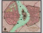
I've always been challenged by trying to produce antique-style maps on CC-Pro that look antique...I've come up with this style for a client, any comments are appreciated!Did it come close to accomplishing the goal,and where does it miss?
(Full size is in my Gallery at www.morningstarmaps.com ....
As always good work. I do not like many city maps, too often it is impossible to get a good balance between scale and detail (the artys side). The style is nice and I think you got the feel you were looking for. BUT...(you knew it was coming right )....The city is too small or the keeps are too big. I would suggest scraping the symbols and doing your own (I, of course, do not have the talent to do such a thing but have the utmost faith in you). Overall, it is a really good map.
Thanks,good point. And you are dead right about the scale/size issues...a realistic size 17th C. city map would/should be a massive sprawling mess...that's something to think about!
Appreciated!

") )....The city is too small or the keeps are too big. I would suggest scraping the symbols and doing your own (I, of course, do not have the talent to do such a thing but have the utmost faith in you). Overall, it is a really good map.
)....The city is too small or the keeps are too big. I would suggest scraping the symbols and doing your own (I, of course, do not have the talent to do such a thing but have the utmost faith in you). Overall, it is a really good map.