Cool, I brought up the meaning of red to me earlier. I said it felt a needy and loud and toy-like, whereas purple is more appealing. Of course I'm talking about more than just the colors. Red generally has the quality to me but I don't hate red, it could work.
My general view is that I don't see why the logo and cover of a D&D gamebook has to concern itself with "capturing attention" at all, really. Why would it need to do that? Whose attention does it need to capture?
How do newbies come to D&D? Is anybody actually strolling down the aisle of a brick&mortar store when the cover of a D&D book grabs their attention, so they pick it up and read the back, then buy it and play it and get into D&D like that?
No way. Maybe in a toy store in 1985.
Today newbies hear about D&D through cultural osmosis, and then look it up on the internet. Generally by the time they're looking at your PHB cover, they're in -- you have their attention already. At this point I think it's more about keeping their attention, by projecting subtlety, mystery, class (as in classic), quirkiness, the fantastic.
I mean -- think about the initial investment that D&D requires out of people. They have to buy hundreds of pages of printed material, read and learn it and put together an adventure and play it. If people are considering doing this, you don't need to "shout at them" in the art direction. They're already giving you so much attention, you know what I mean?
Also I don't think what I have in mind is so out of touch with current trends and tastes, because the cover of mondosuccessful CRPG Skyrim does it.
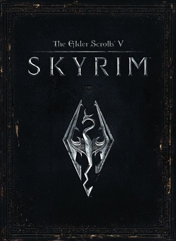
Look how much strength this cover projects. Skyrim knows it's huge. It's not trying to grab your attention with an image like "you can be this!" (although I am aware that it has an iconic character used elsewhere) or even "you can explore this!".
It's all like: if you're looking at this, you already know what this is.
That's what I want the D&D logo/cover to say.
(Not that it necessarily needs to do the this-new-book-looks-like-an-old-book thing. That's just one way. The silver and navy-blue contributes to it, talking about colors.)

