Some of my maps and drawings

Sirith

First Post
Greetings people,

I've been looking through some threads here, and there are some very nice things to be found :) (especially those underdark maps from Hellhound). I'm somewhat of an artist myself, and since a friend talked me into DMing I rediscovered map making.
Apart from that my interests concerning art mostly point towards concept art (for games, rpg books, starcraft 2 concept art for example just rocks) and anything else I find interesting :p. I draw mostly with pencil and ink, though lately I've rediscovered Painter, which has some tools that fit my style of painting and sketching very well.

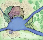
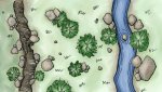
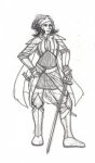
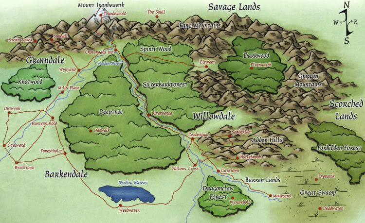
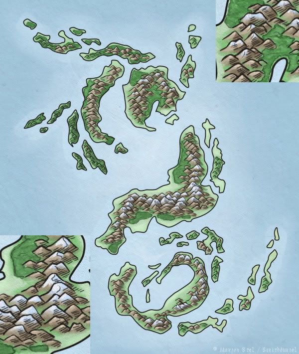
Anyway, I've uploaded two maps and an inked sketch of a d&d like character, hope you like it.

Oh, and I've got bigger versions of those maps, if anyone's interested
 

Attachments

  • map, scornubel.jpg
    map, scornubel.jpg
    84.3 KB · Views: 251
  • map, encounter.jpg
    map, encounter.jpg
    63.5 KB · Views: 227
  • 07-27 girl in armor.jpg
    07-27 girl in armor.jpg
    39.8 KB · Views: 203

log in or register to remove this ad

Sunaj2k3

First Post
Map Comments....

Your city map is colorful and crisp, good job. Your encounter map is well illustrated and a nice piece of eye candy, consider it snagged. My only minor quibble is that the encounter map does not have a grid. Keep drawing and good gaming.
 

Pyrandon

First Post
Okay, Sirith, I really, really, really like that city drawing--fits my favorite, hand-drawn style of mapping perfectly. Wow, it's just great.

I think the encounter map (and to a much lesser extent, a few portions of the city map) are a bit too pastel, too light and airy in mood--but that is merely my personal preference in maps, and I have no idea what tone your new campaign is establishing, so feel free to garbage disposal that suggestion :)

Again, I really like your work!
 

jaerdaph

#UkraineStrong
I really like the watercolor-style city map and encounter area. I don't know if I'd use it for an encounter area with minis, but I think it would look very nice in a published adventure or sourcebook.

Nicely done!
 

Sirith

First Post
Pyrandon > Thanks for the comment. About the colours: I'm still figuring out what colours to use, imo, it's the most difficult thing about mapmaking. So in that light, thanks for the comment on the encounter map, it's good to know what feel it establishes :)

Sunaj2k3 & jaerdaph > both thanks for your comments, much appreciated.
 

Fusion

First Post
Sirith, your city map is excellent. I think far too often RPG cartographers are more concerned with ease of use over aesthetics. However, the aesthetics of a certain map will go a long way to encouraging the PCs in the campaign, if you get what I'm saying.

In short, very nice!
 

Sirith

First Post
Okay, bump of my thread from quite a while ago. Just didn't want to make a whole new thread for a few new maps..
Fusion > thanks for the comment (and sorry for my so very late reply). I do understand people may find it tedious work, but I agree that a little attention to detail and aesthetics can go a long way.

Here are a few new maps I did over the course of a few months. They are all fully digital done in Painter. Yeah, I prefer traditional art, but digital is just so much faster at times, especially the colouring (I still have to learn watercolour or some other technique).

First is done for 3point75.org magazine. Really happy with this one (a more readable version is in the magazine, decided I didn't want to spoil it too much :))
Second map is just a random bunch of isles with a whole lot of mountains (and two close-ups of my favourite parts). No cities or labelling or anything, as I feel it would need some more worldbuilding in the sense of who are the people etc, while this one started as a doodle on a whiteboard and I really just wanted to practise painting.

Both have a texture slapped on as a last step in the whole process, gives the piece something extra, especially in the case of fantasy themed maps.

motherland-tex.jpg


IslesofFuar09.jpg


Remove ads

Top