• The VOIDRUNNER'S CODEX is LIVE! Explore new worlds, fight oppressive empires, fend off fearsome aliens, and wield deadly psionics with this comprehensive boxed set expansion for 5E and A5E!

D&D 4E Vote for your favorite 4E PHB cover!

Which PHB cover you prefer?


Li Shenron

Legend
Zamkaizer said:
The second. I realize the third is more 'D&D', but it's the Player's Handbook, not the Dungeons & Dragons Handbook--the focus ought to be on the player characters.

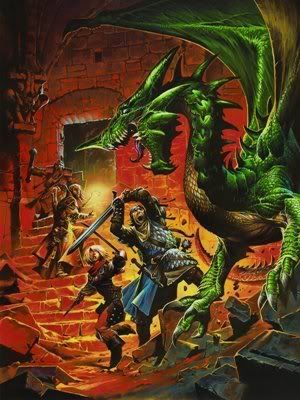
I disagree. The Player's Handbook is more "D&D Handbook" than any other book including the DMG. It is the only book that everyone has... it also contains the core rules (DMG contains only marginal rules compared to the PHB), hence it IS the game.

And the game is not just about creating characters, it's about their ADVENTURES. Even if a lot of people nowadays are more concerned with character builds and advancement, and see adventures only as a MEAN, rather than the purpose of playing, but there would be really no game without them.
 

log in or register to remove this ad

Pale Jackal

First Post
#3 but...

Only because the artist seems incapable of drawing humanoids. The human warrior on the first cover looked absolutely retarded, the dragonborn on the second cover also looks pretty retarded... and the human wizard on the second cover doesn't look too good either.

If the humans and dragonborn were more aesthetically pleasing, it'd be a different story. But... #3 for the win.
 

Hey all! :)

I voted for the third one, but I understand what Zamkaizer is saying.

Maybe they should have a cover featuring a party of four (or five) adventurers (the standard party model they hope to push) with the Wizard in the back, Rogue lurking in the shadows, Cleric in the middle and Fighter at the front with a big shiny shield with an approaching Dragon, Beholder or some other iconic monster reflected in the shield.
 

Except for the clunky placement of the blue bar (it breaks up the action a bit too much), I voted for the adventurers & dragon mix. I'm not even sure why they made the other ones.
 

ObsidianCrane

First Post
Jaws said:
They all suck.


j.

Pretty much - the Dragon V Adventurers just sucks the least.

There are so many artists that are so much better than WAR, yet there he is providing suckage for the flagship products. (Most likely at the direction of some truely unispired marketing person /art director at WotC.)
 

Zamkaizer said:
The focus of the second cover is the two adventurers, the focus of the third cover is the dragon.

I'd say the focus of the third cover is the fighter. He is the one with all the momentum of a, maybe reckless, charge. The Dragon is just standing still, waiting. But you can see in all the party a lot of dinamism, a lot of potential action.

Anyway, how about this version? is this enough player-focused?
4egreendragon.jpg

There you go! the fighter is RIGHT in the middle of it.
 

I voted for the 2nd.
In the first, I don't like the posure of the female Fighter, it looks a bit odd to me.
In the third, I don't like the colors. Something is off there.
I haven't anything specific to complain about the 2nd, even though I definitely would prefer a full adventuring group (in action). But I have really no idea how that should look, so far nothing really convinced me, thought he 3rd might come close (maybe with the Dragon not standing in the front, and different colors?)


Li Shenron said:
BTW I am sorry at realizing that WAR is not one of my favourite artists anymore... :( his style is kind of involuted at the moment, all faces look the same and the weapons are ridiculous.

Maybe this is why I thought the green dragon fight wasn't WAR's at first glance (as I posted earlier in this thread) the weapons in this image are all normal! the sword, the rapier... even the staff. This is good. (The color in this picture is a bit different compared to most of his art, also)
I don't knowww. I hink this picture is one of WAR's best.


Voidrunner's Codex

Remove ads

Top