• The VOIDRUNNER'S CODEX is coming! Explore new worlds, fight oppressive empires, fend off fearsome aliens, and wield deadly psionics with this comprehensive boxed set expansion for 5E and A5E!

D&D 5E Vote for your favourite 5E cover art!

Which cover art do you like best?

  • Starter Set

    Votes: 63 22.1%
  • Player's Handbook

    Votes: 34 11.9%
  • Monster Manual

    Votes: 90 31.6%
  • Dungeon Master's Guide

    Votes: 30 10.5%
  • Hoard of the Dragon Queen

    Votes: 14 4.9%
  • The Rise of Tiamat

    Votes: 54 18.9%

Derren

Hero
You know what these images have to do with their respective books?

Selling them.

Strange that one of the most sold core books (3E) have such "unattractive and boring" covers.
I find it just sad that this is apparently WotC thinks their target group wants and caters to. Random, over the top action everywhere.
 

log in or register to remove this ad

Stormonu

Legend
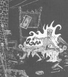
I thought of this image when I saw the beholder pic (it's from the 70's coloring book).

[sblock]
coloring-album-beholder.jpeg

[/sblock]
And I am reminded of the false tomb in S1 for the DMG:

[sblock]
3ydIQu.jpeg
[/sblock]
As for the starter set, I like how the dragon appears green from above, but red from below - a nod to the green/red dragon from the Basic sets of yore (as well as the pose of the fighter facing the dragon).
 

Hussar

Legend
Strange that one of the most sold core books (3E) have such "unattractive and boring" covers.
I find it just sad that this is apparently WotC thinks their target group wants and caters to. Random, over the top action everywhere.


Yeah, those silly WOTC guys not knowing anything about what sells:

Pathfinder_RPG_Core_Rulebook_cover.jpeg


:uhoh:
 

I have sent this shot to a (non RPG) friend and got called a nerd for my pains ;)

However he made a good point, when seen like this there is a lot of

AAAAAAAAAAAAAAAAAAAAAAAAAARRRRRRRRRRRRRRRRGHHHHHHH HHHHHHHHHHHHHHH

DD-Book-Cover-Shot.jpg


Mouth open stuff. I love the covers but together the mouths all open wide for the dentist makes me laugh!

And reminds me of this...

[video=youtube;42WFxAtoM-g]https://www.youtube.com/watch?v=42WFxAtoM-g#t=72[/video]

:cool:
 

DMZ2112

Chaotic Looseleaf
Strange that one of the most sold core books (3E) have such "unattractive and boring" covers.
I find it just sad that this is apparently WotC thinks their target group wants and caters to. Random, over the top action everywhere.
Look, I totally agree with you. I would love to see a PHB with a campfire scene on the cover: cleric passing out cheese and crusty bread; elf fletching arrows; fighter laughing over some indelicate joke with the dwarf while the magic user rolls his eyes; dragonborn poring over a dog-eared map; halfling cleaning the froth out of a mug with a finger; thief in the shadowy brush in the foreground, suspiciously eyeing the reader.

...And then they all die horribly on the cover of the MM while the dragon dungeon master watches from the cover of the DMG.

But yeah, quite obviously, Wizards' target audience wants random, over-the-top action everywhere. When was the last time a video game featured a campfire scene? 1987?

D&D has already /got/ the geeks who want to hang out around a campfire in the Dark Forest on their way to Skull Peak from Cloverton. We seek D&D out. If D&D didn't exist, we'd invent it. Wizards' marketing department's job is to convince Skyrim players that their imaginations are more fun than Bethesda's code and that is an uphill battle.

I have sent this shot to a (non RPG) friend and got called a nerd for my pains ;)

Yeah, well, he probably plays fantasy football, like a total dweeb.

However he made a good point, when seen like this there is a lot of
AAAAAAAAAAAAAAAAAAAAAAAAAARRRRRRRRRRRRRRRRGHHHHHHH

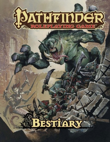
*sigh* Yeah. At least it's (nearly) all monsters this time. And no one has extraneous teeth, except the beholder who is arguably supposed to.

PZO1112_360.jpeg


...Seriously, Wayne, what... what the hell, man. How does he shut his mouth?
 

Greyson

Explorer
Marketing Miss

I think this cover art is a major marketing miss. The cover art is okay. As others have said, there is something "off" about this art.

For starters, it's a bit too dark and shadowy in terms of contrast. These images do not pop-out or catch the eye. Not at all. I had to look closely at these images to tell what was even happening. Wizards of the Coast had to explain who and what was on the covers on Twitter. It's pretty bad when you have to explain your cover art.

The choices for font type mystify me. This gets back to the art not catching the eye. The worst offender on these covers it the tiny, red-colored "Dungeons & Dragons" in the bottom left-hand corner. Is WotC trying hide their brand? There is similarly small "D&D" at the top, but it hardly does the job of boldly presenting your brand.

Paizo's (I know, they always come into the conversation, but they usually do a better job at this sort of thing) redesign of Dragon and Dungeon magazines in 2004 is a textbook study of how to present your brand in bold, noticeable design. Wizards of the Coast did a great job with this with their D&D 4E products. It was no doubt whose brand those books were.

I think it's disappointing. With all of that said, I am buying the game for its contents. But, those covers are not something I think draw the eye.
 

Jeff Carlsen

Adventurer
I have sent this shot to a (non RPG) friend and got called a nerd for my pains ;)

However he made a good point, when seen like this there is a lot of

AAAAAAAAAAAAAAAAAAAAAAAAAARRRRRRRRRRRRRRRRGHHHHHHH HHHHHHHHHHHHHHH

DD-Book-Cover-Shot.jpg


Mouth open stuff. I love the covers but together the mouths all open wide for the dentist makes me laugh!

:cool:

This is something I noticed pretty early. 4E ruined me for this, once I noticed that almost every cover had someone with their mouth hanging open.

The gist of this problem is that every cover is an action scene. And while that's okay for now, I hope that subsequent books add more variety.
 

MJS

First Post
I think the core 3 are a miss. They're cool though. Too loud for core book covers to me, but then this is D&D....
Fav is Rise of Tiamat - awesome pic that is
 

Hussar

Legend
To be fair though, if you're drawing a monster, in the process of trying to eat someone, shouldn't it's mouth be open?
 

Jeff Carlsen

Adventurer
To be fair though, if you're drawing a monster, in the process of trying to eat someone, shouldn't it's mouth be open?

Certainly. In every image, it makes sense that one or more characters have their mouth open. The problem isn't that, but the fact that every cover is such a situation.
 

Remove ads

Top