D&D 5E What do you want in a published adventure? / Adventure design best practices?

Libramarian

Adventurer
The DM should be able to run a published adventure off the page with no prep. I have done this successfully with some adventures (both short and long, dungeon crawl and scene-based), and struggled to do this with others, so I think it's a totally valid and doable design goal. Of course the experience might be enriched with more prep time, but the pick-up-and-play experience should be decent and not a disaster.

I think it was the 4e DMG that described what to do to run a game if you only have 1 hour to prep, what you can do with 4 hours, etc. Maybe an adventure could be like that: here's what you get if you run this without even reading it first, here's what you can do if you have more time.
 

log in or register to remove this ad

Yeah, I know what you mean. I think it really depends on the dungeon design and the cartographer.

For example, here's some of Derek Ruiz's work that reads very clean to me:

52-Forsaken-Ruins-L.jpg

That map, although very pretty, would be a nightmare to use at the table. As Lanefan said, it's hard to tell what the relationship between elements is; it's also very busy and overloads me with information that I have to try and sort. Not a fan. My favourite cartographer is Mike Shley, and Jared Blando's work can be excellent (see his battlemaps patreon), with the odd and notable exception of his mostly useless ToD maps.

I find that verticality is something often praised, but in practice it leads to my confusion more than my satisfaction.
 

Quickleaf

Legend
The more examples folks can include the better! Whether that's a specific adventure mode, a picture or a scan, or something you compose to illustrate a point.
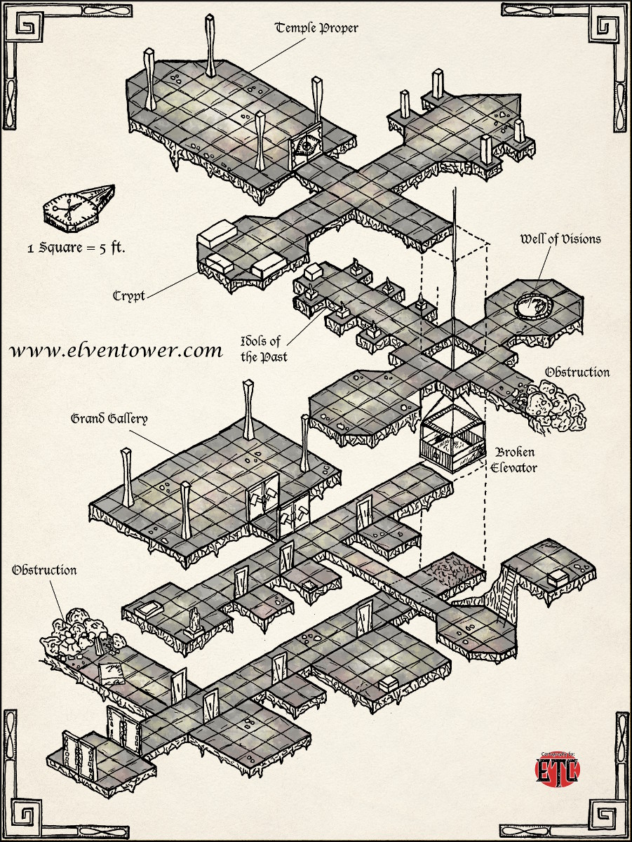
[MENTION=29398]Lanefan[/MENTION] [MENTION=32659]Charles Rampant[/MENTION] Interesting. I see a lot of value in isometric maps to communicate things to me as the DM. Do you guys have examples of maps communicating verticality that you feel are successful / usable for your games?
 

Ilbranteloth

Explorer
Maybe it's just me, but I find those isometric, or viewed-on-an-angle maps absolutely impossible to read. Horrible things.

Better is to simply set a 0' elevaton peg point at the dungeon entrance or some other key place, then on the map use either contour lines or elevation markers (e.g. -10', +25, etc.) to indicate the elevation difference from the peg point.

It's just you :D

I understand what you're saying, and I know they aren't for everyone.

Take a look at the maps at this site: http://www.thebanmappingproject.com

That would be ideal (and I use these maps for tombs anyway). The maps in I3-5 Desert of Desolation are great and similar. Ideally you have a top down view and an isometric. Something like this with a top and profile is also useful: http://www.jamaicancaves.org/st_clair_map_090506_highres.jpg

No thanks. I'm paying for it on paper, I want it on paper; and I have no intention of first paying for the module and then paying for printer ink to get it on paper.

So some things, like printable maps, are in both. But since page count is an issue, I'd rather have the information available, than not at all.

But are you buying it to read, or to run? I'd rather see a module that maybe doesn't read well but has everything when and where I need it in order to be able to efficiently run it.

Lanefan

Wasn't my comment, but for me it's both, leaning more toward the read. I rarely run a published adventure, although I often pull parts of it out for my own campaign. But I'm fine with the functional presentation for either.
 

Quickleaf

Legend
To me, that map - though pretty enough - is terrible. I've no way of knowing the elevation difference between one floor and another;

To me, it's 5 squares (25-feet between floors), but I'm very used to reading isometric maps. I agree that the artist should have called it out more explicitly, but I can count squares in the vertical just as easily as I can in the horizontal.

no easy way to tell what's supposed to be above/below what,

Looks like the top crypt is above the grand gallery.

and without looking at the elevator and seeing there's an elevation difference it reads as though one could dig or Passwall through from the idols room to/from the crypt without much effort.

I agree. One trick I've seen other isometric artists do is use lighter lines for things "farther away" from the viewer, along with faint "lines of descent" as a visual cue when a room lies above/below another room.

Using the map you show, all it would need would be a "0'" notation at the top of the elevator, a "-20'" (or whatever) notation at the Well of Visions level, and so forth; with those notations using a colour specifically not used for anything else so it's obvious what they are.

I think that's a fine solution. I like how you've made me more aware of including vertical dimensions to clarify stairs and things.
 

The more examples folks can include the better! Whether that's a specific adventure mode, a picture or a scan, or something you compose to illustrate a point.

@Lanefan @Charles Rampant Interesting. I see a lot of value in isometric maps to communicate things to me as the DM. Do you guys have examples of maps communicating verticality that you feel are successful / usable for your games?

Best example off the top of my head is Maelstrom from Storm King's Thunder. It's a visually cool map, it helps me understand how the different levels fit together, and it is easy to see the ways that the players can move from one level to another. In case you're not familiar with it, here are the maps (I didn't want to hotlink for fear of spoilers for those reading):

Levels one and two
Level three

I've never read whichever module it came in (Keep on the Borderlands?), but I understand that the Caves of Chaos had a similar vibe, of lots of tunnels accessible from a central multi-level location.
 

The Old Crow

Explorer
Printer friendly maps are very important to me, especially with pdfs. Caves on a solid dark background do look cool, but I'm not printing them out! I need practical maps, Black lines on white background is fine.
 

guachi

Hero
Someone complained about the poor layout of current 5e adventure books.

I3 - Pharoah has, I think, very good adventure layout. The encounter descriptions are clear. At each encounter are a there is boxed text first. Then the following get their own paragraph(s) with the heading in bold:
Play
Monster
Character
Treasure
Trap/Trick
Lore


It's always in that order, except for one instance. Even better, in the "Notes to the Dungeon Master" section on page 3, all of the above are detailed in the exact order the DM will see them and with explanations on how to use them.

Example:
Description This is a general description of the area as the players first see it. Any readily noticeable and obvious features are generally described here to allow the DM to read the text directly to the players. these descriptions are boxed-in to be easily distinguishable for the DM. The descriptions were written with the assumption that the characters are using a torch to see by. A torch normally lights a 30-foot radius area.​

This is what I want in module design and what I want out of boxed text. It doesn't make for a particularly attractive module or one that's a great read. But it does make it blindingly easy to run. Boxed text is getting a lot of love in this thread and I wanted to explain what it is I want out of boxed text. But the above paragraph explains it all - noticeable and obvious and in a box so it's noticeable and obvious for the DM!

Don't make DMs roll their own Perception and Investigation to find the information in a module!

Here is the very first encounter area:
B. The Gates of Sule:
Rising up out of the dust, twin pillars of stone stand slanting at odd angles, their surfaces pockmarked and sand-worn. Odd inscriptions are faintly visible in the pockmarked surfaces.

Play: If no storm as immediately preceded the party's arrival, the trail of horses and human footprints continues only between the two pillars (this track is indicated on the DESERT WILDERNESS MAP).Sinkholes extend up to either side of the pillars (See Area C). Those attempting to go around the pillars must enter area C. The rune inscriptions on the pillars are found in Lore.

Lore: There is a base 30% chance of reading the writing correctly as:

The Gates of Sule curse ye who enter unbidden

It's not a thrill a minute to read, but it tells you everything you need to know to relay information to the PCs and run the adventure.

Here's the beginning part of a rather involved room:
G7. Room of the Guardinas
This 20-foot wide hall, and its ceiling, disappear into the darkness. Three pairs of huge statues line the side walls, their tops not visible in the darkness. What appears to be a light blue curtain of translucent material fills the space between the first two statues.

Play: The hall is 60 feet long, with a 60-foot ceiling. The statues are 50 feet tall. On a platform, in front of the back wall, there is a huge bronze lamp. there are three Trap/Tricks that must be passed before reaching the platform. There, the Treasure will be found. If the Treasure seal is broken, the Monster will appear. The Treasure cannot be moved until the Monster is released.​

You then get Monster, Character (details the monsters motivations), Trap/Trick #1, Trap/Trick #2, Trap/Trick #3, and Treasure.

It does, of course, have inline monster descriptions. The 5e APs are awful by comparison.
 
Last edited:

Take a look at the maps at this site: http://www.thebanmappingproject.com

That would be ideal (and I use these maps for tombs anyway). The maps in I3-5 Desert of Desolation are great and similar. Ideally you have a top down view and an isometric. Something like this with a top and profile is also useful: http://www.jamaicancaves.org/st_clair_map_090506_highres.jpg...

You can do something similar to the flash map using Campaign Cartographer and in Fantasy Grounds using hot spots/links. Not as showy, but just as useful.
 

So, here's my standard "layout" for an encounter or event in my modules;

Intro optional, usually 1 or 2 sentences and info when to read the boxed text
Boxed Text
Details such as secret info or more info not included in the Box text that the DM may or may not reveal as appropriate.
Setup conditions and/or locations of NPC, events etc
Encounter aka NPCs, number and types and info as needed
Tactics How will the NPCs react/act, do they run away, etc
Treasure
Aftermath Anything that happens after the encounter (especially important when the adventure is not linear and when events in one location effect other locations, such as raising alarms, etc)

Sometimes a section or two may be missing and occasionally I've add to add others for unusual situations, but it works well for me.

EDIT: Note, Intro, Boxed Text, and Details are not actually headers, but the others are.
 

Remove ads

Top