Joshua Dyal said:
I'm not sure exactly what a "boring" layout is supposed to be. A layout can be bad in that it's difficult to read or use, or it can be professional and slick, or somewhere in between. I'm not entirely sure how it can be boring, though.
And again, I think the AU layout is my favorite in the industry, so you can't just point to that as an example.
")
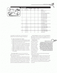
Perhaps it will be easier to show than tell. I'll give an example from Way of the Staff (one of the PDFs that is a "piece" of Arcana Unearthed) by way of attachment (I have shrunk the scan of the page down to the point where it should be illegible in terms of reading the text itself, but the general idea should be clear).
Take a look at the first page below... tell me what you see.
I see LOTS and LOTS of huge areas of white space. The margins - especially the bottom and left margins - are huge. The left margin's sparsity is exaggerated by the fact that there's no text underneath the "gem with eyes" graphic (this is not unique to this page, it's in evidence throughout the book). As noted earlier, the sidebar has little demarcation... just a little extra "white space" around it, making it visually a little bit difficult to distinguish.
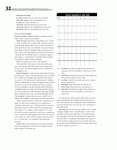
Now take a look at the second page below... again, we have the white space problems, but it also demonstrates another of the problems I have with the layout... the "Sameness." All of the text is in the same 1.5-spaced format, in the same font, at the same size, all the way down except for the "Class Features" header (which may be slightly hard to read, it's the first "break" in the left paragraph) but it's not much different from the text itself.
Basically, while the format is legible and neat, it's mind-numbingly dull. The 1.5 line spacing and huge margins make for a *lot* of white on the page. You have small type "swimming" in the midst of the white - which is a headache to read. Headers don't particularly stand out from the text. Sidebars don't particularly stand out from the text. Basically, all you see is a lot of white with small-font text swimming in the middle of it (the large margins and generous line spacing exacerbate the small font size by emphasizing it).
To put it another way, it looks like a textbook. It's dry. It's bland. The content is excellent - I'm not knocking that - and the layout is clean - I'm not knocking the legibility - but it's very boring. There are no "alternative fonts" or even "noticeable changes of font size" on the headers to break up the monotony of the "look" of the text. The sidebars are nearly undifferentiated from the remainder of the page, and don't break up the monotony of the look of the text. For contrast, pick up an FFG book some time - they have probably as much margin space, but break up the monotony of "black text on white page" with both page borders (which are not always popular, but do break the monotony) and, more importantly, with Headers in the Morpheus Font at a considerably larger text size from the main text (so they stand out - though FFG is not always great at "chopping the text up" into coherent sections underneath the headers).
Does that help explain why I find the layout boring? It's page after page of the same font, same size, same spacing, floating in the middle of a LOT of white.
--The Sigil