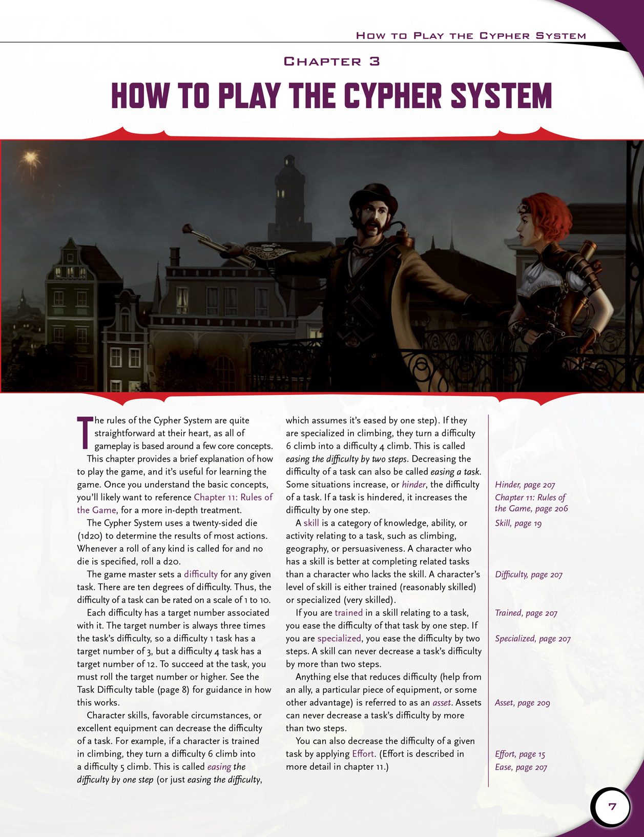
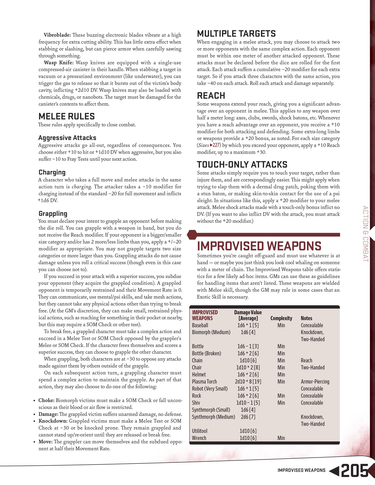
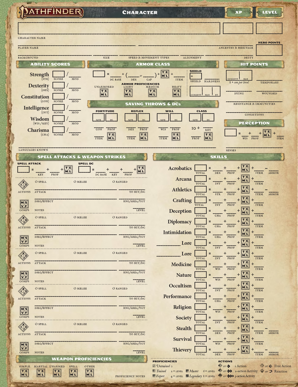
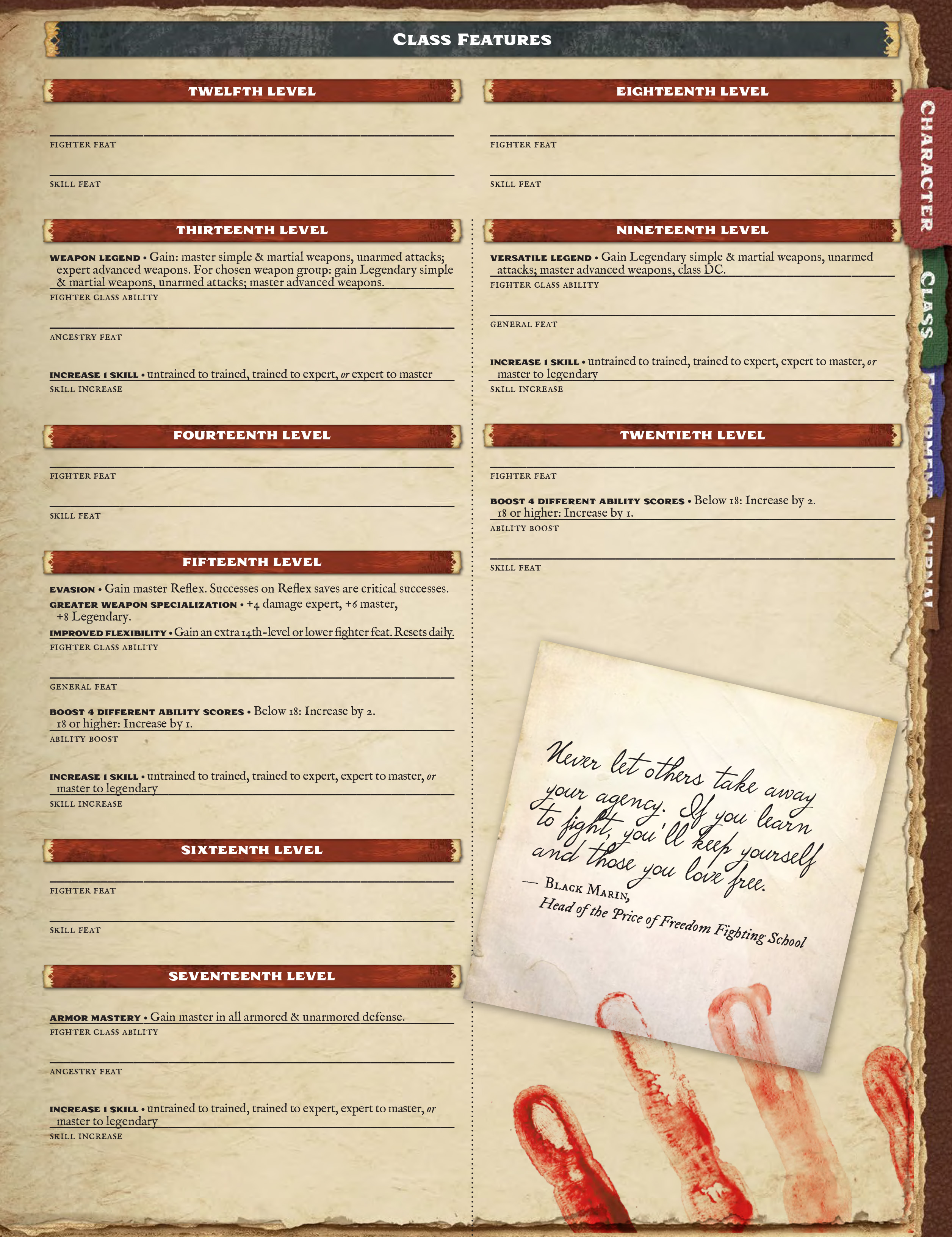
Great graphic design makes a tabletop roleplaying game more engaging. While true, this isn’t the most critical topic in tabletop, yet it leads to pleasing outcomes. Excellent layouts are like editing in movies, if done right you don’t see how well it was executed.

In the past few years, layout artists and graphic designers have revised our expectations when it comes to reading a TTRPG. Recognizing the importance of layouts, the Ennie Awards, the “Oscars” of tabletop RPG awards, created the “Best Layout and Design” category in 2019. The Origin Awards added a “Graphic Design” category in 2023. At Itch.io, a game jam dedicated to TTRPG layouts (Phil's TTRPG Layout Jam 2023, in which each contributor lays out a version of the Misery’s Keep adventure by Rugose Kohn) had a number of participants. Johan Nohr, the artist and layout artist for the award-winning MÖRK BORG Artpunk RPG, had a stellar Kickstarter for his artbook, a category that can be hard to fund. With new focus on graphic design, especially the artpunk aesthetic, I asked some of the upcoming graphic designers, Brian Colin of Vast Grimm and Eric Alsandor aka Spider00x of Rane in Blood and the upcoming Highlander Pro: The Card Game, about the discipline and what makes for good layouts? Eric Alsandor gave his thoughts:


The award-winning layout and design of Mörk Borg led to many homages which tried for the same art style and layouts. Among the standouts, those that used Johan Nohr’s work as a springboard instead of a destination, is Brian Collin’s work. Vast Grimm succeeded because the artwork and style aren’t derivative, but original. Fans responded to Vast Grimm (original GameFound and sourcebooks Kickstarter) because Brian and Ross crafted an impressive concept combined with artwork, all of which is presented in an engaging way. I’ve interviewed Brian Colin about Vast Grimm at EN World (here and here) and on Youtube. How popular is Vast Grimm? Check out the Boundless Torments: Vast Grimm Game Jam to see its fanbase turn out. Looking at the TTRPG’s core rulebook pages 66 and 67, the "Becoming the Grimm" two-page spread, I asked Brian if he would breakdown his layout process:

I’ve covered Eric’s Kickstarters (Rane in Blood here and his Galaxy of Death pamphlets here. On September 2, 2023 at Dragon Con, I played Eric Alsandor’s Miami Laser Cutter Massacre: Escape from Laser Cove! That pamphlet was an ideal Mothership adventure. When asked what he wants to see in other creators’ layouts, Eric shared this:

That examples demonstrates how excellent layout can impress GMs with its information flow. B/X Essentials and OSE use straight forward, two column layouts which does a fantastic job of conveying information in one- and two-page chunks. This example is to say that good layouts are where you find them, not just in artpunk projects.
How do you achieve new layouts if your only input is TTRPGs? Are there non-TTRPG examples to review? Eric Alsandor (Spider00x) suggested a few outside sources for pointers:
If you’re interested in RPGs with exceptional layouts, the Origin Awards added a “Graphic Design” category in 2023 which Pinnacle Entertainment Group’s Pathfinder Savage Worlds Boxed Set won. As well, here are the Ennie Award winners for “Best Layout and Design” since the category’s inception in 2019.
2019
Egg Embry participates in the OneBookShelf Affiliate Program, Noble Knight Games’ Affiliate Program, and is an Amazon Associate. These programs provide advertising fees by linking to DriveThruRPG, Noble Knight Games, and Amazon.
In the past few years, layout artists and graphic designers have revised our expectations when it comes to reading a TTRPG. Recognizing the importance of layouts, the Ennie Awards, the “Oscars” of tabletop RPG awards, created the “Best Layout and Design” category in 2019. The Origin Awards added a “Graphic Design” category in 2023. At Itch.io, a game jam dedicated to TTRPG layouts (Phil's TTRPG Layout Jam 2023, in which each contributor lays out a version of the Misery’s Keep adventure by Rugose Kohn) had a number of participants. Johan Nohr, the artist and layout artist for the award-winning MÖRK BORG Artpunk RPG, had a stellar Kickstarter for his artbook, a category that can be hard to fund. With new focus on graphic design, especially the artpunk aesthetic, I asked some of the upcoming graphic designers, Brian Colin of Vast Grimm and Eric Alsandor aka Spider00x of Rane in Blood and the upcoming Highlander Pro: The Card Game, about the discipline and what makes for good layouts? Eric Alsandor gave his thoughts:
“This question is quite complex in some ways because beauty is often subjective, but there are underlying design principles at play when examining the works of many professional layout artists. I commend Johan Nohr of MÖRK BORG for paving the way for artists like me in the artpunk community. We are able to showcase bold and dynamic designs, while still maintaining a level of clarity that ensures the material is easy to comprehend, ACTUALLY usable for game masters, and visually striking.”
Playing with the Designers
The importance of rulebook and adventure layouts is driven home when you’re playing with three of the best graphic designers in TTRPG and you can see how their work influences their game. Since the end of the pandemic, it’s rare I get to sit with professional creators outside of trips to Gen Con or Origins Game Fair. However, on Saturday July 15, 2023, I went to Level Up Games in Duluth, Georgia to play Vast Grimm with co-creators Brian Colin and Ross Brandt. In addition, Eric Alsandor (Spider00x) was there with copies of his third-party Mothership adventures. Later that summer, at Dragon*Con 2023, I was able to play Eric Alsandor’s Miami Laser Cutter Massacre: Escape from Laser Cove! These sessions of Vast Grimm and Mothership included high-stakes adventures with convention-level roleplayers, each acting as a memorable character. Looking past the good time, there was another level to the gathering: being in the company of such amazing artists. Brian Colin is a master artist, a sculptor and illustrator with stunning visions that achieve stunning results. Ross Brandt is a 20-year art director by day, RPGer by night. Eric Alsandor has several beautiful self-published projects under his belt as well as freelance graphic design for the upcoming Highlander Pro: The Card Game. Playing their games let me see their adventures and rulebooks as more than dry manuals. The gaming sessions were good enough that, when I got home, I reviewed their books and found another level of quality design.What is the Art of Graphic Design for TTRPGs?
Tabletop roleplaying games have a rich history of impressive artwork crafted to convey the setting, inhabitants, and feel of an RPG’s worlds. These images illustrate the intentions of the author(s) even as they break up the blocks of rules and flavor text. Over the decades, RPGs evolved from simple header/two-column block text to works of visual grandeur. Conveying greater intent with innovative and intuitive layouts, the job of designing an RPG’s look has grown in importance until it is recognized as an artform. As desktop publishing matures, RPGs benefit from the combination of editorial demands, artistic flare, and software that can support both. Brian Collin shared his insight into how he achieves engaging layouts:“For me, it's really hard to not include the artwork when it comes to good layouts. I tend to figure out how the art is going to fit into a page spread first and then work the text around it. Often reducing the text if it doesn't leave enough room for the imagery. That being said, I want to see different sizes and fonts for subheadings and headings to draw your eye into the different sections. If there is very different content on the pages, don't be afraid to use more fonts than they tell you to in traditional graphic design. Break up sections with different fonts so it is obvious that they are their own thoughts. I also prefer to look at it in page spreads vs. single pages. How do the two pages, when opened up together, flow best? Even when looking at these pages, there are columns of text but they are tilted at jaunty angles to give the page more excitement. I prefer bright, loud, contrasting colors to draw the eye even more.”
Vast Grimm's Layouts
How important is art to an RPG? I’ve talked about the importance of art in RPGs in other articles (here, here, and here). Vast Grimm, the sci-fi RPG that uses a variant of the Mörk Borg engine, wouldn’t be here without art. Literally. Born of a sculpture by Brian Colin after a session of Mörk Borg run by Ross Brandt, Brian’s original sculpt was Vast Grimm’s catalyst. But the artpunk artwork and layouts of Mörk Borg provided further inspiration.The award-winning layout and design of Mörk Borg led to many homages which tried for the same art style and layouts. Among the standouts, those that used Johan Nohr’s work as a springboard instead of a destination, is Brian Collin’s work. Vast Grimm succeeded because the artwork and style aren’t derivative, but original. Fans responded to Vast Grimm (original GameFound and sourcebooks Kickstarter) because Brian and Ross crafted an impressive concept combined with artwork, all of which is presented in an engaging way. I’ve interviewed Brian Colin about Vast Grimm at EN World (here and here) and on Youtube. How popular is Vast Grimm? Check out the Boundless Torments: Vast Grimm Game Jam to see its fanbase turn out. Looking at the TTRPG’s core rulebook pages 66 and 67, the "Becoming the Grimm" two-page spread, I asked Brian if he would breakdown his layout process:
“This was a tough spread to layout, until it wasn't. I was trying to determine if I was going to sculpt some sort of person showing that they became infected and none of my sketches were looking right. So I turned to one of the paid stock photography websites I use and searched for medical illustrations until I found one that I was digging. I realized that if I took a scientific-ish drawing and inverted it on a space background there could be some fun stuff happening. Once I got the main imagery down it was looking too flat, so I worked the headline into it. I really wanted that part to feel like it was a piece of the illustration, so I played with the size of the font and also emphasized "The Grimm". Once that was done it still didn't feel cohesive, so I created a gradient that applied to the illustration and the headline as 1 unit. When that began to gel, I added the line art illustrations of the Tergus würm I had created along with directional lines showing all the ways würms can get into the body through one's head. Looking at the typography for the remainder of the spread came next. I wanted to use different fonts to call out the sections to help create visual separation without adding visual blocks or other elements that would distract from the main imagery. I decided to keep most of the mechanic information in a sans-serif condensed font, having some of that on the left of the spread and right allowed the "What's Your Würm?" area to break out with serif font. Then I wanted to make sure reader's noticed the subhead, so I filled the space on the upper right with it. Lastly, I felt it was important to call out the information about The Unscathed. The idea that there is a glimmer of hope and life is not over once you've become infected. So I added the dashed line box around that section.”
Miami Laser Cutter Massacre Layouts
Eric Alsandor (Spider00x) isn’t a Vast Grimm creator, though he’s working on a third-party adventure. Instead, Mothership is his jam. Mothership hit in the same pre-pandemic timeframe as Mörk Borg and touched on the same style of dark universe; theirs featuring grimdark sci-fi using a d100 system. Like Mörk Borg, Mothership employs artpunk storytelling artwork laid out in a modern way. The flow of information is critical to a game, Mothership manages it in a visual way in the rules, adventures, and character sheet. Eric’s third-party adventures are visual treats that showcase his ability to deliver information cleanly despite space constraints.I’ve covered Eric’s Kickstarters (Rane in Blood here and his Galaxy of Death pamphlets here. On September 2, 2023 at Dragon Con, I played Eric Alsandor’s Miami Laser Cutter Massacre: Escape from Laser Cove! That pamphlet was an ideal Mothership adventure. When asked what he wants to see in other creators’ layouts, Eric shared this:
“One aspect that truly frustrates me as a gamer, forever GM, and creator is when products are not user-friendly for GMs. If you want me to utilize your products, ensure they are designed with GMs in mind. I shouldn't have to dismantle your work completely to uncover stats, room descriptions, or crucial action items. It's incredibly vexing to find myself resorting to using a highlighter to dissect a module just to make it usable. Don't hesitate to employ bullet points, underline key NPCs, segment location sections, incorporate maps on the inside and back covers, and develop a reference document for your RPG containing useful tables. Organize your adventures into acts, and consider noting common PC reactions to obstacles based on playtesting. Put yourself in the shoes of someone who A) is encountering your work for the first time, and B) plans to run your adventure in a mere two hours – would they be successful? Or would it take them days to break down the material into something feasible for gameplay? Always approach your content assuming the reader is entirely unfamiliar with it. Establish expectations early on regarding the amount of preparation required before delving into the material.”
Is Solid Layout Only for Artpunk TTRPGs?
Absolutely not. Artpunk does not have the market cornered on excellent presentations. Amazing layouts are wherever you find them. In his 2018 review on Youtube of Necrotic Gnome Productions’ B/X Essentials, the precursor to the wildly popular Old-School Essentials, Questing Beast aka Ben Milton of the Knave TTRPG talked about Necrotic’s tight, effective design choices. For example, while discussing the Cleric’s class information in B/X Essentials: Classes and Equipment, Questing Beast stated:That examples demonstrates how excellent layout can impress GMs with its information flow. B/X Essentials and OSE use straight forward, two column layouts which does a fantastic job of conveying information in one- and two-page chunks. This example is to say that good layouts are where you find them, not just in artpunk projects.
How do you achieve new layouts if your only input is TTRPGs? Are there non-TTRPG examples to review? Eric Alsandor (Spider00x) suggested a few outside sources for pointers:
“I recommend studying program booklets for plays, real estate brochures, and short screenplays – these resources offer valuable insights into effectively and efficiently presenting information.”
Final Words
If the new style of RPG graphic design could be summed up, they might be termed “adventurous layouts”. Despite their look, they aren’t information overload. Brian Colin gave his thoughts on information overload versus on-demand information:“Maybe it's just because I am old and want less info on a page... but I really encourage people to break up the standard 2 column structure that is prevalent in most RPG books. Flipping through pages and pages that look almost identical makes me want to close the book and take a nap.”
If you’re interested in RPGs with exceptional layouts, the Origin Awards added a “Graphic Design” category in 2023 which Pinnacle Entertainment Group’s Pathfinder Savage Worlds Boxed Set won. As well, here are the Ennie Award winners for “Best Layout and Design” since the category’s inception in 2019.
2019
- Symbaroum Monster Codex, Järnringen / Free League Publishing – Johan Nohr (Gold)
- The Black Hack 2nd Edition, Squarehex – David Black (Silver)
- MÖRK BORG Artpunk RPG, Free League Publishing – Pelle Nilsson, Johan Nohr (Gold)
- A Pound of Flesh, Tuesday Knight Games – Sean McCoy, Jan Buragay (Silver)
- Heart: The City Beneath, Rowan, Rook and Decard – Minerva McJanda (Gold)
- The Stygian Library: Remastered, SoulMuppet Publishing – David N. Wilkie (Silver)
- Delta Green: Impossible Landscapes, Arc Dream Publishing – Dennis Detwiller, Stephen Buck, Shane Ivey (Gold)
- Achtung! Cthulhu 2d20: Gamemaster’s Guide, Modiphius Entertainment (Silver)
- Blade Runner RPG Core Rulebook, Free League Publishing – Christian Granath (Gold)
- Frontier Scum, Games Omnivorous – Karl Druid, Chalkdown (Silver)
- Shadowdark RPG, The Arcane Library – Kelsey Dionne (Gold)
- CBR+PNK: Augmented, Mythworks – Emanoel Melo, Raul Rinaldi (Silver)
Egg Embry participates in the OneBookShelf Affiliate Program, Noble Knight Games’ Affiliate Program, and is an Amazon Associate. These programs provide advertising fees by linking to DriveThruRPG, Noble Knight Games, and Amazon.


