I like a lot of what I see, but since you asked for critiques....I'm going to bounce around a lot here, and forgive me if I haven't really used Illustrator a lot in a couple of years and reference something incorrectly:
Since you're already using Illustrator I think that using some subtle stroking effects might do wonders for the contrast issues. Some of the map portions on either of the maps sort of suffer from not having some sort of bolding line to draw the eye around them. Since you're obviously working with a fairly constrained palette, I might use darker variations on the colors you're already using or just a simple thin strokes of black.
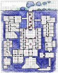
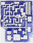
I think you might do well to ditch the gradient effect on the Deepwell map and use the Enclave "water levels" effect you use on that map - it looks pretty sharp. In fact, I think I might even take the color palette from the dwarf hold and replace much of the deepwell map with the former's colors - they're a lot more readable in general.
The transparency thing you've got going on in the dwarf map around the river? I think it's functional, but I think that it might be a case where importing it into Photoshop and freehanding some sort of art to get what you're going for might work better.
I think that some of the sharp points you've got left on some of your objects look a little out of place and they could easily be relaxed a little with just a little carrot tugging.
Your doors on the dwarf map appear to not all be on the right level. Some of them are behind your "walls" object and only show up because you've got the transparency thing going on I think. On the other hand, some of your secret doors look like completely different objects.
On an aesthetic note, the consistent spacing in housing in Deepwell looks a little wonky to me. Have you checked out Butch Curry's (Zombie Nirvana) Youtube "Fantasy Cartography with Adobe Photoshop" episodes? There's a pretty sweet (and quick) technique for quickly knocking out vector buildings in episode 8.
All in all, great job. Everything looks like it would be a lot of fun to play in, especially that snazzy dwarf hold.