New cover art for the Revised PHB and DMG?

That´s what I´m talking about, baby!

Hey Zander, the holidays were pretty good, even tough I had only a week worth of ´em and was far from my family... :)

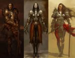
This is what I was trying to tell you about a mix of extreme fantasy and realistic looks (NOT historically accurate, because thas not what this game is about. ;) )

A little Sweetness to all of us:
 

Attachments

  • allx.jpg
    allx.jpg
    63.5 KB · Views: 903
Last edited:

log in or register to remove this ad

As I recall, most of the art department at WOTC was axed about 6 months ago.

The new core books will be featuring "plain brown" recycled paper covers with no artwork, and the title will be displayed in Times New Roman font.

Alternately, they could re-use the covers from the Hero Builders Guidbook for the new PHB, since nobody bought those books anyway. There's about 800,000 unsold copies sitting in a WOTC storage closet.
 

I like the cover style, and I dig the so-called 'dungeonpunk' art. I think it creates options. You want knights and robed wizards? You know what they look like. I like the artwork to open up some new possibilities, show some different angles.

I also happen to think that adventurers would be strange and extreme individuals, but that's just me.

There were some WEAK pieces in the PHB and elsewhere... that picture of the skeleton on the horse in the Spells section? I think I drew that on a Pee-Chee folder in 1985. Most of the line-work was weak. More color! If anyone can afford to keep WEAK pieces out of a product, it should be WOTC.

Vrylakos
 

Zander said:
The reason those fantasy movies had that look is that it costs less (and in the case of metal armour) more comfortable (for the actors) than big pieces of leather, mail or plate armour. IMO an archetypal paladin should look like Lancelot in the film Excalibur and a wizard should be like Gandalf in the LotR films. That's the D&D look. Now there's nothing wrong with variations (far from it), but at least in the core books, they should stick to fantasy, not the punkish quasi sci-fi look.
You say they should stick to fantasy, but by your description, what you really want is historically accurate armor. Which is it you really want? If it's historical accuracy, I'd have to submit that D&D is the wrong game for you. D&D has always been about high fantasy, and the look they have, regardless of the label you put on it, is definately high fantasy, not quasi-scifi. This artwork, like I said, really jives perfectly with the genre that D&D places itself in. A more realistic look would be more appropriate for a lower magic, "low-fantasy" genre, and would therefore be incompatible with D&D.
 

johnsemlak said:
I hate to be a nostalgist but I miss the black and white pictures from 1e days. They were simpler, but better than many pictures in the 3e books.
I think it must be the nostalgia talking. With the very notable exception of Jeff Dee, early D&D artwork was really bad.
 

ColonelHardisson said:
I like the current covers, for much the same reasons Henry gives above. I also like much of the interior art. There really isn't much of the so-called "D&D-punk" art in the books at all, and what there is (mostly pictures of Hennet the sorcerer) is pretty good. There are some weak illos that could be replaced, but there are many more that I'd like to see stay. For new art, I'd love to see a lot more by Wayne Reynolds.

I agree with you 100%, Jeff. (By the way, do you know who illustrated the Positive Energy Aura on page 65 of the ELH? It's a really good picture, IMO.)
 

I too weigh in on the side of loving the 3E cover art and "dungeonpunk" interior art. As has been stated, we all know what robed wizards and plate-clad fighters look like. I find that the current art evokes more "Hey, THERE'S an idea!" moments than gazing upon Generic Fighter #475. Even if he is trying to decide whether the wand he's holding allows magic-users to cast the various Bigby's Hand spells or a +3 Backscratcher.

I agree, too, that the illustration of the Animate Dead spell has to go. I'd rather see the caster in the background with the new undead crawling out of their graves (or the like) than a skeleton riding a skeletal horse.

-Tiberius
 

Joshua Dyal said:

I think it must be the nostalgia talking. With the very notable exception of Jeff Dee, early D&D artwork was really bad.

I liked Erol Otus, actually. His designs had a certain weird surreal quality.

Vrylakos
 

I enjoy the look of the 3E books more than either of the previous editions. If they went back to the Earl Otis-style artwork from previous editions, I'd be most displeased.

And no more Jeff Easley either, please. Yuck.
 

I like the tome look. Looks much better than any previous cover art.

Not a fan of "dungeon-punk" as people are calling it, though. Most of Wayne's stuff is pretty good, though.

Don't know why, but it' Alhandra's picture that drives me nuts, not Hennet's. Oh, and Mialee (aka "Dumbo the elf"). She has to be about the most horribly deformed elf ever.

Most of the illos in the prestige class section of Song and Silence are dead on to what I'd like to see. Not completely historically accurate, but not outlandish, either.

I actually like the chapter intro artwork. The whole DaVinci's sketchbook and parchment look is perfect for the feel of the game.

I also like the pic that Illuminae posted above, especially the leftmost panel (she looks like a vampire in the middle). The armor's a bit "enhanced" (not historical), but it's not absurd.
 

Remove ads

Top