You are using an out of date browser. It may not display this or other websites correctly.
You should upgrade or use an alternative browser.
You should upgrade or use an alternative browser.
D&D 5E (2014) Vote for your favourite 5E cover art!
- Thread starter Morrus
- Start date
steeldragons
Steeliest of the dragons
Individually the open mouths don't bother me. But the poster was correct, when you put them all together, it is kinda "RAAAAGH!" Which...kiinda tickles me a bit.
I think, overall, for all the various types of flack, the images are all good. The full-wrap-around versions are better and obviously all of that black space for the 'back side" of the books will be filled with some kind of marketing blurbage or more in depth description of the contents (like the 1e books all had).
The only thing that I might change in relation to the open mouths sitch would be on the PHB and require a completely different image. A few adventurers, in a dungeon corridor, in "exploring mode" if you get my meaning. Perhaps coming up to a corner around which there are unsuspecting monsters (so their mouths wouldn't be open). Or, like, a troll, looking toward the corner with a quizzical look on its face, as if it had just heard something. Naturally, in the background, behind the troll(s) would be a hazy image of a giant demonic jewel-eyed altar/statue.
Starfox
Hero
These are ok but not overwhelming. They look a bit too much like paintings done from computer renders, with some filters applied. Personally I like the calmer 3E covers best. But the job of these pictures is to be eye-catching, and I guess they are. I wish them much luck in attracting new customers.
I choose between the MM and Starter Set as favorites, and so it seems was many of us. I finally voted for the starter set, and I like that this is the best one, as it has to be the most eye-catching of them all to get picked up and looked at.
I choose between the MM and Starter Set as favorites, and so it seems was many of us. I finally voted for the starter set, and I like that this is the best one, as it has to be the most eye-catching of them all to get picked up and looked at.
These are ok but not overwhelming. They look a bit too much like paintings done from computer renders, with some filters applied.
Especially the monsters on the DMG and the PH remind me of the grey 3D renderings that are common in Kickstarters for miniatures, for some reason...
pming
Legend
Hiya.
I'm going to go with...they all kinda suck. They are all boring. More or less the *same* thing happening on every single cover ("A monster leaps out with a roar!"...or "A monster leaps out with a roar!"...or "A monster leaps out with a roar!"...or "A monster leaps out with a roar!"...or "A monster leaps out with a roar!"...or "A monster leaps out with a roar!"). I feel the art director at WotC for D&D 5e basically told the artists pretty much what Henry Ford told the workers ("A customer can have a car painted any color that he wants so long as it is black." - Henry Ford). Or, as the WotC D&D art director would say "Any cover you want so long as it is a monster with maw agape screaming at a hero in some sort of heroic fashion" -5e Art Director
Out of all of them, I like the Starter Set the most (but that's kinda like saying "I like being punched in the face more than I like being stabbed, shot, poisoned or set aflame").
I want art that has me instantly thinking "ooooo...I wonder what *that* thing is? Oh! What's that in the background?!? Hey, is that a cave entrance back there? Oh man! I just noticed the shadow on the ground! Something is behind the cleric!". That kinda of thing. I don't want "Oh, look, it's a heroic fighter in heroic armor doing a heroic pose fighting a multi-fanged beastie. Again. For the fourteenth time".
(yes, I'm a bit jaded...I'm old and crotchety!
^_^
Paul L. Ming
Spinachcat
First Post
The PHB color scheme is just terrible. The trade dress across the line is embarrassing. I am not a Paizo fan whatsoever, but their art blows away all of the WotC 5e stuff.
Totally unexcited about owning any of those books, but in judging the art, I gotta go with the Starter Set being the most eyecatching. Nice green color there.
Totally unexcited about owning any of those books, but in judging the art, I gotta go with the Starter Set being the most eyecatching. Nice green color there.
I love that beholder. I just find the foreground character's pose a little confusing. Easily my favourite image of the set. Beholders suffered from looking goofy for a long time. This one is downright scarey, as it should be!
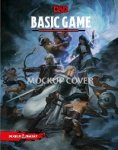
I also like the mock up cover of the basic pdf. Is there a big version of that somewhere?
I also like the mock up cover of the basic pdf. Is there a big version of that somewhere?
Last edited:
Thaumaturge
Wandering. Not lost. (He/they)
I also like the mock up cover of the basic pdf. Is there a big version of that somewhere?
[MENTION=6776579]TheBlueKnight[/MENTION] did a nice mock-up of the Basic Game cover in this thread.
Thaumaturge.
Thanks, but that's not the one I was talking about.
On http://www.enworld.org/forum/content.php?1631-Dungeons-Dragons-Starter-Set-Fantasy-Roleplaying-Fundamentals-%28D-D-Boxed-Game%29-Hits-Amazon!
There is a nice image of combat with goblins

I'd really like to see this full size as it appears to be the sort of cover art that I like most.
On http://www.enworld.org/forum/content.php?1631-Dungeons-Dragons-Starter-Set-Fantasy-Roleplaying-Fundamentals-%28D-D-Boxed-Game%29-Hits-Amazon!
There is a nice image of combat with goblins

I'd really like to see this full size as it appears to be the sort of cover art that I like most.
Similar Threads
- Replies
- 29
- Views
- 9K
D&D 5E (2024)
What old monsters should return to 5e?
- Replies
- 75
- Views
- 5K
G
- Replies
- 18
- Views
- 2K
- Replies
- 51
- Views
- 6K
