Wolfspider
Explorer
I also tend to regard most of the art as ugly (not just done in a style different from what I prefer, but actually ugly).
I was thinking about picking up this book for nostalgia's sake, but now I'll skip it. If the art has lost most of the flavor that I thought of as Dragonlance, I can only imagine what the rest of the book is like.
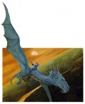
Cover's nice, though.
I was thinking about picking up this book for nostalgia's sake, but now I'll skip it. If the art has lost most of the flavor that I thought of as Dragonlance, I can only imagine what the rest of the book is like.
Cover's nice, though.