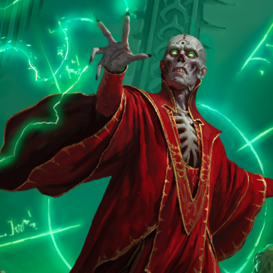
[ELH] Is the art in this book utter crap?

drnuncheon said:

Hey, I don't care if he sketched it off or it took him hours, I just love the style.If he can draw the really cool detailed pictures and then he wants to go back and make it look like a sketch, that's fine - I'm not saying I like it because I think it's dark good for a sketch, I'm saying I like it because it's darn good artwork. It's got a good style to it. It's evocative in all kinds of ways that a lot of the art isn't - it makes me think of the lost notes of some traveller who's been all over the world having adventures and seeing all sorts of unusual sights - which is a big part of what D&D is all about in my mind.

J


What I would REALLY like is to get a chance to see the entire drawings. There's a lot of neat detail in them that gets lost by having the text over them. I would actually pay money for an art book containing the full prints.
 

log in or register to remove this ad

Arnie Swekel is one of my all-time favorite D&D artists. He did a lot of work back on the Pendragon RPG also. You wanna see him at his best? Check out the 4 volume Encyclopedia Magica, which he almost entirely illustrated. His work in Deities & Demigods (and speaking of which, anyone who thinks the ELH is better illustrated is clearly on another plane of existence than I am) is also fantastic.

Wayne Reynolds is another favorite.

Y'know, even back in my 1e days (long before Easeley did the covers for the hardbacks), I didn't much like the art for D&D overall. Yes, there were a lot of good artists, but the overall "look" was bland and unimpressive. 3e brought in a new excitement. I never much cared whether armor looked like something from a history book - too often in earlier editions of D&D armor was drawn to look very ill-fitting and clumsy. Maybe it really was, but it seemed wrong to me that a D&D world, which seems to have been using (and therefore perfecting) armor for a lot longer than in our world, wouldn't have armor that looks a lot more comfortable to wear and move around in. Jim Holloway's art, by the way, often played up on this, making the armor look ridiculously clumsy and impractical.

Artists like Roger Raupp and Jim Holloway could make armor like that look good. Very few others could.
 

Flexor the Mighty! said:


One that really stands out is the Sorcerer with his spikey hair and the way his face is drawn. Add in his outfit and you have an image that makes me want to tear the pages our of the book.

And that's pretty much where the whole "D&D-punk" school of criticism came from. One picture. The fact that it actually seemed to fit with what the sorcerer was all about seemed immaterial; people acted like if every illustration in the book didn't contain characters that were dressed, armed, and armored like the characters from Monty Python and the Holy Grail, it was sacrilege. I've always hated the "Monty Python" look for armor and clothes. It's ugly and uninspiring.
 

i think Epic Tordek is the best picture in the book, but that could be because i love dwarves.

i think the Paragon Mind Flayer is easily the worst picture in the book.
 

ColonelHardisson said:


And that's pretty much where the whole "D&D-punk" school of criticism came from. One picture. The fact that it actually seemed to fit with what the sorcerer was all about seemed immaterial; people acted like if every illustration in the book didn't contain characters that were dressed, armed, and armored like the characters from Monty Python and the Holy Grail, it was sacrilege. I've always hated the "Monty Python" look for armor and clothes. It's ugly and uninspiring.

The rogue looks like she would fit into a Cyberpunk game as well. What race is she supposed to be anyway? Someone said it was a halfling...I sure hope not. The armor pictures in the PHB are pretty bad as well. All those spikes...man I bet a lot of folks would maim all kinds of people by accident with that kind of gear! The pic of full plate makes me think of powered battle armor. The paladin...well don't even get me started on that. As someone said at another board, is the half orc really part ogre? I suppose I'm more interested in art that depicts a slightly more historical influenced world. But I guess that's not what 3e is about. I look at "A Paladin in Hell" from the 1e book and say, "Wow that's cool". I look at art from a lot of 3e and say, "did Rob Liefeld draw this?*"

*In my book that's the worst comment one can make about art.
 

bwgwl said:
i think Epic Tordek is the best picture in the book, but that could be because i love dwarves.

i think the Paragon Mind Flayer is easily the worst picture in the book.

Yeah...for a kick-ass mind flayer, you need to look at WAR's cover on the latest Dungeon. Guy looks like he's going to put the beatdown on you without even using his psionics.

J


One question: What's up with all the facial tattoo's? The character gallery pictures have been the worst offenders. They're pretty much unusable for most characters I've seen, because of all the facial graffiti.
 

D&D art in general

Don't have the ELH, and don't intend on buying it either. As to 3E art in general vs earlier incarnations:

On average, the artwork is much better, especially in the core rulebooks. The art in the 1E books was rather quaint and probably would fit in a more historical setting, but color does sell. I like the majority of the monster illustrations, they are excellent and a number of them make the creatures look like the rather formidable foes they are.

The problem with me is a lot of the equipment illustrations and some of the character pics. For instance:

Weapons and armor. The thing is that historical weapons and armor were designed that way not for looks but BECAUSE THEY WORKED THAT WAY! A lot of the weapons & equipment (like the axe used by Krusk) look like they did very good paintings of Warhammer miniatures. The blade on the Barbarian's axe in the PHB looks like it's about 5" thick! Between that and the tree-trunk haft that sucker would weigh in at about 50lb! Evocotive is one thing, but absolutely bloody ridiculous is another.

In general, a couple of items and illustrations look more appropriate to higher-tech settings.

Rifle-style stocks were never on middle-ages crossbows, because that style wasn't necessary for a weapon with no recoil. The stock was simply a straight shaft you tucked under your arm.

The armor illustrations in general look too high-tech, and some of the armor types look nearly identical to the others.

If you want an idea of what real weapons and armor from the ancient era through the early rennaisance looked like, pick up a copy of Palladiums "Compendium of Weapons, Armor, and Castles." Most of the weapon artwork isn't particularly great, but the armor illustrations are good, and they have some great real-world info on weapons and armor.

Then there's some of the iconics. The sorcerer actually does look setting appropriate, even if the pants are ridiculous (Going to the toilet looks like an all-day affair). The rogue (Lidda?), looks a little more Goth/S&M than I'm used to in a D&D setting. If it was "Cyberpunk d20" I'd say it was a good pick.

Another favorite is the rogue/fencer guy in the "Description" section. An interesting outfit, but he looks like more like the kind of guy who'd draw a laser pistol in his other hand and board a helpless space-merchant ship than he does some duellist from some pseudo-Rennaisance setting.

I do miss some of the earlier artists (Parkinson and Wood in particular) but have to agree that the overall art design in the current D&D products is much better, even with the flaws.
 

Remove ads

Top