Graphic Design and the Aesthetics of Tabletop RPGs

reaglesham

Villager
I just wanted to share something I'm really proud of: the graphic design work I've done for my game, Warped: A Manic Multiversal TTRPG.
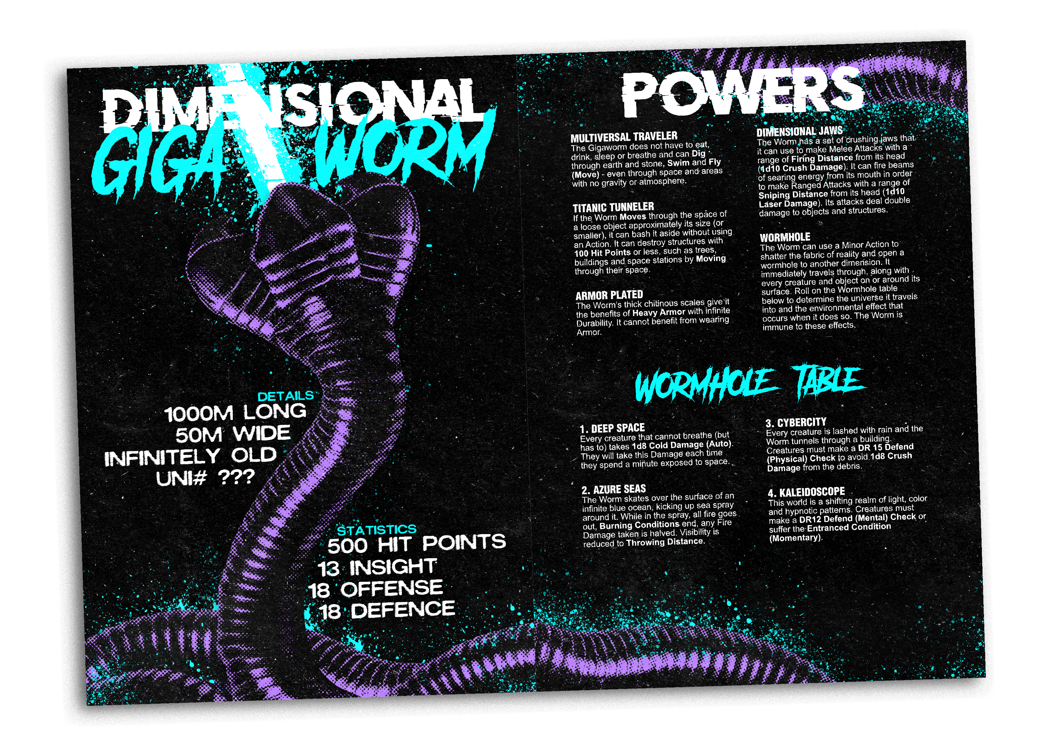
Gigaworm Spread Example.png


As a TTRPG designer, I put so much effort into my rules and mechanics, and that's where the heart of a game truly lies, but graphic design and aesthetics are so incredibly important when it comes to hooking players in and getting them invested in the game in the first place. Mork Borg, for example, is a very simple mechanical system and it is massively elevated by the style and artistic flair of its book. Monster Care Squad was inspired by Studio Ghibli and the artwork suitably compliments that inspiration. The aesthetic style also helps inform the players' actions: you're going to fear a towering beast rendered in the Mork Borg artstyle far more than Monster Care Squad's, for example. As such, I wanted a similar punchy, chaotic style to Mork Borg for my game (sans the heavy metal darkness). It's about deadly, reality warping adventures across the Multiverse, so I felt the graphic design had to be suitably wild and colorful.
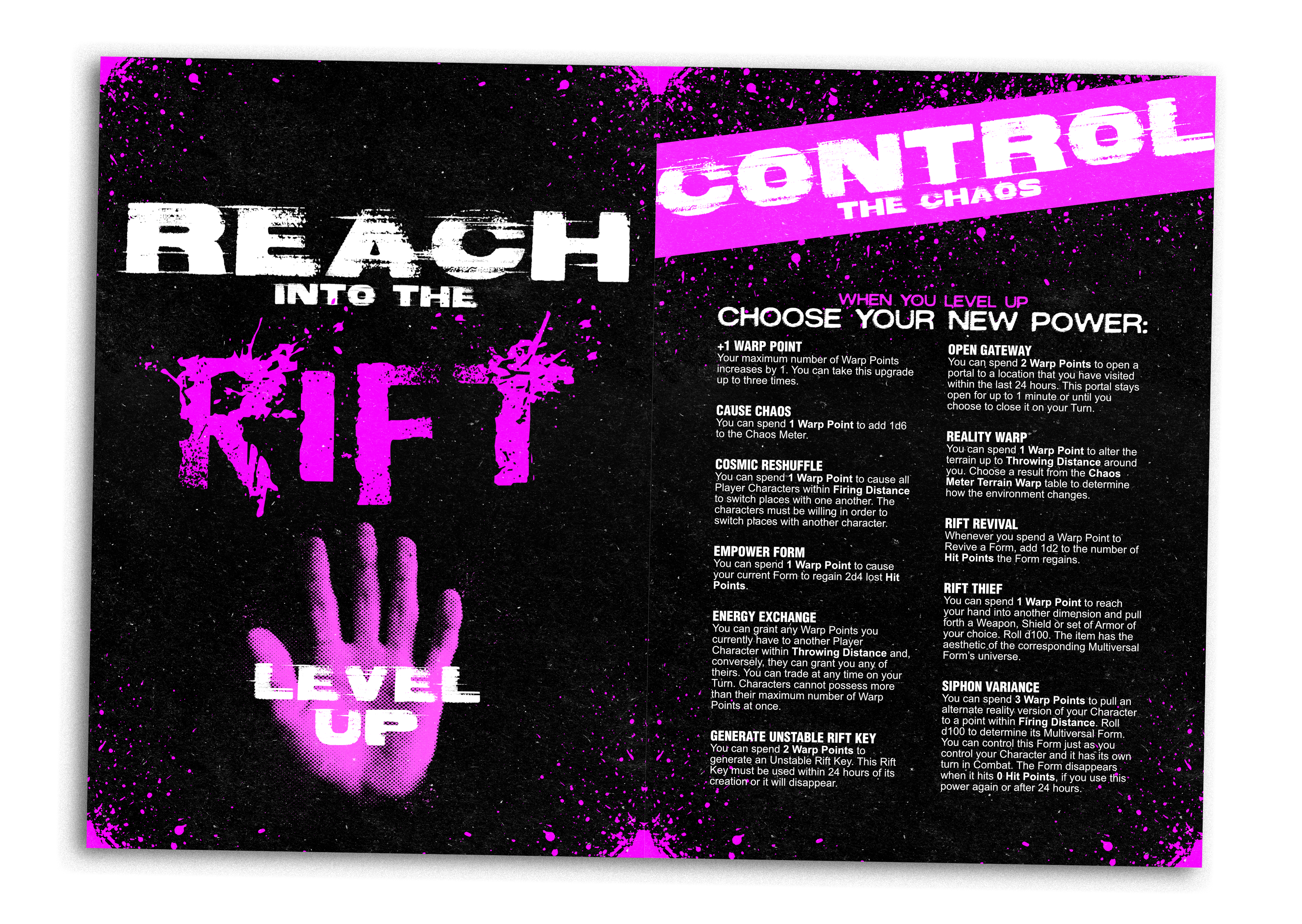
Rift Spread Example.png


Just as there's something really satisfying about streamlining your game design, I get the same feeling looking at a piece of graphic design that hits just right. It really gives me energy to keep pushing forward! I really hope my work catches the imagination of the players, and with only 4 days left on the project's Kickstarter campaign (and so close to the funding goal), I'm getting ready to do more and more design work in the coming year!

Are there any games you've played where the aesthetics or graphic design have really struck a chord with you? Any that you felt shaped your playstyle in large part due to the aesthetic of the game?
 

log in or register to remove this ad

Blue Orange

Gone to Texas
Thank you for being avant garde while at least being readable. I still remember the black backgrounds on White Wolf books...ugh. Not to mention the illegible writing in HoL. Magenta and blue of course echoes the synthwave aesthetic of the 2010s and the CGA graphics of the 1980s. The worm is huge, and so is its text.

Graphic design's a subtle thing, and can really date the game. The oldest RPGs look like mimeographed typed sheets, and as we get into the 80s people start being fancier, culminating in some of the overdesigned books of the 90s. Getting into the 2000s, you can make all your pages full-color, which gets into the fancy page backgrounds of 3-5e D&D and 6-7e Call of Cthulhu. It's hugely impacted by the technology of the time--your white-on-black would be totally inappropriate for a printed book where you'd use huge amounts of ink, but is great for a screen in a dark room.

But back to your question...I'd say the graphic design works at a subtle level, so it's harder to appreciate than, say, the art (DiTerlizzi says 'Planescape', Brom says 'Dark Sun'). The tables and blocky typeface of 1e D&D gave it the feeling of a Serious, Difficult Game, whereas the light blue highlights and rounder typefaces in 2e gave it a friendlier feel reflecting its younger target audience. When it was readable, White Wolf's heavy use of black really did give it a goth feel. The heavy shading of Call of Cthulhu's older editions gives it a horror feel where you can't see or understand everything, and the wide variety of fonts and colors used in 21st-century D&D books gives it the feeling of the superhero game it is. As for 3e vs 5e, I'd say the bigger typefaces and more frequent pictures reflect the attempts to simplify the game and give it a wider audience.
 

aramis erak

Legend
Are there any games you've played where the aesthetics or graphic design have really struck a chord with you? Any that you felt shaped your playstyle in large part due to the aesthetic of the game?
Classic Traveller, specifically, The Traveller Book. Nice, simple, clean. All the art is on point for the sections.
Tunnels and Trolls 5th and Deluxe editions. Nice, clean, Simple.
MASHed. Again, very clean and simple, on point.
Dragonbane. Clear and straightforward (tho' I wish there was a no-background version for use on my eInk device)

Yeah, I'm a humbug - I don't want art behind nor interrupting the text. I don't want the text flowing around the images. I don't want fake stain damage, fake scrolls, etc.
I want the art in full-column-width increments, and free of overlying text.
I want readable text. (open rant at @John Wick - YOU FAILED on this on 7th Sea 2E - it's an illegible mess due to your font choices. Utterly useless.)
Unusual fonts should never be used for body text. Cursive fonts should never be used for anything where intelligibility matters -- many school districts no longer teach cursive, going straight from hand-print to typed.


aramis erak

Legend
Thank you for being avant garde while at least being readable. I still remember the black backgrounds on White Wolf books...ugh. Not to mention the illegible writing in HoL. Magenta and blue of course echoes the synthwave aesthetic of the 2010s and the CGA graphics of the 1980s. The worm is huge, and so is its text.

Graphic design's a subtle thing, and can really date the game. The oldest RPGs look like mimeographed typed sheets,
You clearly haven't seen enough mimeos...

The early games were, for the most part, optically typeset from typewritten manuscripts or, for AH, TSR, GDW, SPI, were done on "hot lead" typecasters, then typeset. GDW explicitly used a Linotype machine, then created masters for optical mastering of the offset foil plates. Early TSR appears to be using a tri-width typewriter or a typecaster, it's hard to say which, but I've never seen pre-'76 versions, so those might have been mimeos.

Only the cheapest were mimeography. I've literally only encountered two in my hundreds of games. One was "Dreams" -which wasn't even bound, being mimeographed, three hole drilled, and then shrink wrapped. The other was a small print in 3.25×4.25 inch format. (TWERPS, and many microgames, also used this size. It's obtained by quartering US Legal Paper, then folding.)

Optical typeset: A "plate" for offset lithographic printing was generated by scanning a layout board with the content on it. The scanner head was generally incapable of reading light blue to cyan... and where the read was dark, the cutting head drilled, carved, or deformed the plate. At print time, the plate is either on a lifting press, or is (for most modern ones) a foil plate, affixed to a drum; ink is laid into the voids, the excess squeegeed off, then the remainder pressed to the paper, which pulls it from the plate. Very low "character bleed". Note that older methods, such as late 18th to early 19th C used chemical baths to

Mimeograph: a "plate," typically thin plastic, was typically drilled by an optical reader to perforate the plate all the way through. The duplicator, when the plate is affixed, forces ink from behind the plate into the paper as it passes through. Letters are almost always slightly fuzzy. As with optical, the sensor head tended to be low response to blue... The characters are almost always fuzzy edged. The older the plate,

Hot lead - as you type, a die with negative of the character was slid into a rail. At end of line, the rail was filled with lead, and allowed to cool/harden. The letter dies were then removed and returned to their bins. the lead bar was one line of lead text, which would then be placed into a frame with the rest of the page's lines, and lead strips between lines to set the vertical pitch, the whole frame would then have the raised type inked, and pressed down onto the sheet.
When used for offset work, the pressed sheets wereusually used as the masters for the later optical mastering of the lithographic plates. Certain small runs might have used the actual framed up lead for pressed ink. Certain things appear to have been so done by GDW and Avalon Hill - mostly errata.

Also worth noting - direct typed mimeography does exist - but requires special typewriters or type impactor media - Dad had a mimeographic type ball for his selectric - which has a multi-needle type face, which perforates the plastic sheet.

Oh, and Dittos were yet another whole mess - ditto machines you used a mastering sheet which imprinted really heavily died type onto the master sheet... which the ditto machine applied a solvent to, and then ran it across the target sheet. They were good, usually, for 2-3 dozen copies... you could squeak out about 6 dozen with ever decreasing quality. But at least you could do multiple colors with dittos...
 

reaglesham

Villager
Thank you for being avant garde while at least being readable. I still remember the black backgrounds on White Wolf books...ugh. Not to mention the illegible writing in HoL. Magenta and blue of course echoes the synthwave aesthetic of the 2010s and the CGA graphics of the 1980s. The worm is huge, and so is its text.

Graphic design's a subtle thing, and can really date the game. The oldest RPGs look like mimeographed typed sheets, and as we get into the 80s people start being fancier, culminating in some of the overdesigned books of the 90s. Getting into the 2000s, you can make all your pages full-color, which gets into the fancy page backgrounds of 3-5e D&D and 6-7e Call of Cthulhu. It's hugely impacted by the technology of the time--your white-on-black would be totally inappropriate for a printed book where you'd use huge amounts of ink, but is great for a screen in a dark room.

But back to your question...I'd say the graphic design works at a subtle level, so it's harder to appreciate than, say, the art (DiTerlizzi says 'Planescape', Brom says 'Dark Sun'). The tables and blocky typeface of 1e D&D gave it the feeling of a Serious, Difficult Game, whereas the light blue highlights and rounder typefaces in 2e gave it a friendlier feel reflecting its younger target audience. When it was readable, White Wolf's heavy use of black really did give it a goth feel. The heavy shading of Call of Cthulhu's older editions gives it a horror feel where you can't see or understand everything, and the wide variety of fonts and colors used in 21st-century D&D books gives it the feeling of the superhero game it is. As for 3e vs 5e, I'd say the bigger typefaces and more frequent pictures reflect the attempts to simplify the game and give it a wider audience.
These are some really insightful points. I'd never thought about 3e v 5e's graphic design reflecting their mechanical shift towards simplicity - very good observation!
 

Reynard

Legend
Supporter
Count me in among the people that think that the ultimate goal for the design of a rule book is utility as a reference. I am married to graphic designer, so I know design can be both useful and attractive. Not that there is anything inherently wrong with "art book" style rulebooks -- I just don't find them valuable as rulebooks. And some are more egregious than others. The pages in the OP are a bit overdone to me, but they at least transmit the information clearly. I can't be bothered with self indulgent designs like Mork Borg.
 

reaglesham

Villager
Count me in among the people that think that the ultimate goal for the design of a rule book is utility as a reference. I am married to graphic designer, so I know design can be both useful and attractive. Not that there is anything inherently wrong with "art book" style rulebooks -- I just don't find them valuable as rulebooks. And some are more egregious than others. The pages in the OP are a bit overdone to me, but they at least transmit the information clearly. I can't be bothered with self indulgent designs like Mork Borg.
I'm a big fan of Mork Borg's graphic design in theory, and was inspired by it when it came to the design of my own work, but when you have a game as simple as Mork Borg and it still takes 10 minutes to work out what the page is trying to communicate that's a pretty big problem in my opinion. It's a very impressive art project and communicates a lot about the style and tone of the game while the mechanics remain simple, but it can be incredibly difficult to decode sometimes.

This page in particular threw me on my first read.
 

Kannik

Hero
Are there any games you've played where the aesthetics or graphic design have really struck a chord with you? Any that you felt shaped your playstyle in large part due to the aesthetic of the game?
I've always considered the graphic design/layout of an RPG (and especially the character sheets*) a vital part of the game as a whole. Part of the graphic design is to make things legible and clear, which is important for the mechanics side of the equation. And part of the graphic design is to evoke a feel and mood, which is important for the narrative and world building side of RPGs (and for flavorful tactical games too).

There are plenty of great examples, and for me Dream Pod 9's books (Heavy Gear, Jovian Chronicles, Tribe 8) will always float to the top of my mind both because they are excellent but also as when they came out they were rare (and they were the first I encountered like this) when compared to the contemporary sea of plain "two-column with interspersed art" type layouts. And they also illustrate how well design can influence aesthetics by comparing Heavy Gear to Jovian Chronicles. Both games take place in the future and feature piloting mecha, but the different feel of their universes and themes come across very well through their different graphic design.


* I have a totally healthy obsession with creating evocative character sheets for games I play in (which is one thing, sadly, that playing more online has taken away from...)


Voidrunner's Codex

Remove ads

Top