Casimir Liber
Adventurer
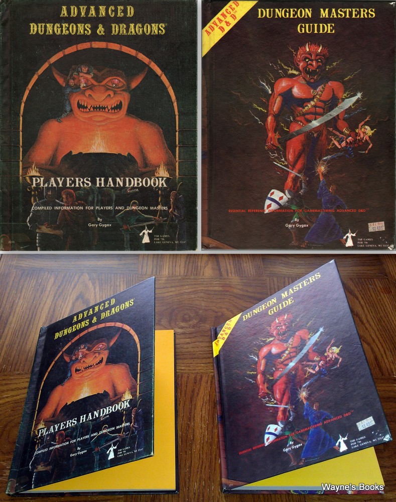
I recall teh first edition monster manual...and now looking at RuneQuest reboot...and it makes me think of the colour pallet used by WoTC. Why does there have to be a preponderance of slate/smog/mud/brown/grey/dark colours interspersed with laval red/orange. If I scan across all the covers really quickly or on a really low res screen or in a darkened room, none stand out as distinctive...they're all so muddy and dark.....does this bother anyone else? I mean part of doing these book surely is that the covers should render them instantly distinguishable from another sourcebook....? I mean I like the art...I just wish the pallets were a bit more distinctive....