Making books more accessible for visually impaired?

Would you prefer alternative digital versions for readability/printing?

  • yes

    Votes: 7 87.5%
  • no

    Votes: 1 12.5%
  • other

    Votes: 0 0.0%

Sacrosanct

Legend
One of the important feedbacks I got from Chromatic Dungeons was accessibility to those with visual impairments. It was eye-opening for me (no pun intended), because I think most publishers completely overlook that part of inclusivity. It seems to me that when publishers talk about inclusivity, ableism gets overlooked a lot.

But that begs the question, why aren't more publishers doing this (at least for digital versions)? Am I totally missing something here? It seems to me that people would want versions that are more printer-friendly and/or easier to read and navigate. Do publishers think it isn't worth it cost-wise? Are publishers afraid of releasing an RFT version for fear of copyright violations and piracy?

1650043179352.png
 

log in or register to remove this ad


Sacrosanct

Legend
People haven't used RTF for 30 years. Why would anyone do that.
I know a few that do at least. The primary advantage is that it's very easy to cut and paste and organize the parts you want, to print off for reference without having to worry about any graphical elements.
 

J.Quondam

CR 1/8
Honestly, I suspect the main reason is just expense. Making a document truly and completely accessible has a lot of dimensions. From my years dealing with accessibility in elections, I recall that some major issues regarding visual impairment were font-size and contrast; and text flow, though I'm sure I'm forgetting others.

I'd think that any format that allows the reader to easily scale up the font (or even reverse to light-on-dark) would be helpful. (Similarly, simple non-italic sans-serif fonts were also preferable, I think?) I know several ebook formats can do that sort of thing, but complex image-heavy PDFs less so.

The other big aspect is text flow. The idea is to have a format in which the text can be fed as-is into a reader app and produce a clean, intelligible audio output. This is really tough to do for docs with complex layouts like a monster manual which has images, tables, sidebars, etc; as well as back-end gobbledegook that can confuse a reader apps. Also, images and diagrams themselves ideally should have some sort of meta-description so a visually impaired reader can experience it in "audio" form. Analogous considerations need to be made for tables and charts. Obviously, the more of these non-text and not-purely-text elements you have, the bigger a project those descriptions become.

In the end, I suspect doing it "right" boils down to just generating a completely different document of the same content, but formatted specifically with accessibility in mind. But how to do that in an efficient way, I'm not so sure. I'd assume that popular doc software like InDesign would have functionality to assist in that sort of thing, but maybe not? I don't know. Hopefully someone else here has some more applicable experience!

I wish had a more solid know-how, since I know this sort of effort is really very much appreciated by people who benefit from it. If you're interested in approaches, maybe a look at web-accessibility best practices could a good place to start? That's specific to websites, but you might find a fair bit of overlap with published documents.


** Oh, and for me personally, as someone with aging eyesight, I like do appreciate options with no background images and clear, upright fonts. While I understand the utility of italics, I find them really difficult to read since they tend to be not only "curly" but also "thin". It's even worse with unusual typefaces that emulate "handwritten" or gothic or other specialized styles. I've seen more than a few handouts in publications that are almost completely illegible to me-- and I only need reading glasses! I can't imagine what it's like for someone with more serious visual impairments.
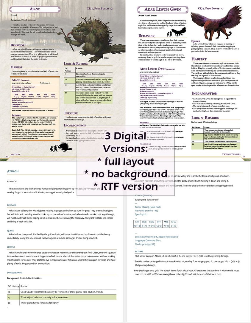
 

Sacrosanct

Legend
For the record, removing background images takes all of 5 minutes. It's a simple step in InDesign. Putting everything in a Word doc and doing basic formatting to make it at least somewhat easy to read took a few hours.

And that's it. It's pretty easy. Unless you're also changing font size and/or type in the non-background one, it's easy. Now, if you are changing font size and/or type in InDesign, it takes a lot of work because you have to redo all the art layout. Probably about a week or two.
 

I'd think that any format that allows the reader to easily scale up the font (or even reverse to light-on-dark) would be helpful. (Similarly, simple non-italic sans-serif fonts were also preferable, I think?).
Zoomable PDFs without complex backgrounds will get you a long way. I was never actually able to read the D&D3.x rules because of the complex backgrounds. Serif fonts are generally preferable for body text. Light-on-dark is best left to reader software, since some people need it and others can't read it.

If colour has to be used, keep it very simple and clear. About 8% of males of Northern European descent have a red/green problem, which means they can't reliably distinguish those colours from each other, or from brown, and often can't tell yellow from orange. Neat colour effects using any of these colours tend to disappear into confusing splodges.
** Oh, and for me personally, as someone with aging eyesight, I like do appreciate options with no background images and clear, upright fonts. While I understand the utility of italics, I find them really difficult to read since they tend to be not only "curly" but also "thin". It's even worse with unusual typefaces that emulate "handwritten" or gothic or other specialized styles. I've seen more than a few handouts in publications that are almost completely illegible to me-- and I only need reading glasses! I can't imagine what it's like for someone with more serious visual impairments.
I'm partially sighted. Italics are fine for emphasis, but not for text longer than about 25 words. I have never been able to read the vignettes in classic White Wolf books, which has definitely handicapped my appreciation of those games. Handwriting fonts and similar effects just lock me out entirely.
 

Umbran

Mod Squad
Staff member
Supporter
And that's it. It's pretty easy. Unless you're also changing font size and/or type in the non-background one, it's easy. Now, if you are changing font size and/or type in InDesign, it takes a lot of work because you have to redo all the art layout. Probably about a week or two.

My understanding is that a lot of the folks who do game graphic design and layout don't have the most formal training, and so they may not have a lot of accessible design in their toolkits.

There's also a difficulty in that there's a wide variety of visual (and other reading) impairments, and they don't all call for the same solution. My understanding is that this is particularly true for fonts - a font designed to be dyslexia accessible may be bad for many visual impairments, and the like. John Dallman, above, prefers serif fonts for body text, while my father found san serif fonts to be much easier to make out as his eyesight was failing.

Once you get into the weeds, there's no one simple practice of visually accessible design, which may make the endeavor intractable for small game publishers.
 

Sacrosanct

Legend
My understanding is that a lot of the folks who do game graphic design and layout don't have the most formal training, and so they may not have a lot of accessible design in their toolkits.

There's also a difficulty in that there's a wide variety of visual (and other reading) impairments, and they don't all call for the same solution. My understanding is that this is particularly true for fonts - a font designed to be dyslexia accessible may be bad for many visual impairments, and the like. John Dallman, above, prefers serif fonts for body text, while my father found san serif fonts to be much easier to make out as his eyesight was failing.

Once you get into the weeds, there's no one simple practice of visually accessible design, which may make the endeavor intractable for small game publishers.
Sure. But that shouldn't mean we don't do anything. There are a few publishers who make the effort, but I don't know of a single larger one who does. This seems backwards to me, since larger publishers have more resources to do so, and have a lot more customers who read their books.


Crusadius

Adventurer
I'm not an accessibility expert but as a programmer I did have to code a pdf export of data a few years ago and generally the guidelines for developing an accessible web page and an accessible pdf are similar.
  • images have alt tags
  • heading structure - one h1, and don't skip a level (h2,h3,h4 etc)
  • include bookmarks (generally generated from your headings)
  • format tables properly (captions, summaries, headers indicating the column they belong to)
  • don't use color by itself to communicate intent
  • make sure your foreground/background colors have enough contrast
Checking this can be a laborious process. I can only assume using Adobe or some other suite of tools publishers use to create PDFs can do this automatically (or at least can run a check).
 
Last edited:

Remove ads

Top