Making books more accessible for visually impaired?

Would you prefer alternative digital versions for readability/printing?

  • yes

    Votes: 7 87.5%
  • no

    Votes: 1 12.5%
  • other

    Votes: 0 0.0%

Sacrosanct

Legend
For those with visual impairments, is this easier to read? I've changed the font to Open Dyslexic, and up'd the default font size to 12.
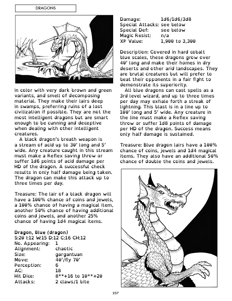
1650321976312.png
 

log in or register to remove this ad


Sacrosanct

Legend
Easier, yes. The font is a bit strange, but the simpler layout and lack of background are welcome.
I'm not dyslexic, so I'm just repeating what others have said. The reason the font is like that is to make every character different and not similar to each other. like how 'b' and 'd' are very similar in this font. But with open dyslexic, you'll note how the thick parts are in different areas of each letter. It's supposed to help reduce the frequency of mistaking one letter for the other.
 

I've used the Open Dyslexic font quite a bit. Both of my kids struggled with different degrees and types of reading disorders - and it did help them quite a bit. From a personal (non-dyslexic) perspective, I find the use of that font considerably slows down my reading (like many people, I read primarily by unconsciously recognizing the overall shape of most words rather than parsing out the individual letters). This is one of the things I like about reading EPUB/MOBI files over PDFs - having your reading device/app swap out the font is usually pretty easy. Of course, laying out a book for this type of format is a very different proposition than PDFs (the concept of distinct pages - and page layout - doesn't really exist with EPUB/MOBI files).
 

jdrakeh

Front Range Warlock
I prefer layered PDFs that one can turn off background and graphics in. That gets you the best of all worlds in one document and most are compatible with text to speech programs.


Remove ads

Top