Went to check out the MM from the local FLGS yesterday, and actually tried to keep this thread in mind to decide which monsters to check out!
")
Two that come to mind are the cockatrice and merrow.
Forgot to check the Merrow, but I did check out the Cockatrice. It's a really good scary picture, but actually it's remarkably similar to the same picture in the 3e MM... which was in fact great, and after reading your comment I was wondering how could they make it better. They couldn't, but they made it almost the same

The griffon ... griffons are weak.
I think it's quite ok. It doesn't look particularly epic, the 3e picture looked more epic but had some strange artifact in the printing that gave it a very odd black lining IIRC.
On the flip side, the owlbear was a huge disappointment, especially after all the awesome concept art.
Agreed, this was one of the worst I noticed. I'll still resort to the 3e MM to show a picture of an Owlbear to the players.
Worgs look like Peter Jackson's Wargs not like giant wolves.
I am not sure how they should be... The current pictured seemed ok to me, but a bit too disproportionate.
Myconids!
I strongly suspect these guys started out as a joke about psychedelic mushrooms, but the 5e art is majestically unearthly.
Well I admit the art caught me unprepared, and I still don't know if I liked it or not. It's just plain weird.
the Kraken, we now have Harryhausen inspired monster instead of a giant squid/octopus (which may be more historically accurate, but not as cool imo)
I saw this artwork online and I am still undecided. Giant squid was fine for me, alien monster is fine also but the current pose makes it impossible to figure out how it actually looks like. In the original artist's webpage you can see other poses and then the monsters makes more sense, but IMO they shouldn't have picked this one for the MM.
Behir really stood out with its serpentine body. It's almost mythic in its appearance.
OTOH I'm really disappointed at the devils and demons. Most of them don't look supernatural enough. They're just cartoony and not intimidating, freaky or unnatural.
Here's some better devils/demons
http://waynebarlowe.wordpress.com/artwork/hell/
Didn't check the Behir. As for demons and devils, I liked them all except perhaps the lesser ones. I think those from your link are way too disturbing... perhaps that's exactly what they should be, but IMHO for a regular D&D book those would be highly inappropriate.
I had Green Ronin's books of devils and demons for 3e, and even there the artwork is much scarier than the 3e/5e MM, and while not yet really disturbing, they were IMO already better suitable for a supplement with a warning label that it's not a children's product.
Modrons art is replicated from a Dragon magazine article, and is quite cartoonish and IMO fails to capture any of the strangeness/gravitas of Modrons, or how I might use them as besides comic relief. I give it a solid "C."
Slaad art OTOH is new, outstanding, and evocative. I really feel the differences in the various types of slaad and get a sense that I could use them as insidious infiltrators and initiators of chaos. I give it a solid "A."
I loved the 5e Modrons art! I don't have the original Planescape books, but the 5e MM pictures are pretty much how I thought them to be back then in 2e. If someone told me they had recycled the old art, I would have believed them.
I am not a huge fan of Slaadi for conceptual reasons (I don't like that "ultimate creatures of chaos" follow a very regular pattern of transformations) and I found that 5e slaad have the same visual problem as in 3e: they all look pretty much the same, just in different colors. But the pictures themselves seemed very good for sure.
Barlgura - it used to be an orangutang, not an orange gorilla). Anyone notice that the mephits ARE IN THE SAME POSE IN EACH PICTURE (except the Mud)? Why do the yeti have ram's horns?
...
Now, there were some I did like - the angels, cockatrice, merrow, centaur & chimera, quasit and the picture of Castle Ravenloft are great. The displacer beast looks sleek and fearsome. Most of the dragons are well done (exception is the red & shadow). I'm glad to see a woman-like Dryad back instead of the tree abomination.
I saw only some of those you mentioned, but here's what I remember:
- Barlgura, not a particularly brilliant picture but fine for me (I have no idea what it was originally)
- Mephits, I remembered your comment exactly so I checked them, and you are right
- Yeti, looked great to me, horns or not I honestly don't care, I am just glad they didn't do it too much ape-like or human-like or with gigantic feet because I generally hate those takes on yetis
- Angels, I liked the pictures but not the concept, they all seemed too similar, all too muscular bare-chested human males with white wings and a sword (I don't even think they need to be muscular at all, but rather have supernatural strength)
- Chimera, that one just looked fantastic!
Not sure about the cloud giant either - since when did cloud giants have vampire teeth? Thri Kreen look awful.
...
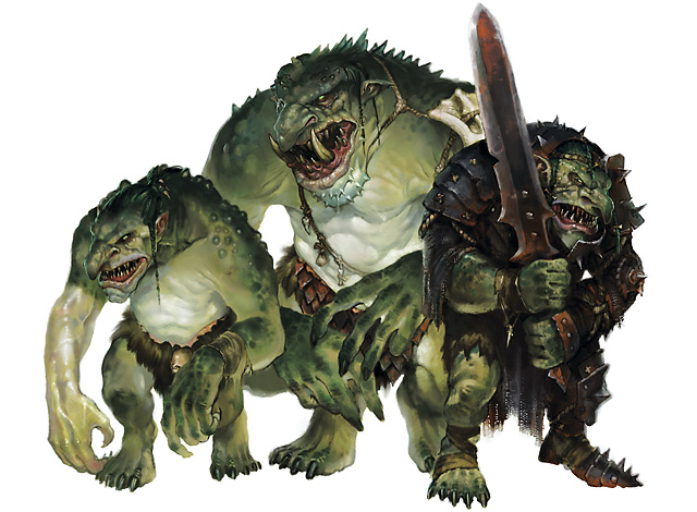
Orc, goblin, hobgoblin, ogre, troll have all changed quite a bit from earlier editions. Is it just me or do they look a bit "warcrafty but with different colours"?
I actually thought the cloud giant had piercing on the lips, not fangs, but maybe I didn't look carefully.
I agree that those others look "wow-ish" but they also look better IMO:
- I prefer the current orcs compared to the fuzzy boar-like 3e orcs, also because now half-orcs actually look halfway between the two.
- I like both 3e and 5e ogres, with slight preference for the new ones
- Trolls look better than 3e and much better than 4e
- goblinoids on the other hand I'm still not completely sure, one positive thing is that they now look visibly related to each other


 Ok, maybe they are not that oversized, but they are large enough to be distracting.