New Features

Mark said:
Couple of things I found while cleaning up my publisher section...

(Page count, price, and a few other things that I assume you haven't yet added.)

All of these are tied to product formats, which hasn't been implemented yet. Products can have multiple formats - softcover, hardcover, PDF for example. It is the format that holds information about the, well, format of the product - page count, release date and so on.
 

log in or register to remove this ad

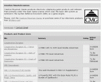
A small formatting change I'd like to see is in the way product line dividers are displayed. I've attached a screenshot to show what I mean - the names of the product lines look too similar to the names of the products themselves.

Ideally, I'd like it to be within a shaded bar of some kind, bolded, and not underlined. That would make the product line divisions stand out much more clearly.
 

Attachments

  • screen.jpg
    screen.jpg
    182 KB · Views: 133
Last edited:

Michael Morris said:
All of these are tied to product formats, which hasn't been implemented yet. Products can have multiple formats - softcover, hardcover, PDF for example. It is the format that holds information about the, well, format of the product - page count, release date and so on.

I see.

What of the first two parts of my post? Are release dates and product lines tied to those things in some way as well?

(Just asking. It's already a workable system that pubs should be able to use to clean up their sections to a great degree.)
 

Morrus said:
A small formatting change I'd like to see is in the way product line dividers are displayed.

That'd be nice. Maybe a parenthetical in a smaller font and italicized, too, would help, i.e. "(product line)"


Morrus said:
I've attached a screenshot

Where?
 

Mark said:

Up there! It only shows the current setup and circles the bit which needs changing. I don't have the graphical prowess to actually whip up an example of how I'd like it to look, unfortunately.
 

Morrus said:
Up there! It only shows the current setup and circles the bit which needs changing. I don't have the graphical prowess to actually whip up an example of how I'd like it to look, unfortunately.

Sneaky... ;)

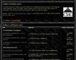
I don't usually use it, but I checked the "Stealth" mode and it is well delineated in that format (though I'd suyggest checnging the header to say "Product Lines and Products" rather than the other way around, but that's a nitpick, really.

Now, I've attached an image... ;)
 

Attachments

  • pub_section_001.gif
    pub_section_001.gif
    19.1 KB · Views: 120

Yeah, it does look a little better in Stealth. The horizontal bar works; the text still looks the same as the product titles, though. I think a simple bold and removal of the underlines will solve that nicely.
 

After comparing the two it looks like you'd have to make some fundamental changes to the appearance of the default board style to make it more clear...and that might make some waves. Personally, if I didn't use the pub sections and only used the mesage boards, it might get me slightly riled. Might be worth doing in the long run but expect a slight backlash early on and toughen your skin to it. Also, now that this is apparent, each new style that gets added down the road will need to be checked in those pub sections to see if the delineation is as clear as the "Stealth" mode or basically non-delneated like the default mode. Just a few thoughts.
 

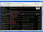
I mocked one up that removes the underlines, raises the font up one notch, and makes it bold. Honestly, though, I'm not sure this can be done without making changes that effect the whole message board system. Michael will know. I'm liking the Stealth mode more and more as I view it, btw. :)
 

Attachments

  • pub_section_003.gif
    pub_section_003.gif
    166.1 KB · Views: 135

Ah, now that looks much, much better, and far more professional. With the addition of making the bar a different shade, I think we've got it.
 

Remove ads

Top