Page design opinions...

Targeteron said:
Thats what i wanted to say mrob. Personally i prefer as few color as possible for printing. not that big a deal i can always tell my printer to print everything B/W, as long as its not too intricate and would force everything to be "black" when printed out this way. Also for printing out PDFs i HATE soft flowing text around a picture. I normally just cut out and delete artwork so i use less ink on printing it out. "round" text makes it a) look bad and b) a pain to cleanly remove the artwork. since we dont have printshops like you in the US have i have to do all the printing on my own cheap lexmark inkjet at home. Artwork itself is of course necessary to make it "look good" no question about that.

Mostly i read a PDF at my PC and print out only what i want/need at the gaming table. so generally i am no big fan of 2 column standard print layout, forces me to scroll down, up and down again while reading a page. Thus I prefer Single column flowtext.

Just my 0.2 € as a user.

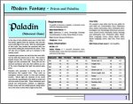
Good point, I'll make a sideways style as well with fonts large enought to read one full page at a time on-screen.

So, do you have a problem with art on the screen version or the print version?

Anybody else have opinions on this?
 

log in or register to remove this ad

I am actually an art nut, i just love good and fitting artwork. so in an onscreen version definetly art. but to print out preferrably without. If there is only one product either fullpage/halfpage/quarterpage or "framed" art so its easily removable.
For example in a class description have the artwork depicting a member of the described class at the beginning of the description where there is normally most of the "flavour" text and have the parts pertaining to rules clean. And have pictures either "framed" or the text flowing next to it in a straight line.
But in the end go with what sells and works for you. after all i am just one user out of many and i am shure there are a lot of people out there with different opinions, even though they may not express themselfes in this forum. ;)
 

Try this...
 

Attachments

  • side view.jpg
    side view.jpg
    56.2 KB · Views: 104

mroberon1972 said:
Why? The print would be B/W anyway...

Not if they are colorized by takin the colors to them via paintbruch program.

Ala Robin Wood style. It cost the same at most prints if you have the color on the header or on the picture, it is not the amount of color you pay for but that it is there.
 

marketingman said:
Not if they are colorized by takin the colors to them via paintbruch program.

Ala Robin Wood style. It cost the same at most prints if you have the color on the header or on the picture, it is not the amount of color you pay for but that it is there.

Sorry, I need you to rephrase that. I didn't understand.
 

Very interesting. For reading at the PC very neat. I guess its even ok to have it printed out that way. It is unusual so i cant say for shure but i "think" i would like it on the monitor as i would like it printed out.
 

Targeteron said:
Very interesting. For reading at the PC very neat. I guess its even ok to have it printed out that way. It is unusual so i cant say for shure but i "think" i would like it on the monitor as i would like it printed out.

That's ok. I'll make both, and a stripped down version for printing too.
 

mroberon1972 said:
Sorry, I need you to rephrase that. I didn't understand.

O.K. the question being are you going to have a print version of this product availabe at some time in the future?

If you are the printer will charge you just the same for the splash of the two colors you have chosen has he would if the Band White Illustrations were done in those same two colors.

Or just go completely black and white with your print run and save yourself the money but be look down upon by buyers. As inferior i.e. TSR/Judges Guild.
 

The standard D&D classes redone for d20 Modern (+magic) is a better approximation to what we've been looking for than anything else we've seen. (Uh... you do plan on including spellcasting cleric & paladin equivalents, yes?)


Are you really saying you'll make both a portrait layout with illustrations AND a landscape layout without illustrations? Or was it something illustration-rich for onscreen and something without illustrations for print -- and portrait or landscape for those?

In general, we like the layouts. Our only quibble is the color blocks.
1) Many, if not most, inkjet printers have problems with blocks of any solid color. You often get lines of 2x saturation where one printed row overlaps the next.
2) Those colors gotta go... yes, you need pale colors if you're going to have print on them, but those reminded me of Easter eggs right off the bat.

My husband the artist came up with a solution to both issues:
Use a brighter, more intense color for the lines in the borders.

That way, you get color accents without requiring the customer to use lots of ink. And strong, bold colors are probably more popular with your target audience.
 

Axegrrl said:
The standard D&D classes redone for d20 Modern (+magic) is a better approximation to what we've been looking for than anything else we've seen. (Uh... you do plan on including spellcasting cleric & paladin equivalents, yes?)

First, d20 is modeled around advanced classes being specialized, so no, the paladin does not get spell-casting. Nothing is stopping a paladin from taking a few levels of cleric to get the spells he needs, though...

The priests (clerics) are also missing the heavy combat system that the D&D cleric has. Again, you would want to take levels of soldier, strong, or tough...

The first book is about paladins and priests (clerics), and contain all the rules for the classes. The priest does not have a spell-list, since everyone I can think of will either be using the d20 modern or D&D books to use these classes.

What I am doing is distributing the powers more evenly, making it so that a player should have the same interest in taking higher levels as opposed to just grabbing all the powers at levels 1-5...

Actually, I'm going to make a b/w version for printing. In fact, for the moment I have shifted the whole thing to b/w. I may re-add color later. But only after I find a set most people don't look at and go Blegh! :p

Back to work...
 

Remove ads

Top